Forgive me, friends, as I have been horrid at keeping my scribal works properly documented here. But, now that I have a tiny bit of time, I’d like to talk about the work I did for my friend Jon’s Laurel scroll.
When Jon was announced at Queen’s Prize, I immediately went to Rochwen (his sponsor) and went “I’d love to be a part of Jon’s day!” Lucky for me, Jon also wanted an original piece from me, and after the madness of Lilies and general weird life stuff, we could all kind of settle in to create some magic for Jon.
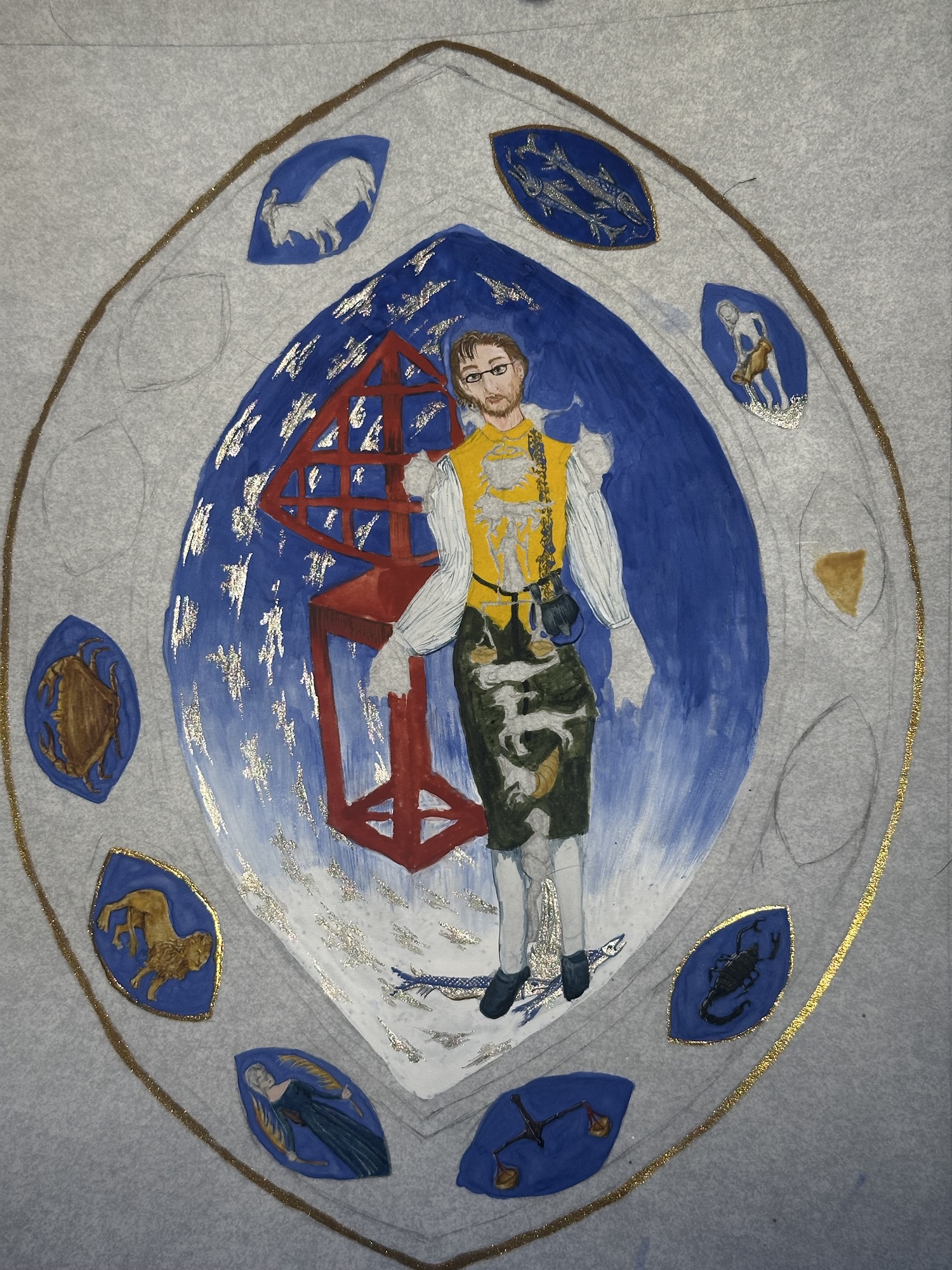
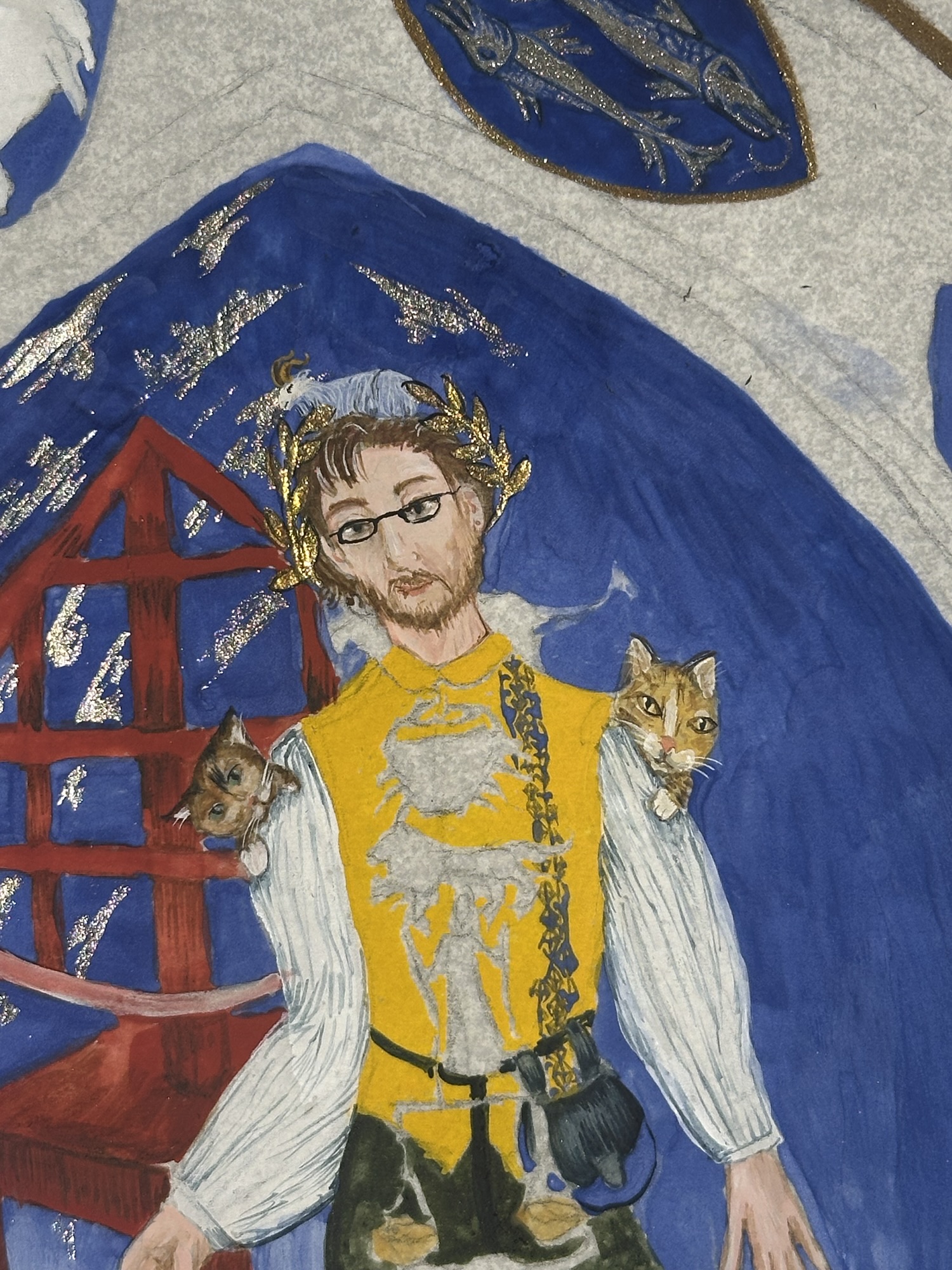
Jon is very much into medieval astronomy and has spent an immense amount of time studying and explaining the subject to not only the SCA, but outside of the SCA at academic conferences, as well. He’s even done observation of the heavens with a quadrant that he’s set up at camping events. So, when I got the brief of late period astronomy, no telescopes, no naked people, and a couple of interesting calligraphy pieces that went into astronomical detail. That said, since the items he had for inspiration in his brief didn’t have a lot of illumination, I took a couple of days to really dig deep to find items that would work for an astronomer.
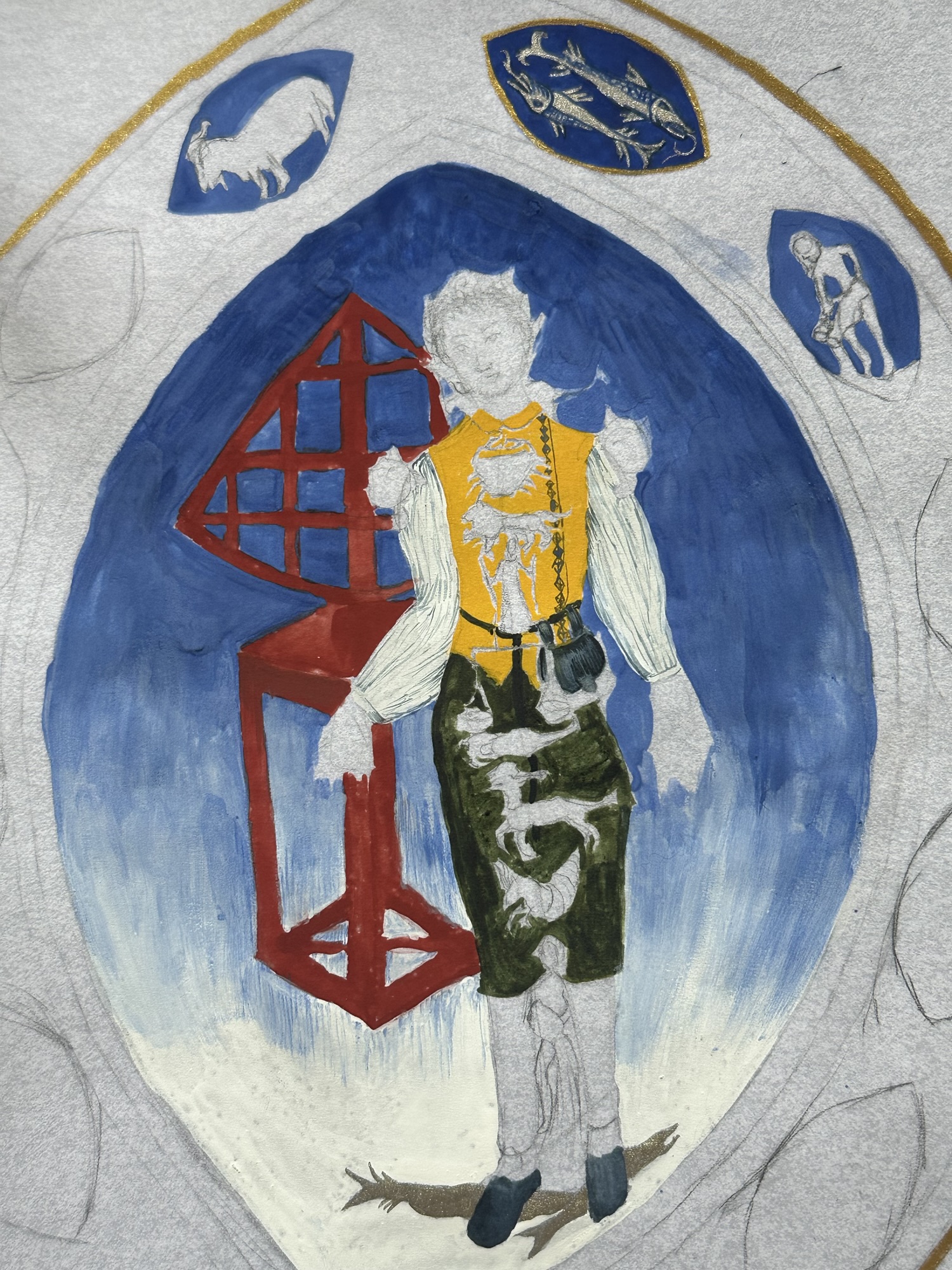
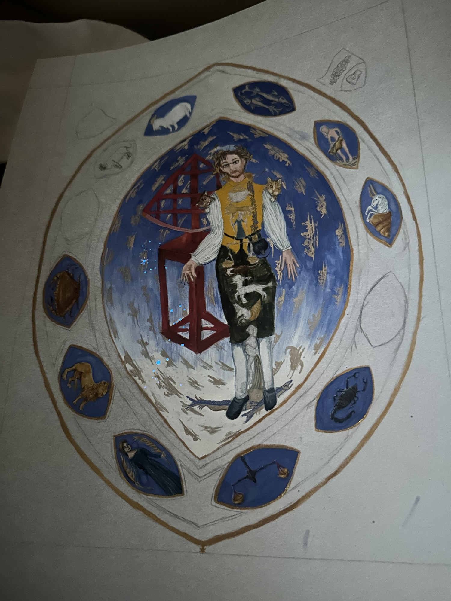
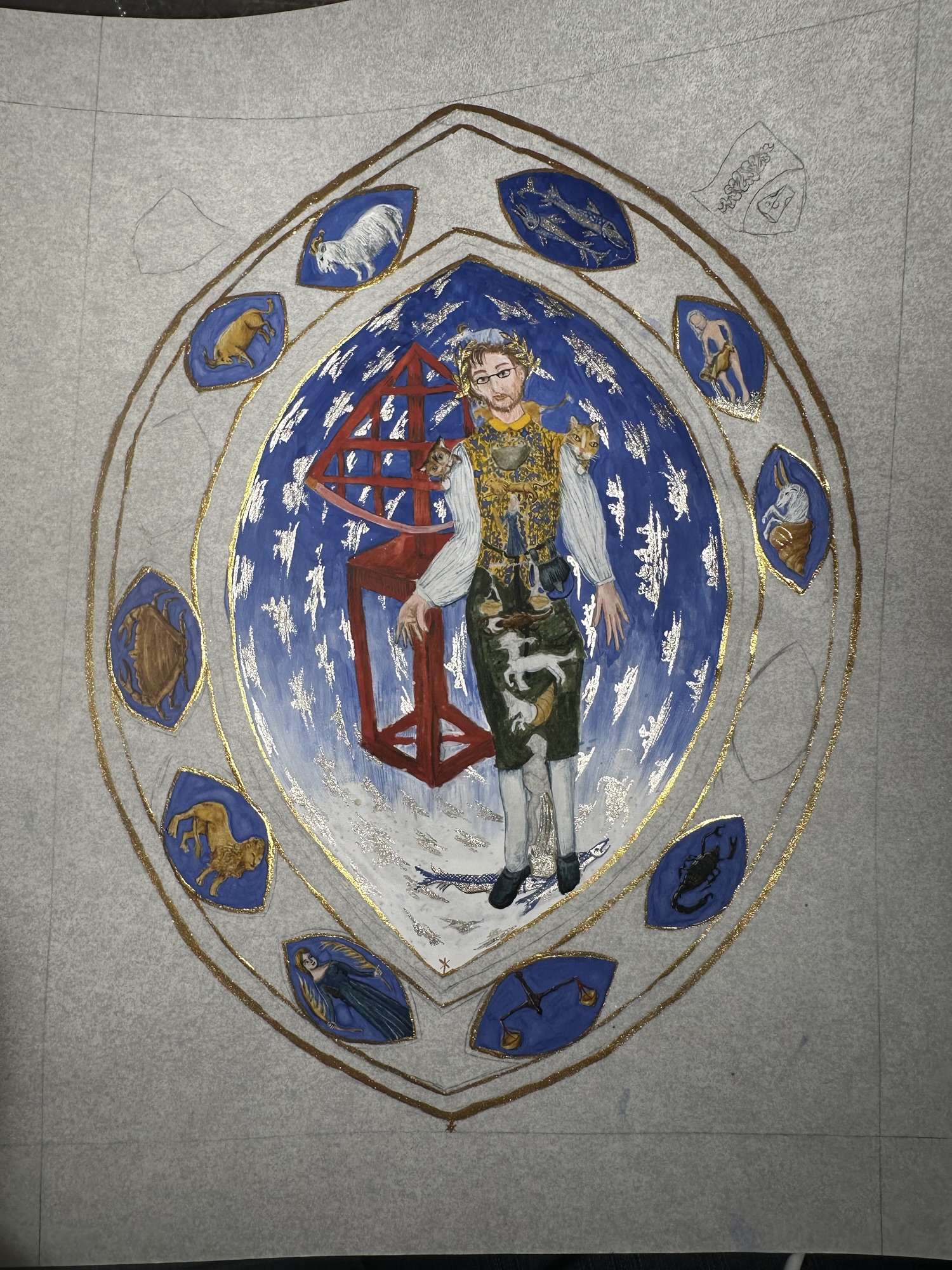
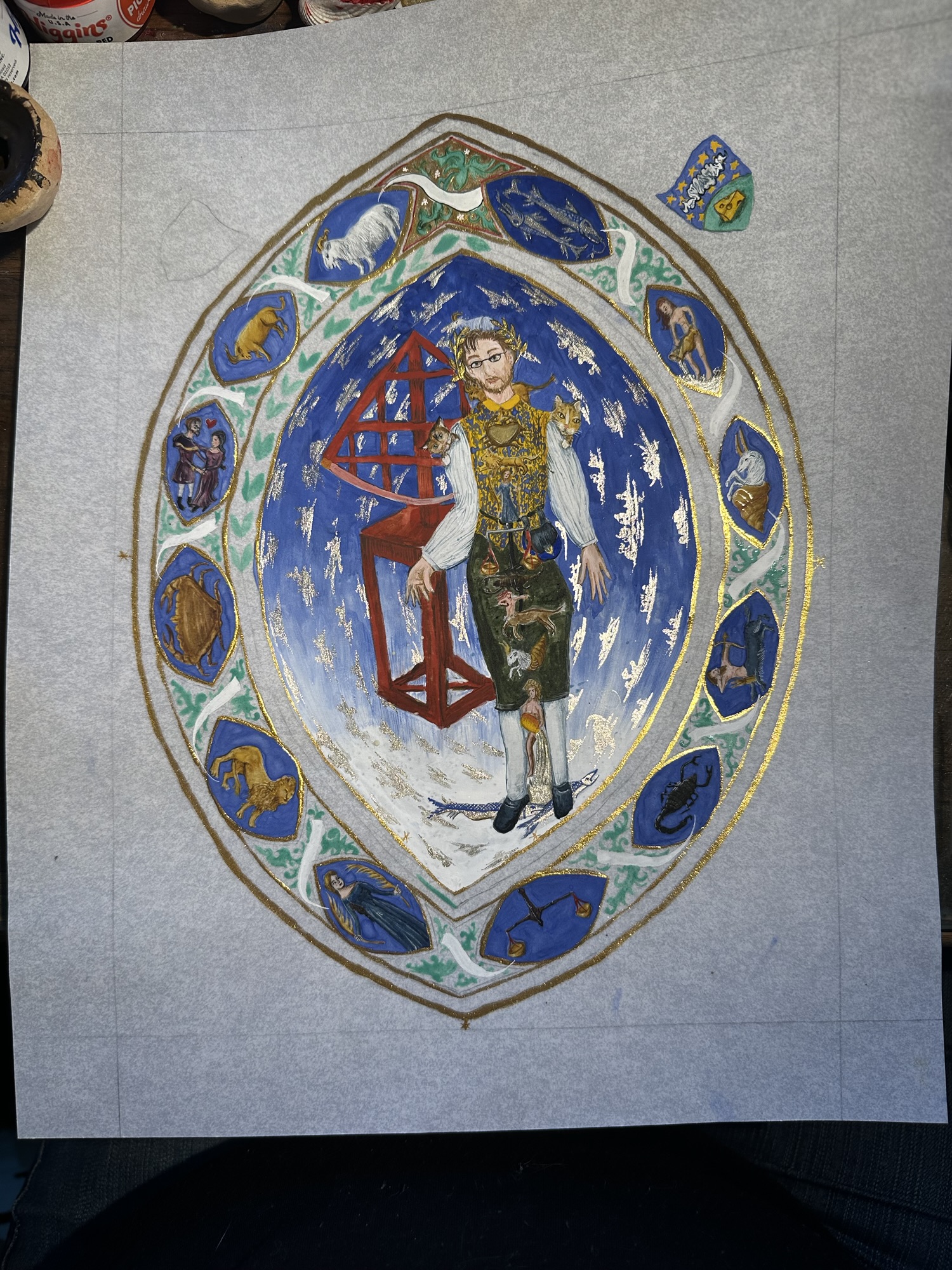
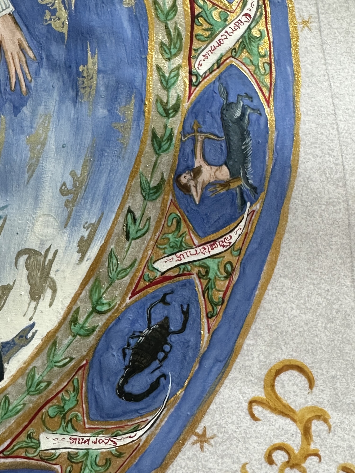
Enter Très Riches Heures du Duc de Berry. Illuminated for Jean, duc du Berry (the brother of Charles V of France) between c. 1412 and 1416 by the Limbourg brothers until their death by plague (and then completed in the 1440s by an anonymous painter), this massive book of hours (one of fifteen in the duke’s collection) contains calendars (with the appropriate activities illustrated for the season/month), prayers, and a show-stopper: an anatomical zodiac man. (There are many other show-stoppers, but for what fit the scope the best, it was this guy.)
One minor, tiny problem. I had about two weeks of time (but realistically about a week’s worth of painting time with my other life obligations) to get it penciled, painted, and packed.
This is usually not that big of a deal for me, as I tend to work on the smaller side, but as Très Riches Heures du Duc de Berry is about 11.8 inches by 8.5 inches (30 cm in by 21.5 cm), (though it was bigger at one point due to cuts in the original vellum) meant that I would have to sacrifice some details in order to make sure it was complete by the time it was presented in morning court on Saturday.
That said, having a stock of ready-cut pergamenata (or close to it) meant that I could cut down to about the size I needed, but instead of doing this, I accounted for a frame for later, so I created margins so that I had a similar space as the original illumination while also making sure that it could be framed without cutting details out.
I also realized I’d need a compass to get the mandorla shape as smooth and proportioned correctly, so a quick trip to the art supply store, meant that I was essentially down a day.
Stress.
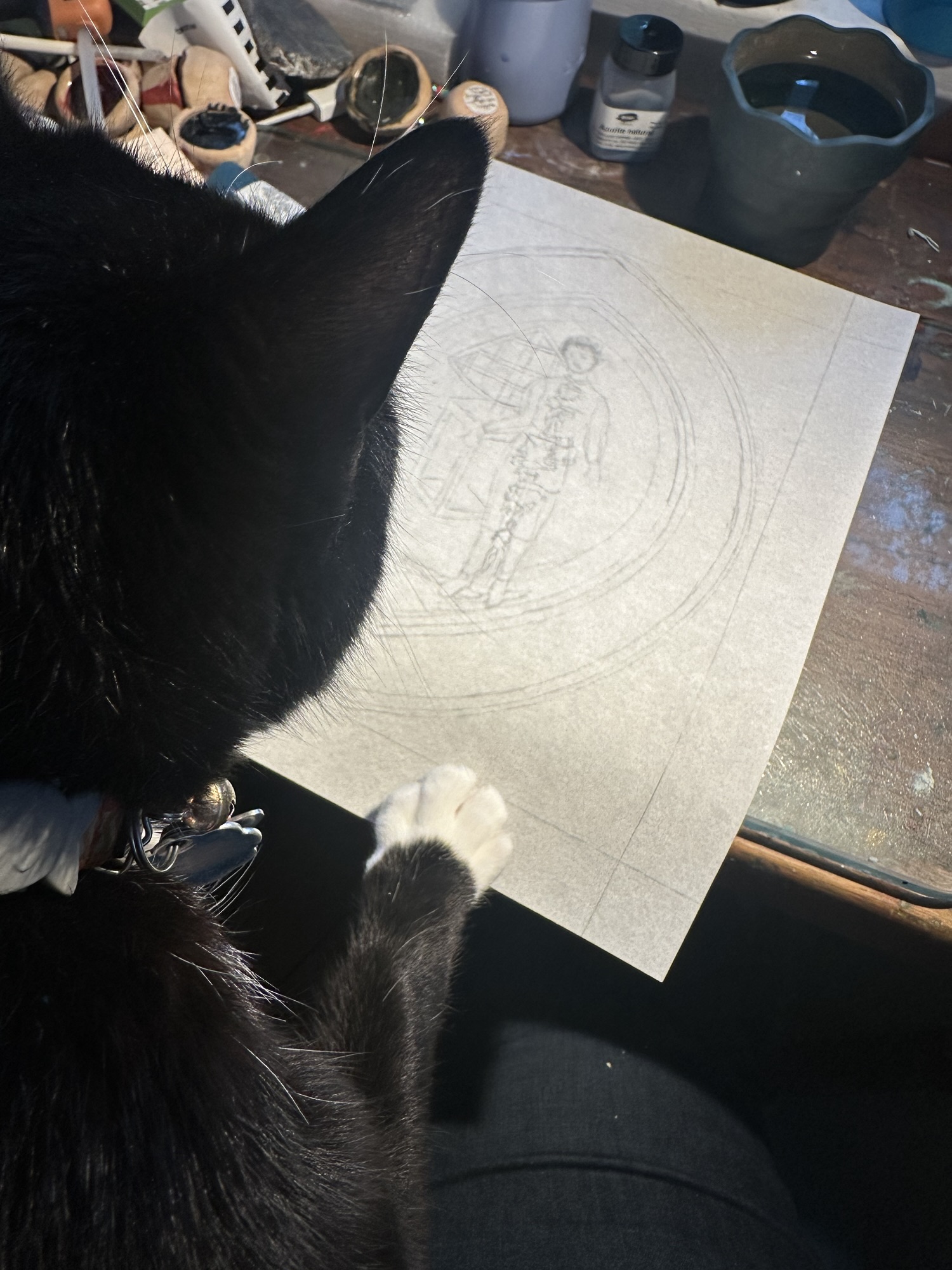
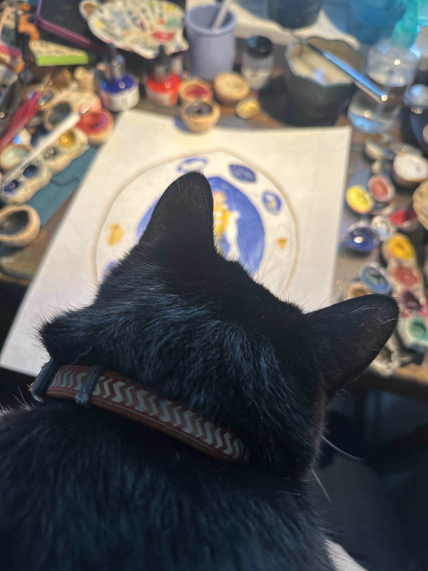
The first day I could actually start the drawing process (July 1st), I pencilled in the basic shape of the mandorla, keeping space for the person in the middle, as well as smaller versions. And then I had a bit of feline help. Orion (my cat) really insisted on helping as much as he could, and who am I to deny my 17 pound bowling ball of cat a tiny bit of joy (but really, he knows he’s not allowed on my desk for many many reasons).
The other part that was tricky was knowing that the extant actually contained measurements for astrological (and at this point in history, astronomical) use. I wanted to include it, but the short working time meant that some of the really precise details, like the measurements might have to be reconsidered.
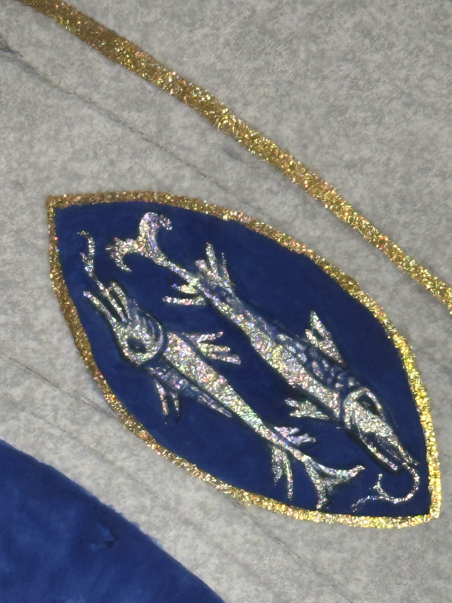
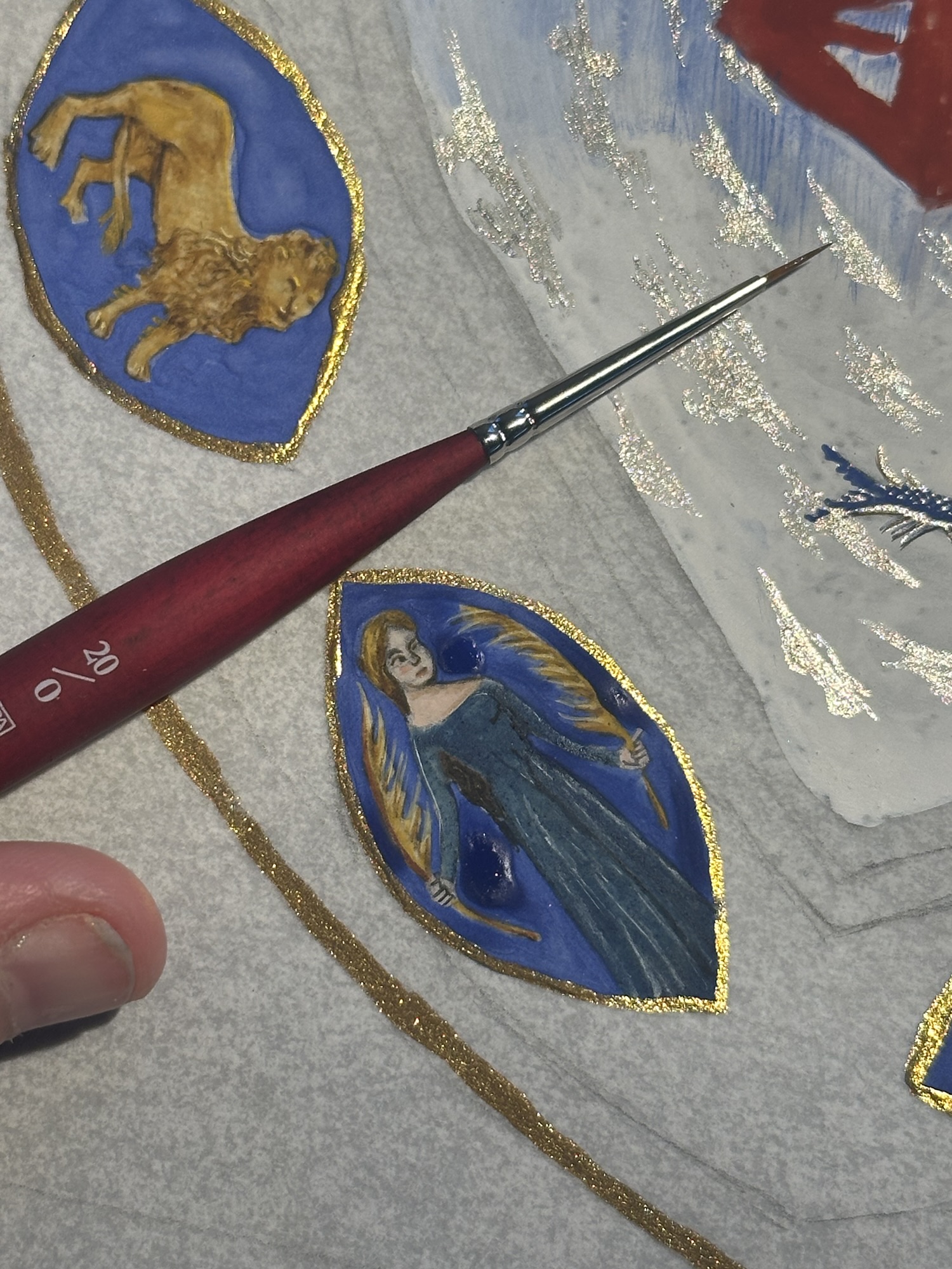
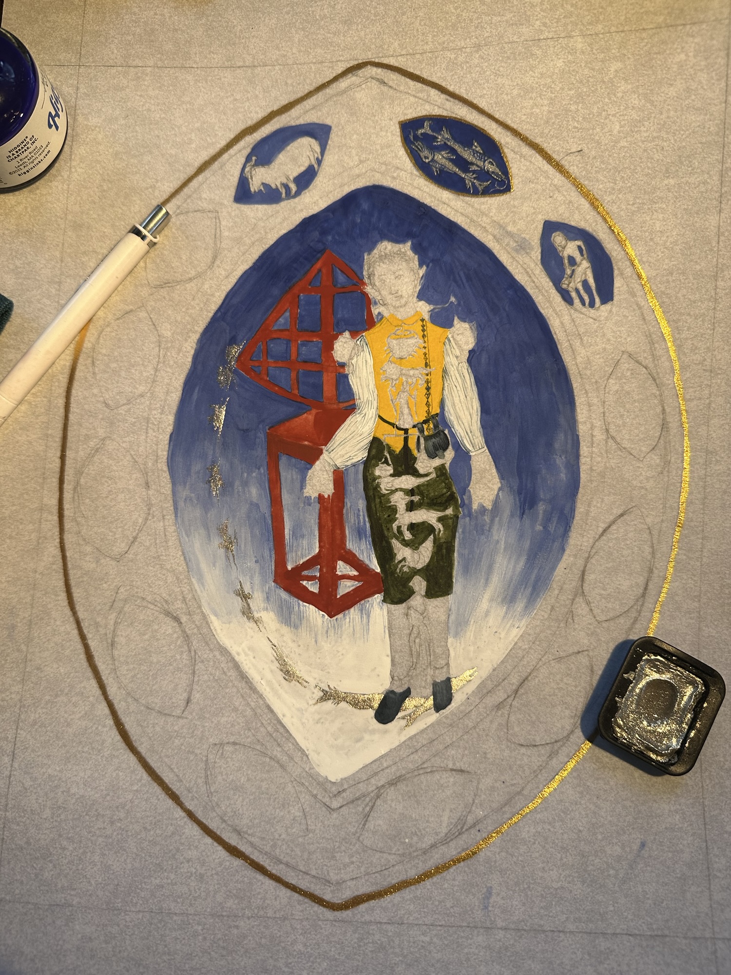
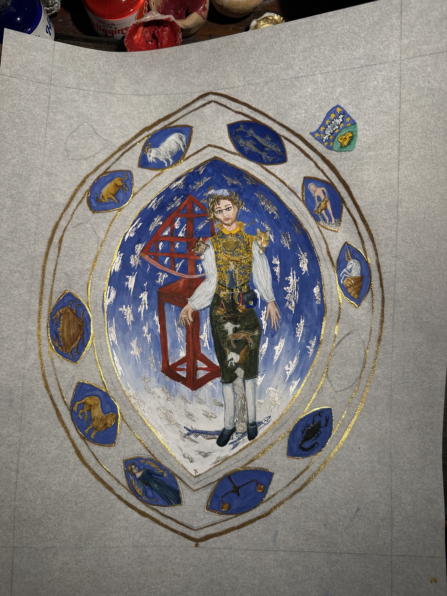
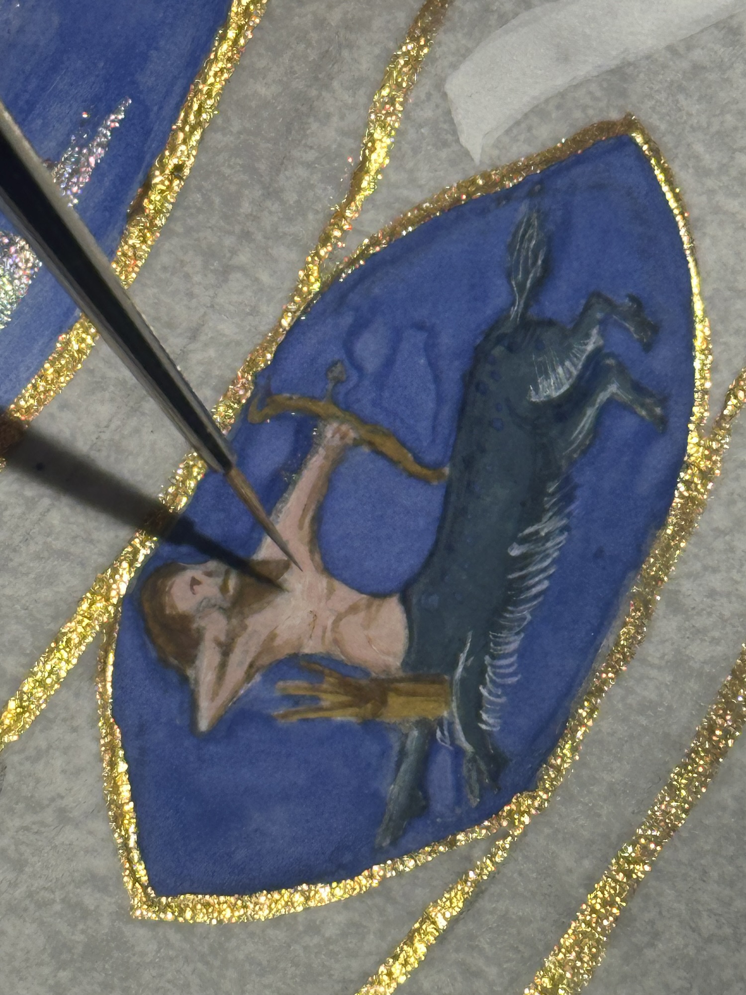
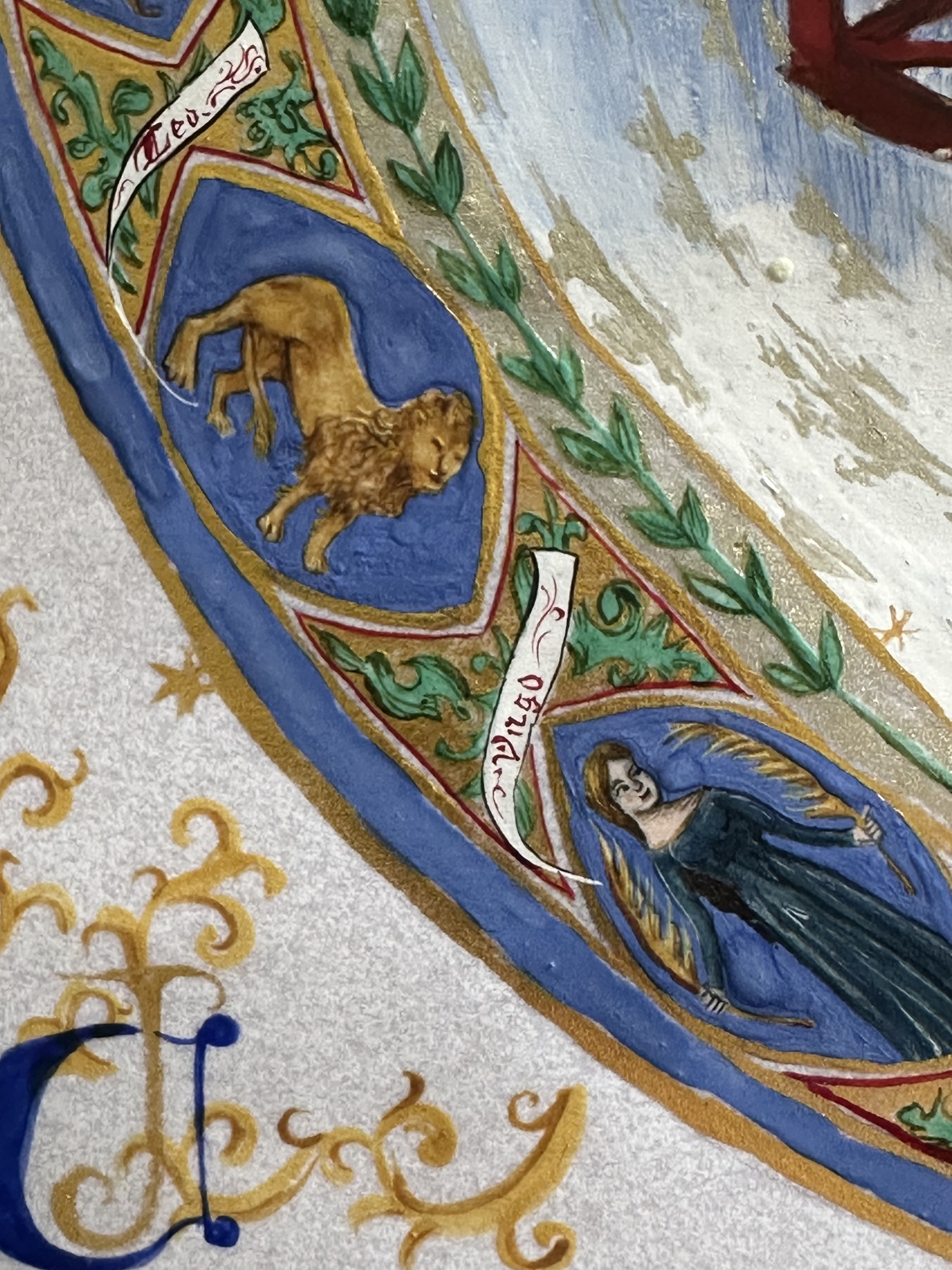
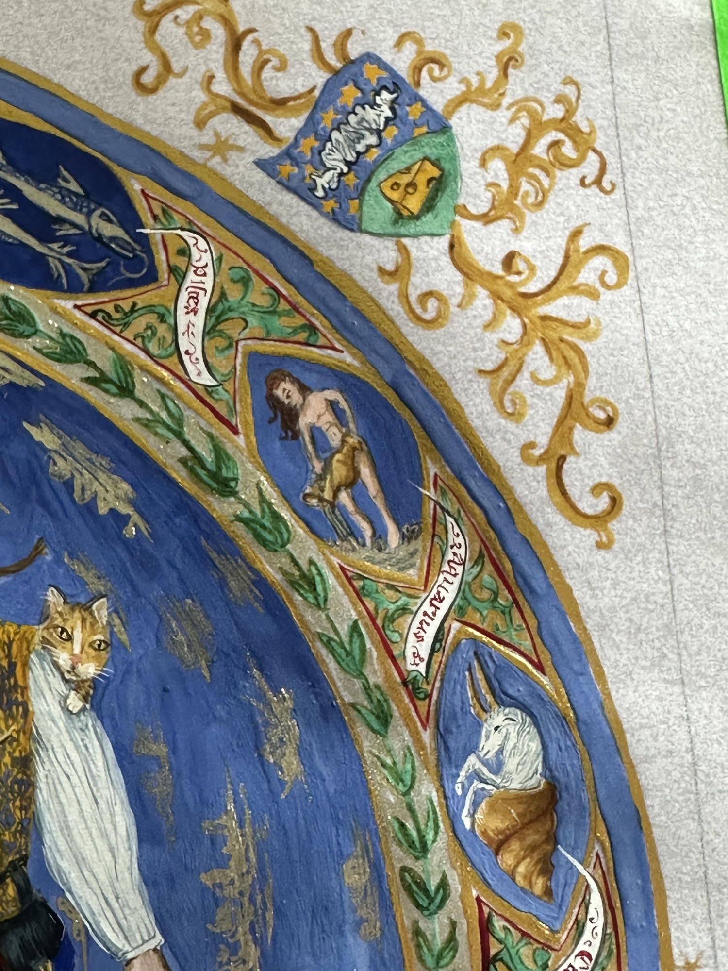
So I pressed on. By the end of the day on July 1, I had completed most of my pencilwork and proceeded with the easier parts of the zodiac (Pisces’ fishies were a pretty good start.) I laid down Finetec’s Real Silver, which contains silver as part of the paint, to really drive home the richness of the extant (also, the extant features the fish and the clouds in the main mandorla in an almost tarnished brown, so the brothers may have actually used silver to create this). For the deep dark blue, I used real lazurite blue (yes, the real deal lapis) that I had made in a gum arabic base in a few layers to get a similar depth of colour. With most ultramarine found in tubes now a synthetic blue (nothing wrong with this!), I wanted to better replicate the look of the finest Fra Angelico blue as best as I could. The lazurite I have is not as deep of a blue, however, with judicious use of layering the paint on, I could get a lovely dark blue.
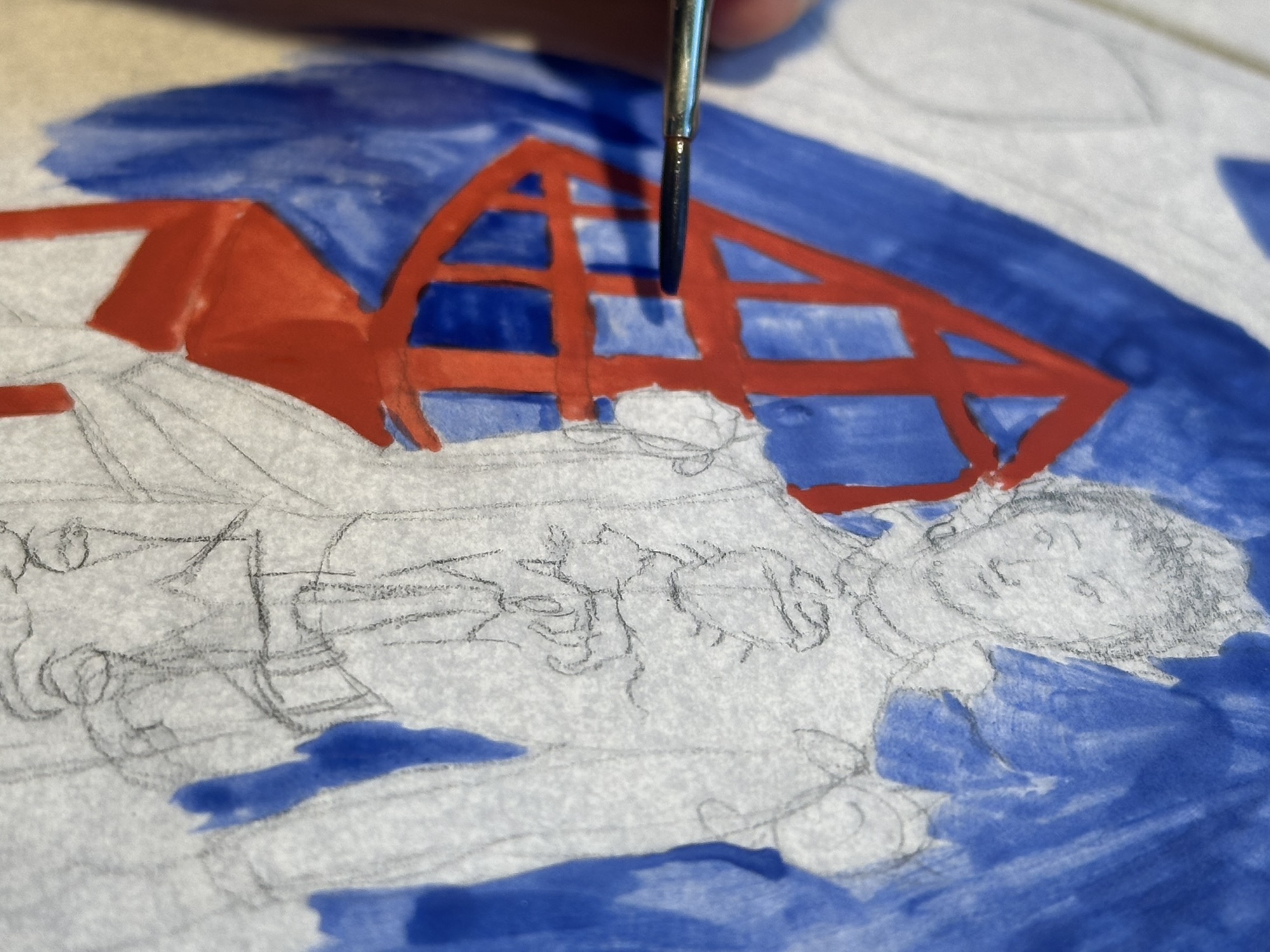
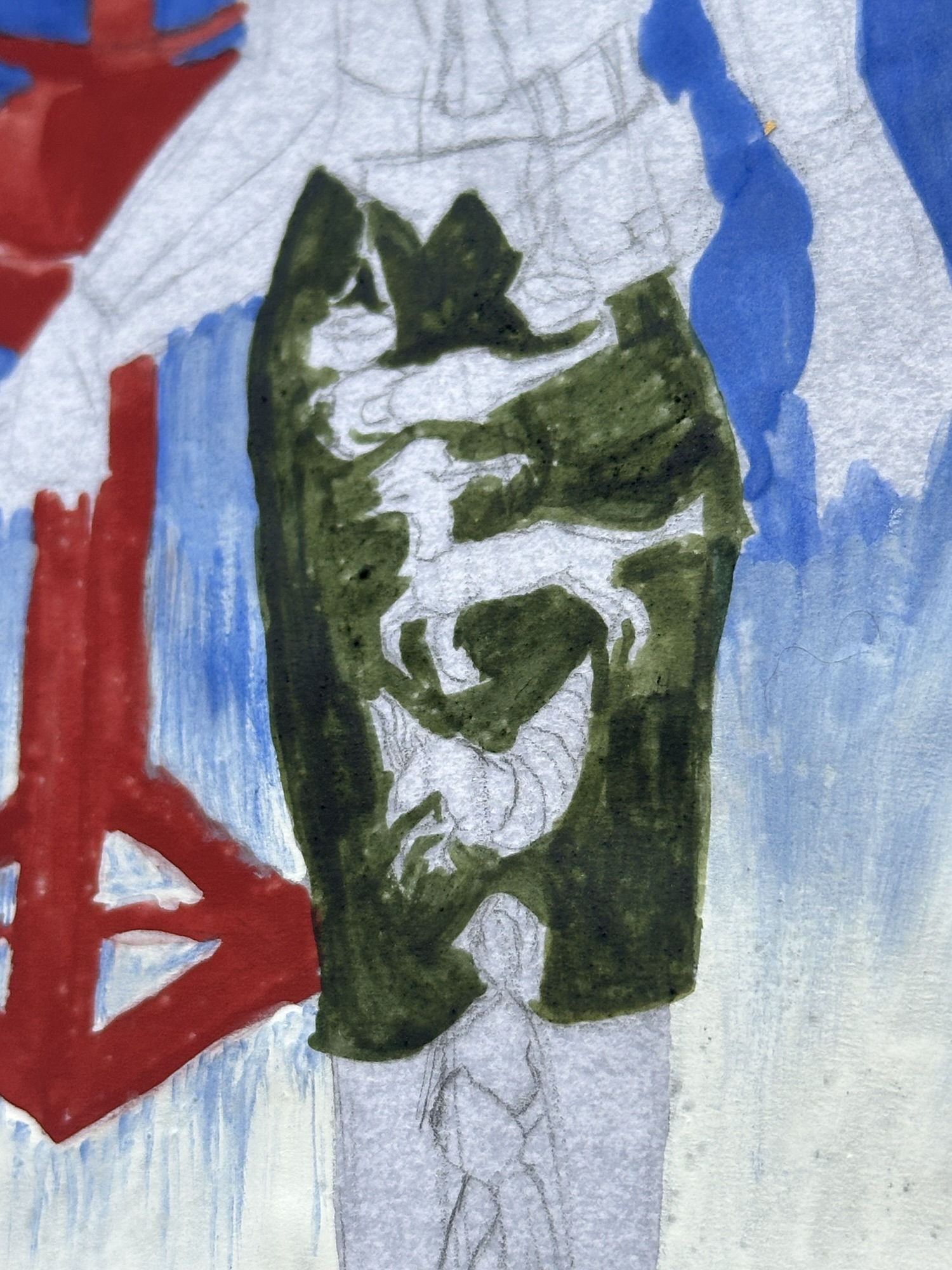
The overall choice in paint, if it weren’t painfully obvious, was to use mostly paint I had made myself. The exceptions were the Finetec Real Silver (I find it a much more superior product than any silver I’ve attempted to make with mica powders) and Finetec’s High Reflection Gold to look like a good shell gold at a fraction of the price. Otherwise, I mostly used my handmade paints, staying close to a typical 15th c atelier palette. The paints I used include the real lapis, titanium white (lead is not allowed because see cat), indigo green, red ochre, Venetian red, malachite, yellow ochre, furnace black, cochineal, indigo, my indigo/cochineal purple blend, Italian gold ochre, burnt sienna, raw umber, vanadium pentoxide (orpiment is also not allowed because see cat), terre verte, burnt umber, and the tiniest bit of synthetic ultramarine. The extant did not use a lot of the more warm reds (which would have been provided by red lead in period), so I was able to mostly ignore these from this, but these were also part of that palette).
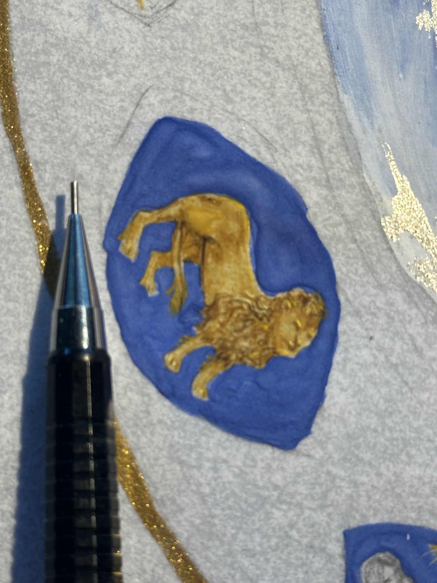
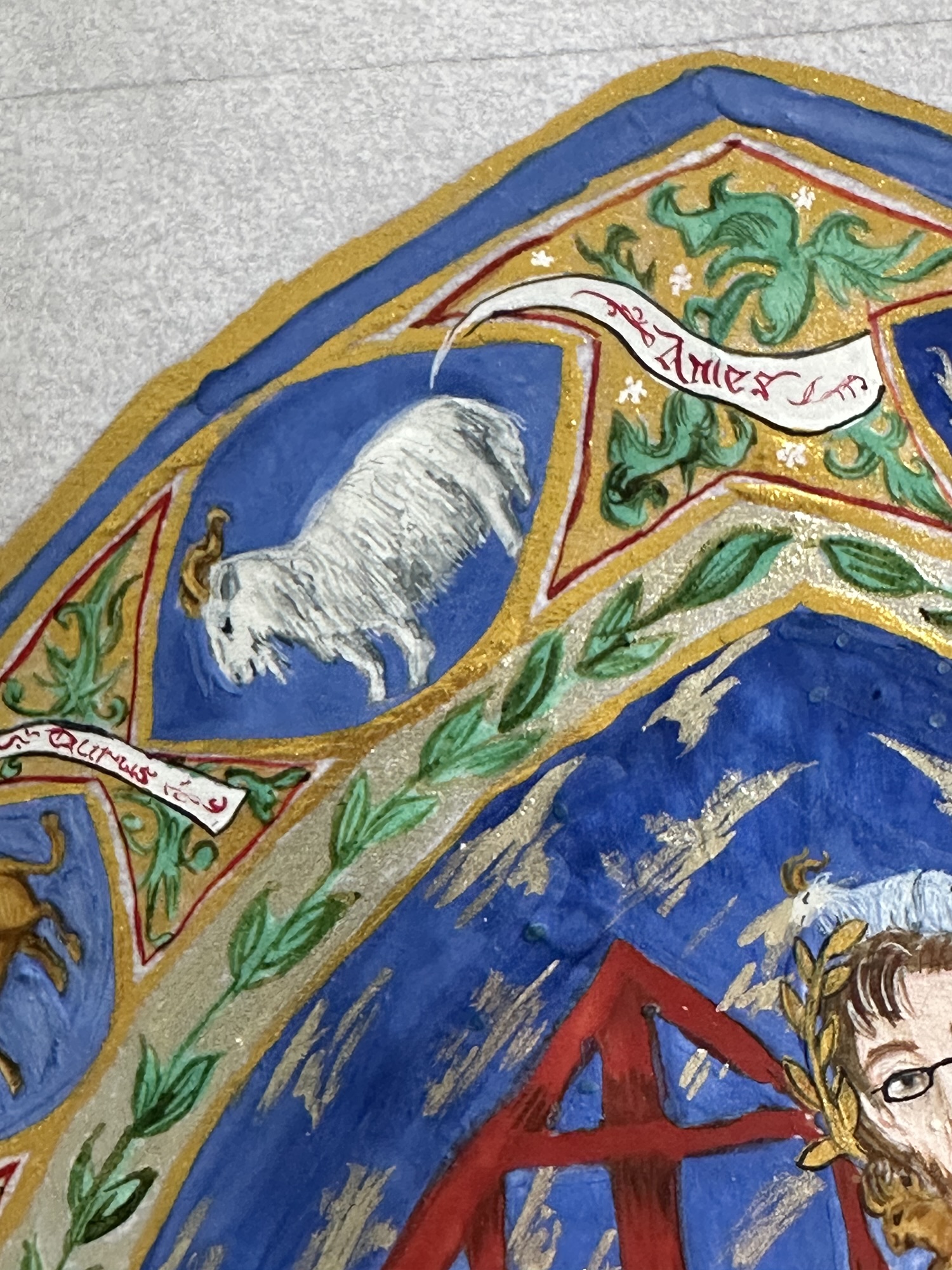
Technique-wise, I worked larger areas of paint with an Escoda 2 synthetic round travel brush, and the smaller, more detailed areas with small strokes from my 20/0 Princeton Velvetouch Monogram Liner. A lot of this particular style of painting uses small, delicate strokes, especially on the skin of the figures, with sinuous, S-curves on hair and fur, and delicate almost cross-hatching in gentle layers of paint. I used a similar painting technique with a fairly thin-textured but also a mostly dry paint on the details to keep the general opacity of the full piece.
And then we lost power due to a driver hitting a power pole near our house on July 2nd (house is fine and the person who hit the pole walked away from the accident). I thankfully had plans to go see 1776, but it was bloody hot, and I knew I wouldn’t be able to really get a lot of painting done with the heat and not having directed light from my lamp (have good lighting, friends. Save your eyes!), so I lost a day.
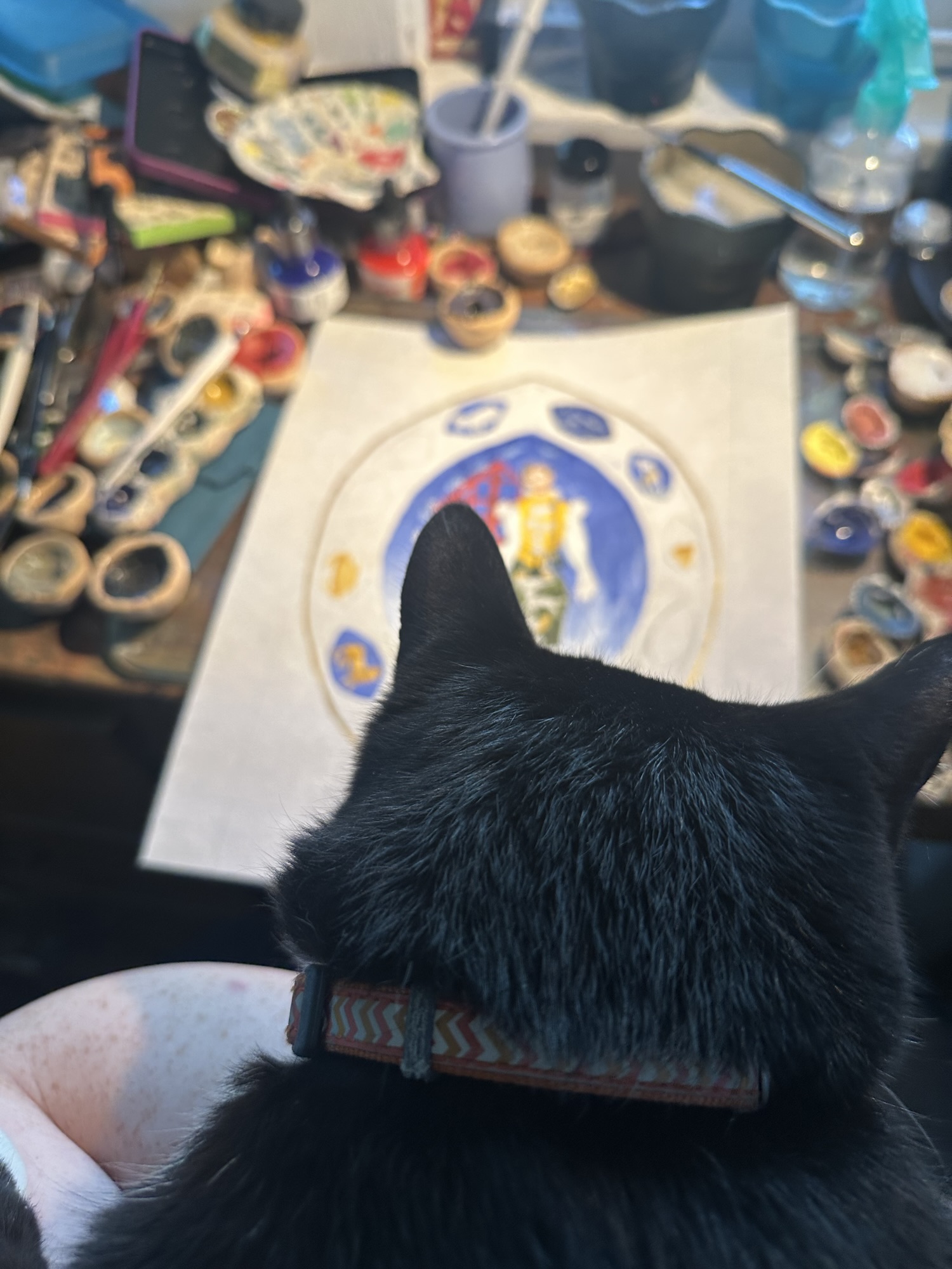
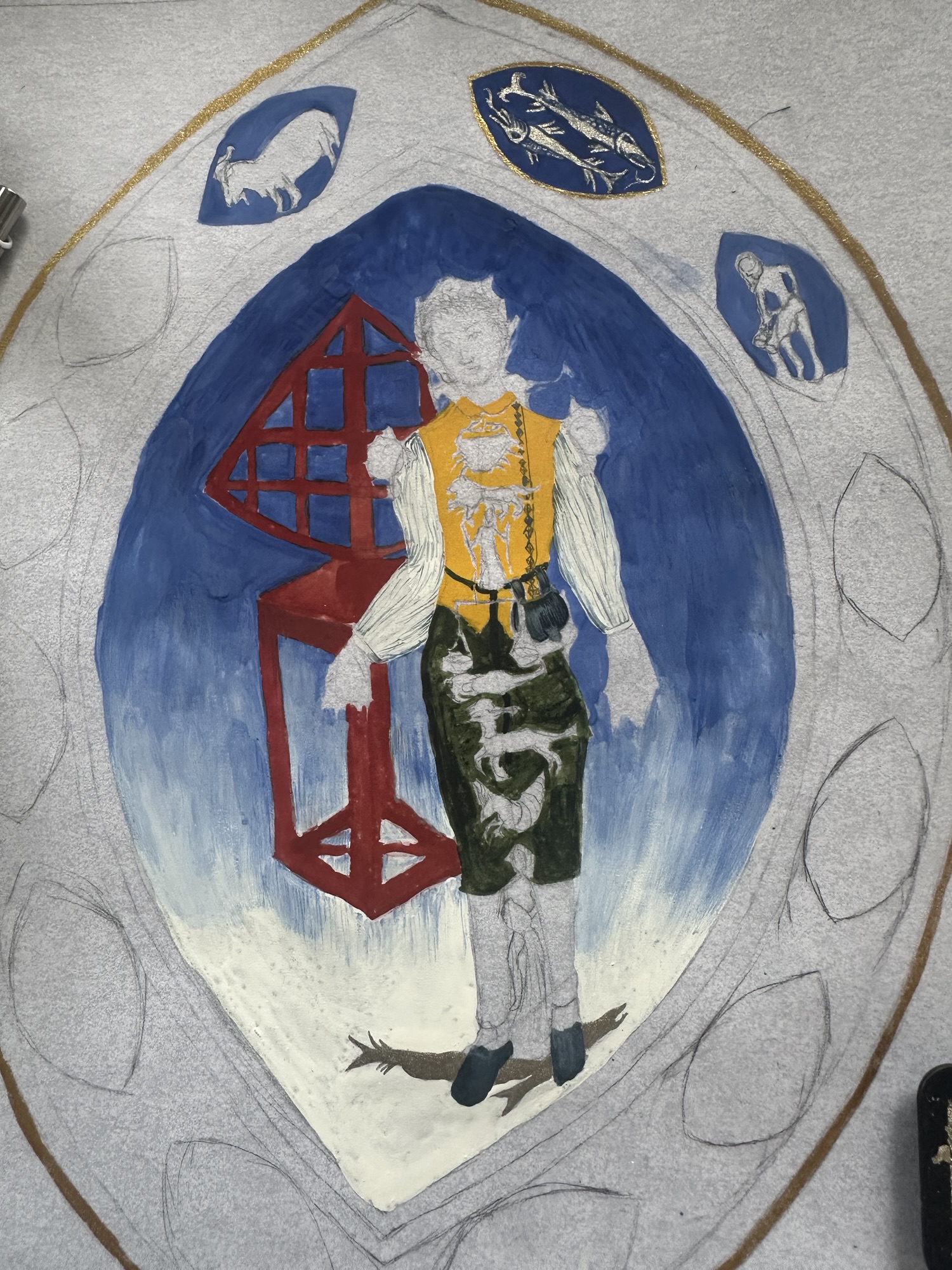
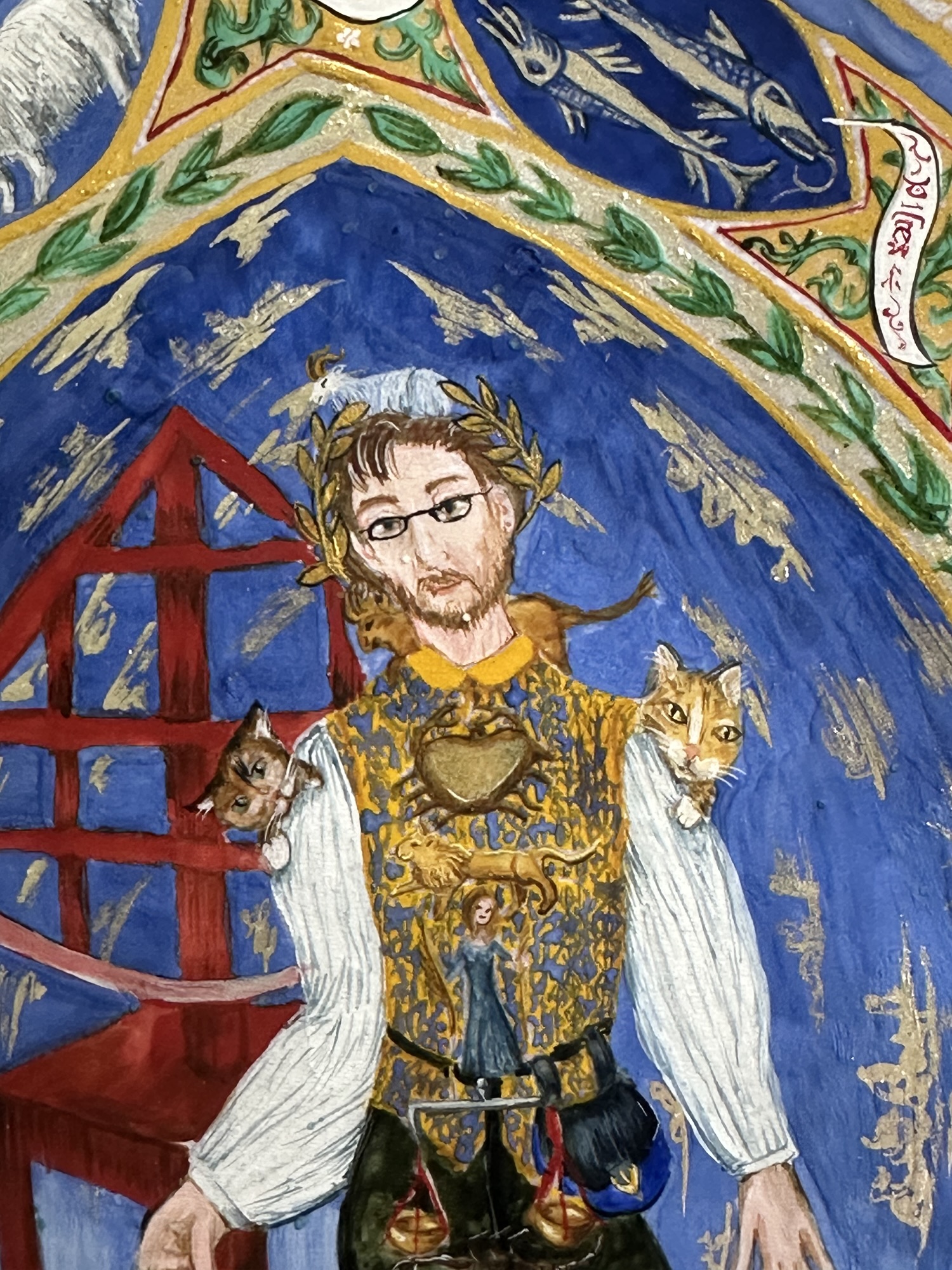
Enter the long weekend. Having July 3rd off helped immensely, so I was able to get a lot of painting done. I was able to go from mostly pencil outlines and a couple fish to having the figure in the middle (who by this point I had decided would be Jon and his quadrant) and a few more of the smaller mandorla shapes penciled in or painted.
Life happened again. Season baseball tickets, and friends coming in to visit meant I lost two more days without much of a chance to paint. But, I was back to work on July 6th, to which more feline supervision had to occur. It was also about this point that the sheer amount of stress came back in a particularly weird way.
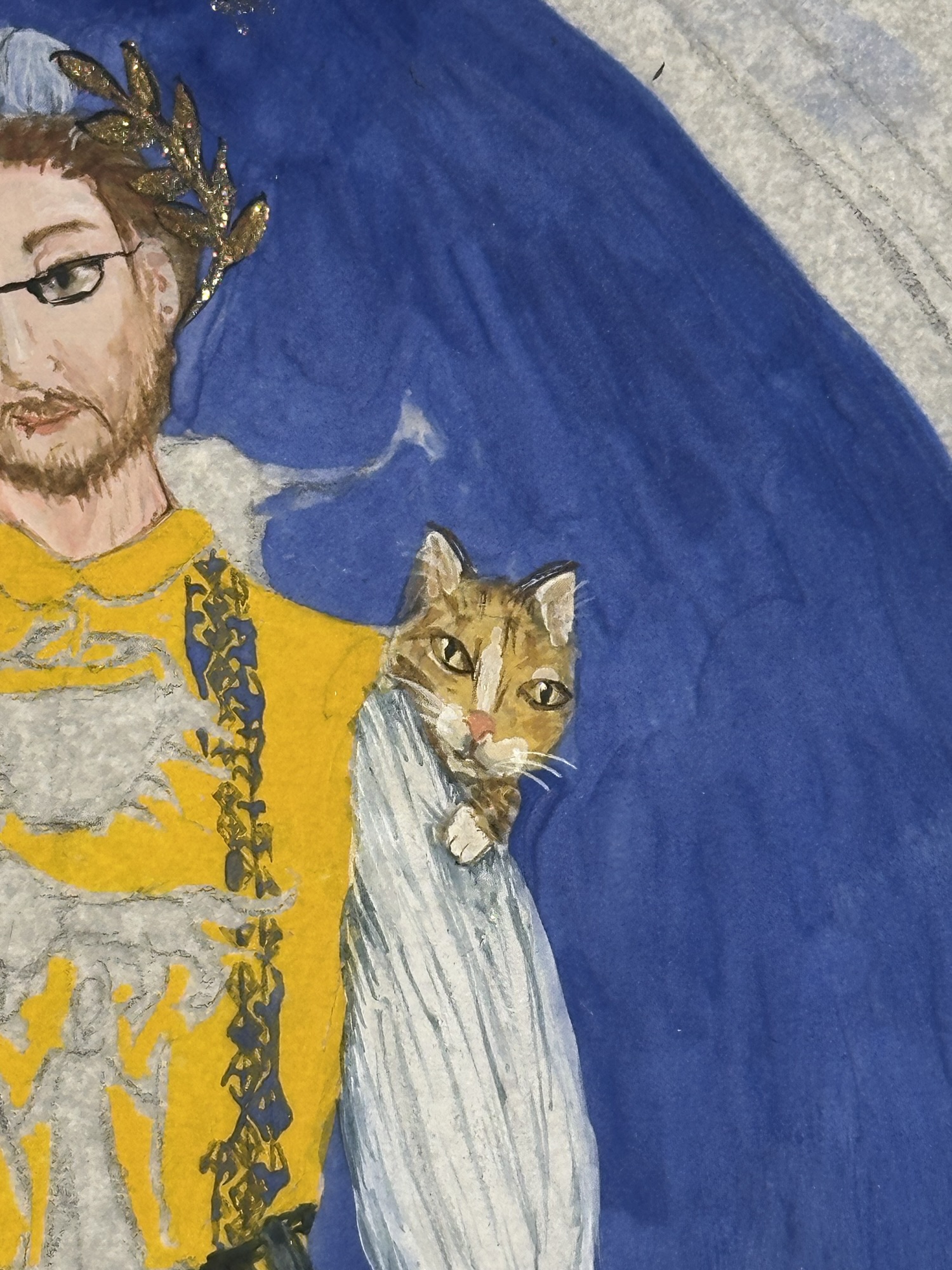
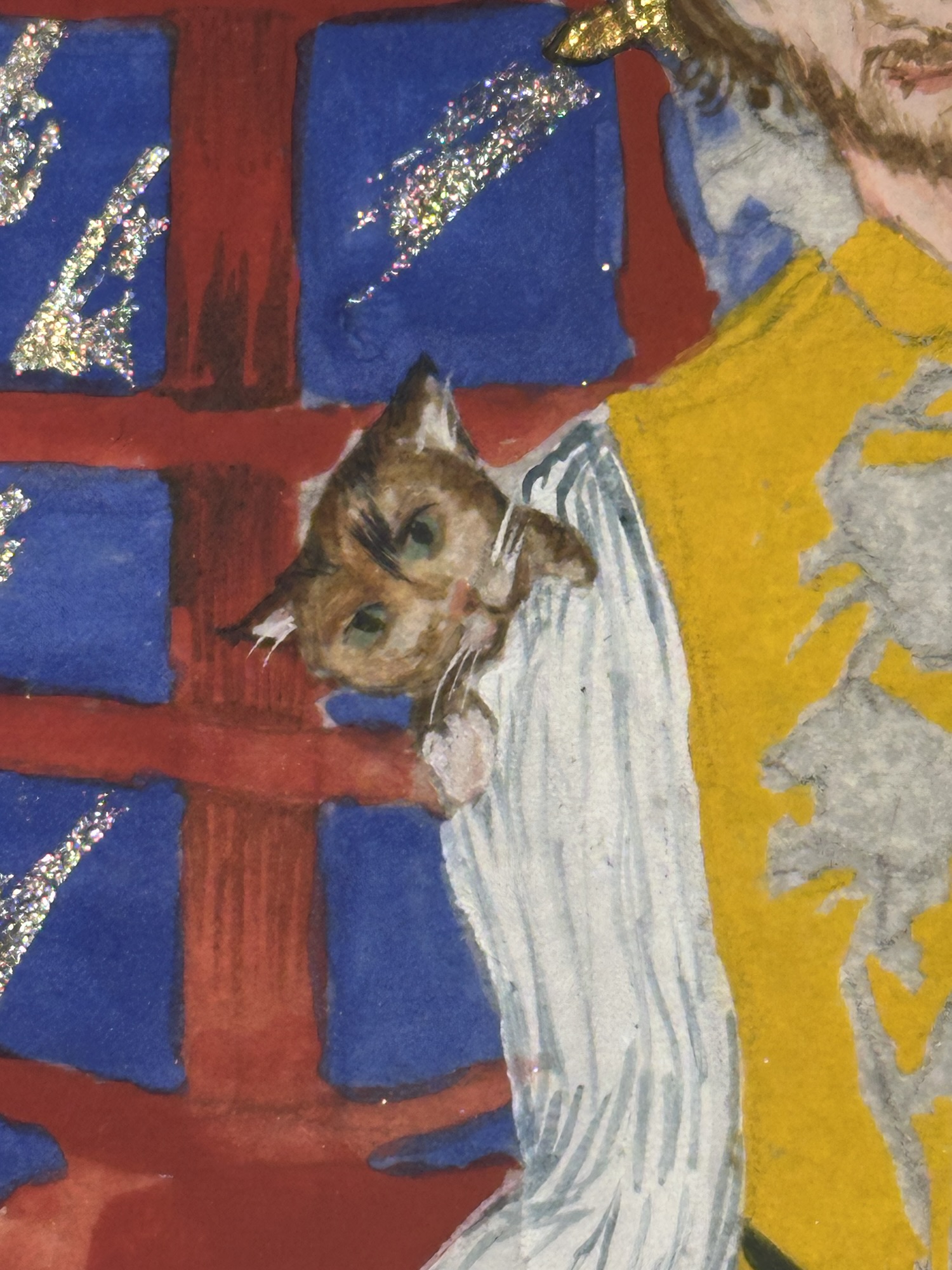
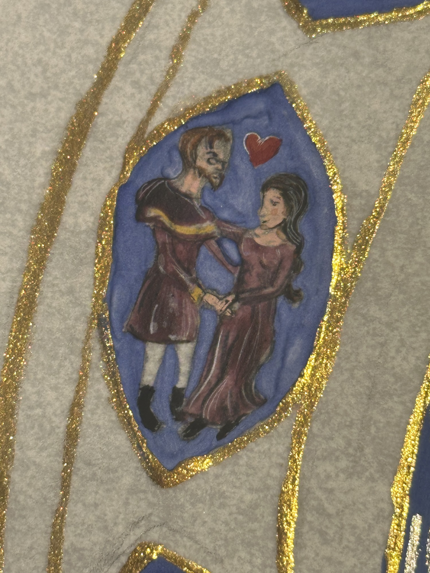
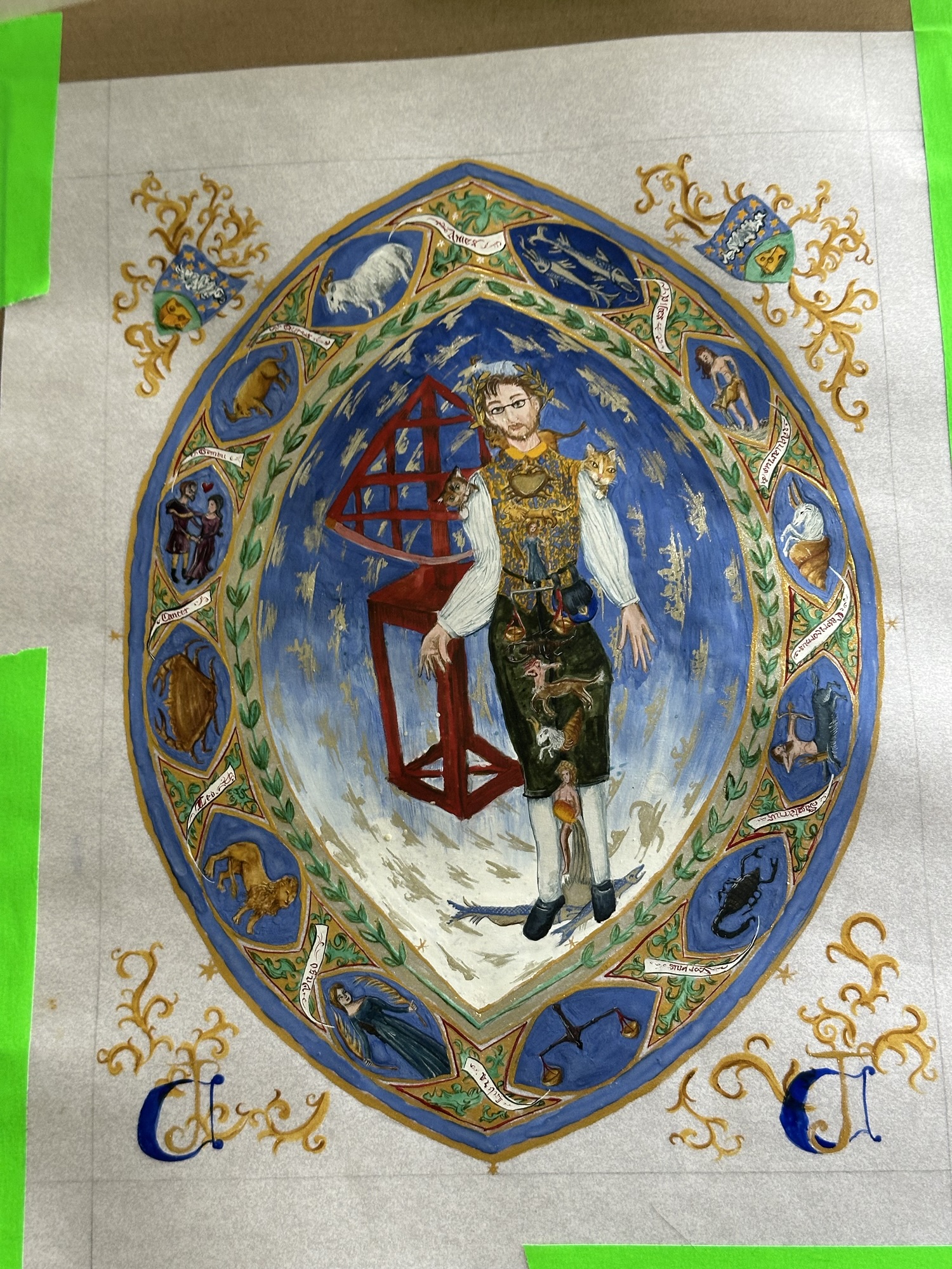
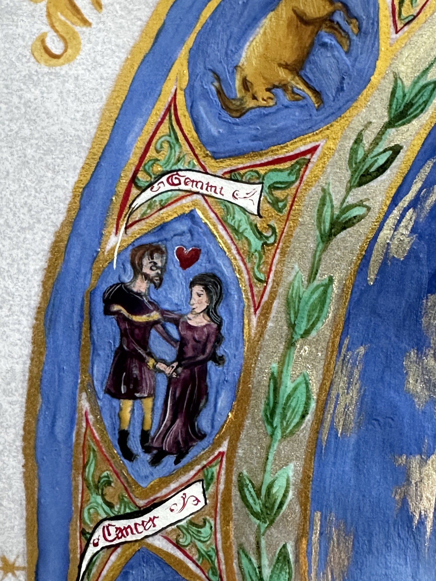
I like being able to customize scrolls to the people I know. If I can put in fun details, I’m going to do it. I had already decided that I would put in Jon’s cats Midna and Ri-ri, and I knew I was also going to use Jon and his spouse as the figures for Gemini in the border (the extant actually features a man and woman for Gemini, which is a little odd given that the mythical duo were twins).
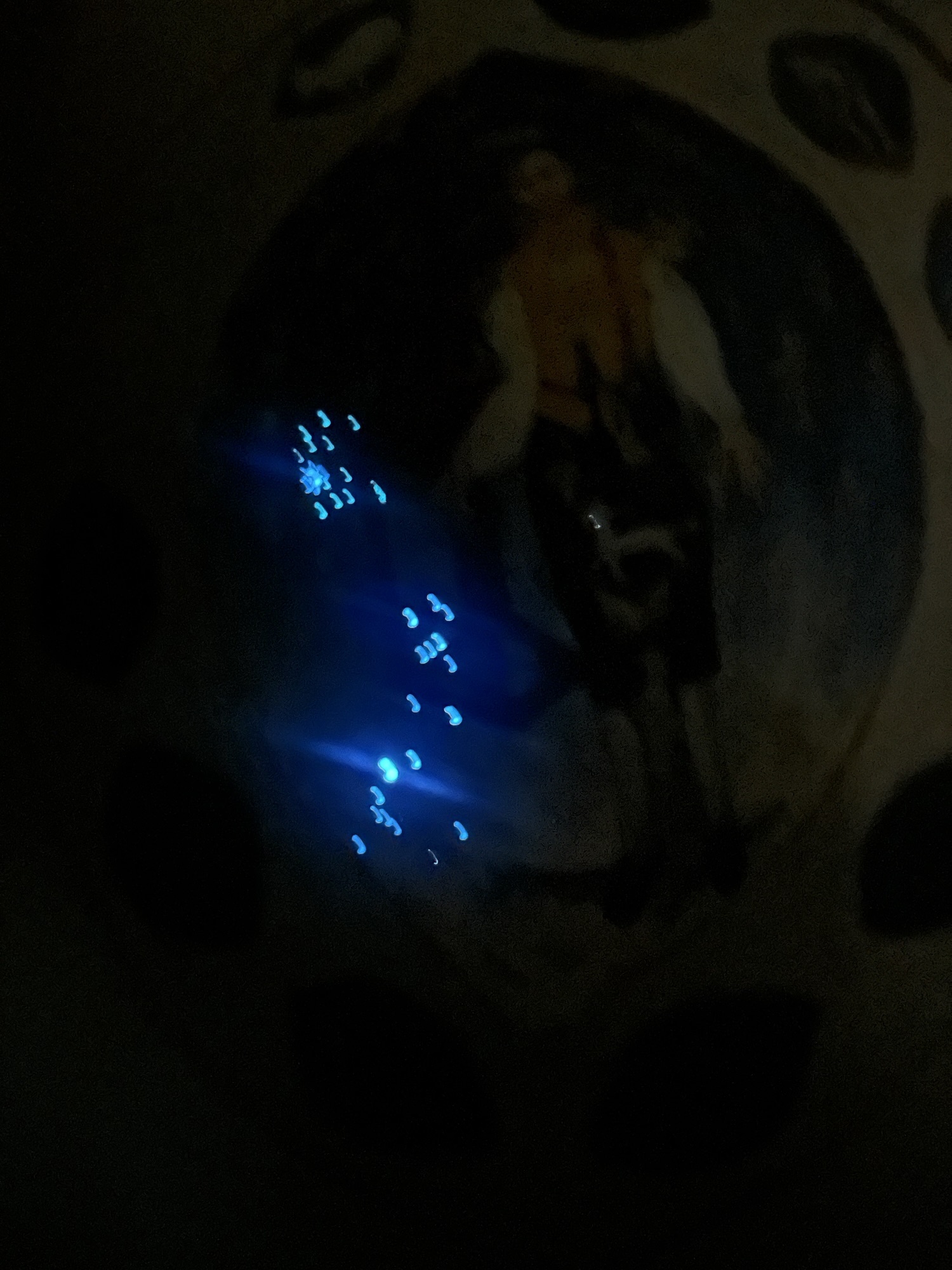
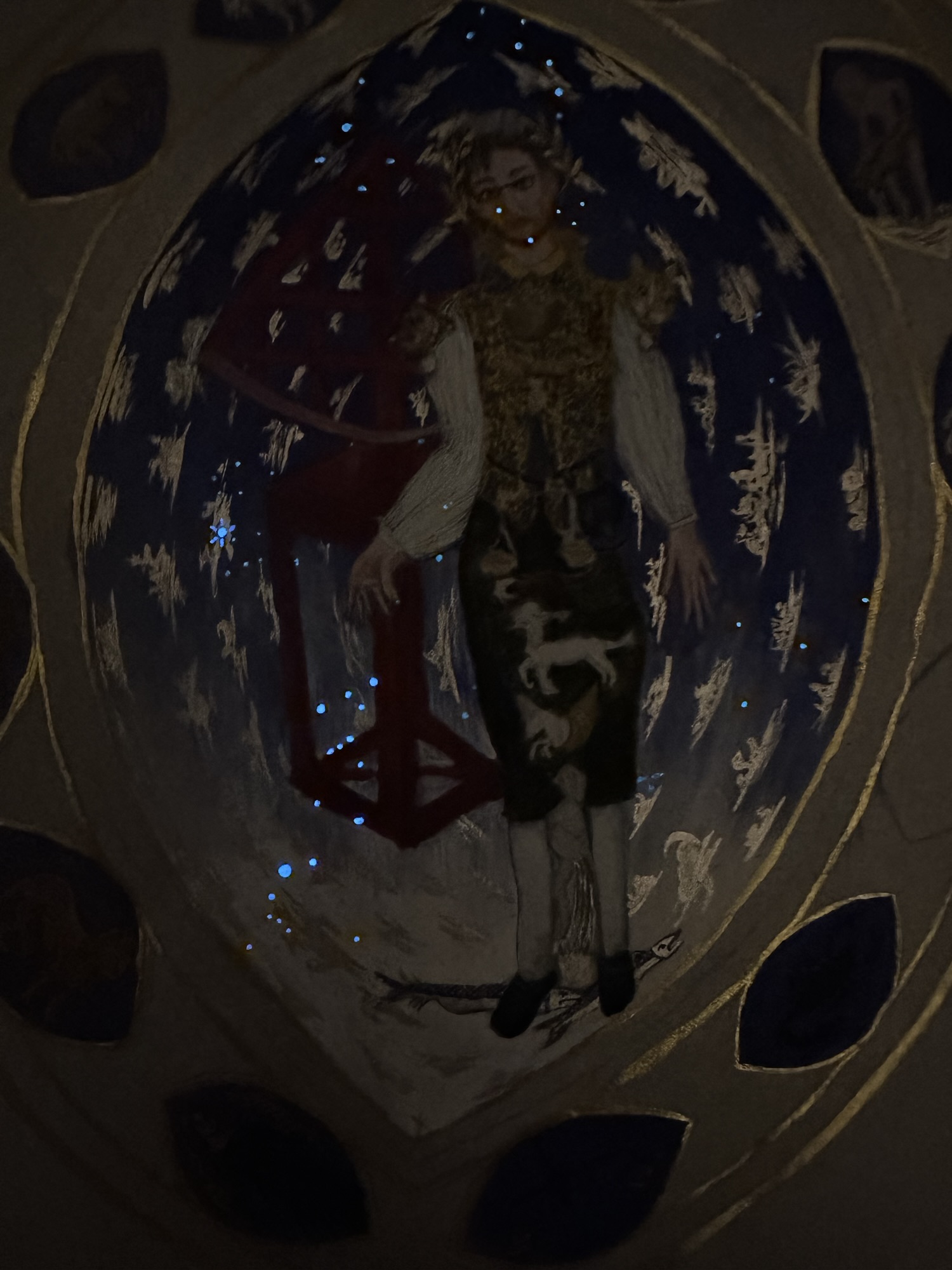
It was about this time where I was talking with my husband and went “you know what would be cool? Hiding a star map for the day and approximate time that Jon gets the accolade. I can even use glow-in-the-dark paint and he wouldn’t be the wiser.” I’ve done similar things for Jon already, as I’ve painted his combat shield in his heraldry and then hid a special date for him in glow-in-the-dark acrylic paint (which he knew about, but it was a great full-circle moment).
Of course, I ran it by Jon’s spouse, who then went “DO IT,” so I went back to my husband, who has a PhD in modern astronomy, and asked him to get me a star map for the Barony of Three Rivers (modern-day St. Louis, Missouri). Sticking point: I needed a time. So, I threw out 10:30 am, simply by estimating past patterns of elevations at SCA coronations, and hoped it would be good enough (more on this later). My loving husband not only got me a star map, but pointed out some of the more important things I’d need to know, like the sun would be up, so I’d have to figure out how to show the sun in my own chart.
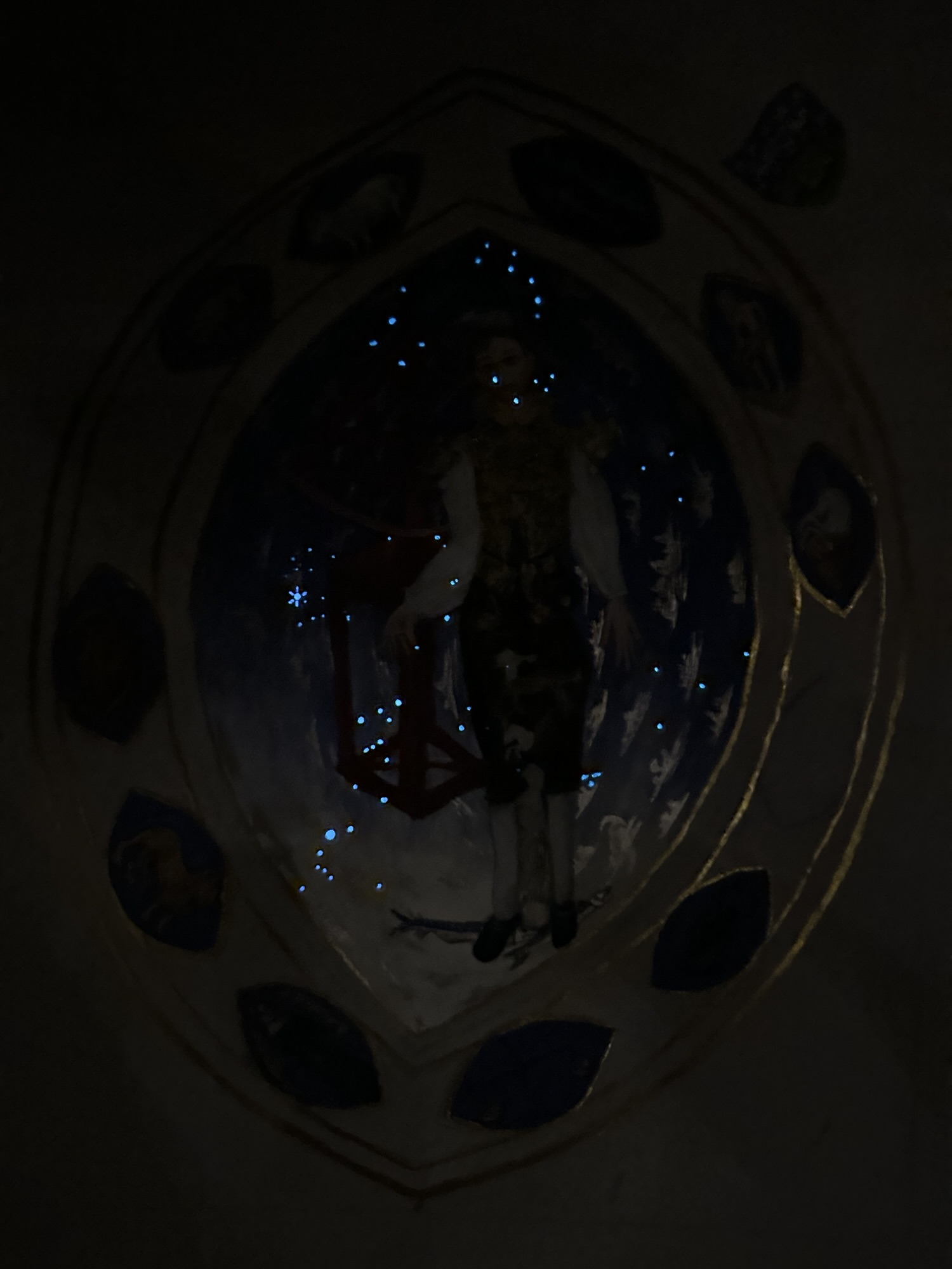
By the time July 7th rolled around, I had a star map, and started carefully plotting the minuscule points of light (having a UV flashlight helped), and while the measurements are no where near as precise as I’d like them to be, for carefully hiding them in the mostly finished middle section was going to be difficult. I wouldn’t be able to show lines like the ecliptic or other reference lines without giving away the secret, either, so I had to rely on removing some of the other non-constellation stars from the map. I also had to make sure that most of the contents of the mandorla (the figure of Jon, the clouds, and most of the zodiac figures on the large middle figure) were complete so the map could be relatively inconspicuous.
The other issue is the mandorla shape, which meant I lost detail of the stars on the other parts of the sky, which meant I was also losing some context. That said, the constellations Orion, the Big and Little Dippers, Gemini, and Cassiopeia all made it on there. The pigments I used to create the glow were Blue LIT and REN powders from Culture Hustle. (Due to Culture Hustle’s continuing issues with fulfillment, I can’t recommend them as a company, but the products are pretty solid.)
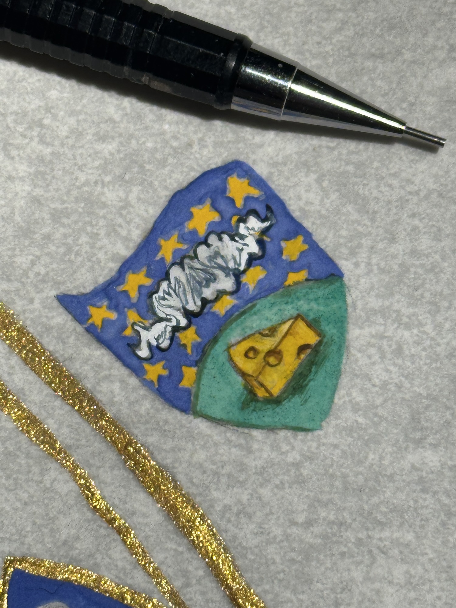
By the time the star map was complete on July 7th, I still had the rest of the border figures to complete. By this point, I could see the event right on the horizon (and we had a lot to do, as we had planned on taking the train to the event). So, I painted as quickly as I could. The next two days were absolutely critical. I spent a lot of time painting Jon’s heraldic device, and in place of the calligraphy I wanted to do (but didn’t have time to do), I made a simple cypher with Jon’s initials.
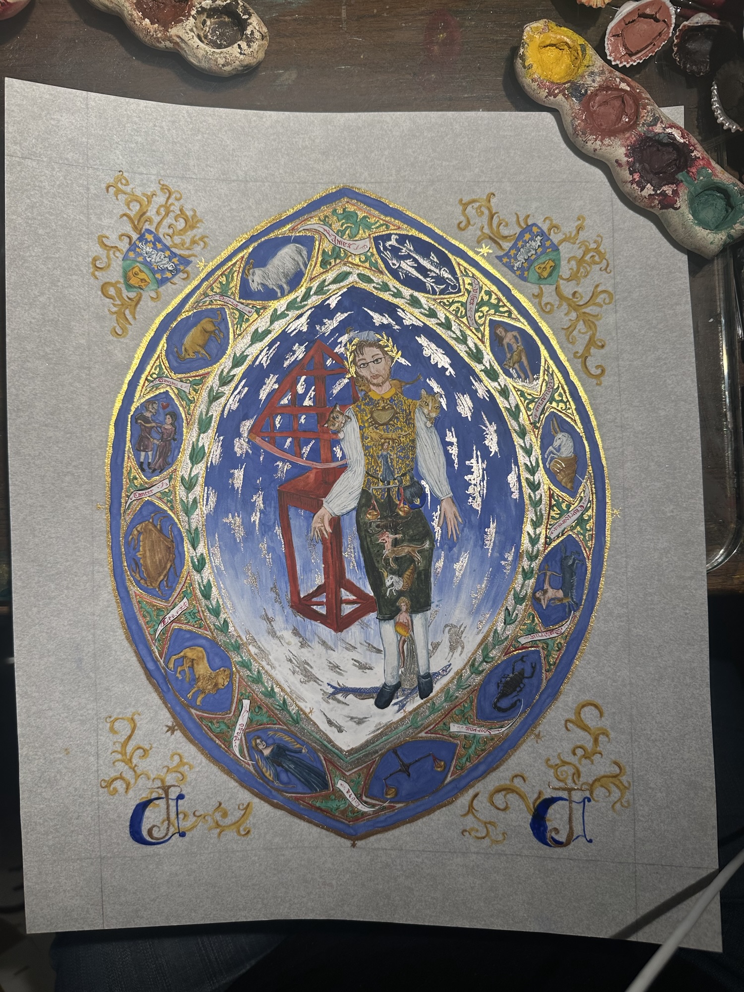
By this point, I knew I wouldn’t have time to put in the measurements on the extant, so I improvised and put a laurel wreath (because Jon was being made a Laurel, so, duh) where the interior measurements went. I also painted more blue where the ourside measurements went. On July 8th and 9th, I spent most of my time doing calligraphy of the names of the zodiac figures around the border with a 20/0 Princeton Velvetouch Monogram Liner because I didn’t and still don’t have a nib small enough to get that detailed on that scale. For such a large scroll for at least my general practice, this particular one is extremely detailed.
July 10th, the day we were supposed to leave on the train, and my husband got a text at 2 am from Amtrak. Our train got cancelled. We decided that instead of dealing with motorcoaches that we would cancel the whole thing and drive, which bought me a tiny bit of time to finish up the last details before packing everything away. This is definitely one of those cases where one cannot keep messing with a project (self-editing is such an important skill, and there are times I still struggle with it). We packed everything up, and the scroll went with me just about everywhere.
Day of, I secreted the scroll away, and got to present it as part of his entourage. When Jon took the oath, I held my breath and looked at the clock in the hall: 10:30 am, the same as the star map my husband got for me. I’m glad my guess paid off that well, and it was cool letting Jon in on that secret at the very end of things.
That said, functionally having a week to complete this was definitely a challenge. I’m still pretty happy with how things turned out, but I definitely learned some stuff.
Lessons learned for this scroll:
- Don’t rush good work. If you have less time than you think, find ways to cut details that don’t take away from the full piece.
- Keeping within a period colour palette does a lot to keep the work looking internally consistent and can help with the overall look of the piece
- Never be afraid to do some risky things. Just work within your comfort level (after all, how hard could it be?).
My dear friend, thank you so much for letting me be part of your day, and for letting me create something that I hope you love.


I’m fascinated by your choice to use vanadium yellow as a substitute for orpiment. Other than toxicity, of course, what led to this choice?
I’m working with real orpiment (Morrow Archival, Etsy) and comparing it to different watercolor and gouache paints across all dimensions – hues, transparency, masstone, etc. Vanadium yellow was not even on my radar.
I’d love to know your decision making for this, so I can think about it, too.
In bed after big, icky back surgery, but wishing you and B. all the best ~
Aidan
LikeLike
I was given the vanadium by a ceramicist friend to see if it would be viable as a pigment (it is). As a clay body stain, it is relatively stable at high temps. Unlike bismuth vanadate, vanadium pentoxide reads as a fairly true golden yellow (the bismuth tends towards a greener cast, which means it doesn’t quite capture the warmth of true orpiment). Cadmium, while a lovely yellow, tends green, as well, and even the more orange varieties when blended do not hit the same chroma, etc. as real orpiment. Vanadium, though, is delightfully opaque, a lovely warm golden yellow, and up until a few years ago, relatively easy to procure from clay suppliers. (it’s gotten harder to get, however, I’ve got a couple of links to possible sources.)
Part of the reason I chose the vanadium was I already had it made, but also because the toxicity level is less of an issue (when used carefully) in comparison to the more toxic options out there.
I’ve made a conscious decision to not use overly toxic materials (lead, orpiment, realgar, etc.) in my studio as my cat spends time in there. Vanadium pentoxide is toxic, especially if eaten, however, it does not offgas (like lead), and if care is taken with PPE, it’s relatively okay for paint.
LikeLike
interesting! What are the sources. If you don’t mind sharing, that is. Obviously, I’m not looking for a lot – my other pigments are generally 10 g or less, unless it’s something I’m going to use a lot (rose madder, lapis, etc. ).
I also have cattage, so my studio has, at last, become a room with a door, at least for storage (right now). The work table/my lap are still dog and cat accessible, so finding these equivalents is important.
I appreciate the work you’ve done along the same lines.
LikeLike
Unfortunately, the smallest size I’ve found is from US Pigments in a 1 lb bag. Bracker’s had it for a while, but vanadium pentoxide is being phased out from most of the sources I can find.
LikeLike