The last few weeks post-Birka (which, yes, has been a blur) have been spent going through everything. It was a great trip! I got to see people I haven’t seen in years, made some new friends, and got to take home some excellent swag.


But that’s not what this post is about.
The last few months, I’ve been on a rabbit hole on compound colours, that is, colours comprised of multiple pigment sources. Theophilus talks about a few instances, whereas Cennini talks about making greens from two or more sources. The others involve several ways to make green (all of them toxic in some way) and one way to make a fake ultramarine blue.
Cennini only talks about mixing colours up, but not in the particulars, whether that be from compounding two pigments together, or from mixing two standalone paints together, though we have some hints that some colours may have been made from pigments into paint. The first one is in the making of a better ultramarine by adding kermes and brazilwood laked pigments, both red colours, to make a low quality ultramarine a stronger blue colour. Here’s where Cennini states:
And know that if that lapis lazuli stone was not so very good, or if you worked the stone up so much that the blue did not come out violet, I will teach you how to give it a little color. Take a bit of pounded kermes and a little brazil; cook them together; but either grate the brazil or scrape it with glass; and then cook them together with lye and a little rock alum; and when they boil you will see that it is a perfect crimson color. Before you take the blue out of the porringer, but after it is quite dry of the lye, put a little of this kermes and brazil on it; and stir it all up well with your finger; and let it stand until it dries, without sun, fire, or wind. When you find that it is dry, put it in leather, or in a purse, and leave it alone, for it is good and perfect. And keep it to yourself, for it is an unusual ability to know how to make it properly. And know that making it is an occupation for pretty girls rather than for men; for they are always at home, and reliable, and they have more dainty hands. Just beware of old women.
On The Character of Ultramarine Blue, and How to make it. Chapter LXII. Il Libro dell’Arte, Cennino Cennini
While this particular method was to give a little extra colour to low-quality lapis, I have chosen, then to start with compounding pigments together into making paints. This helps keep the colours consistent, and it appears to be one of three ways that our medieval counterparts painted. In “Pigments in Ancient Manuscripts and Paintings Brought to Life by Raman Spectroscopy- A Short Review,” it is discussed by researchers that “Some other differences in the pigment palette were a) the use of indigo and yellow ochre mixture to achieve green colour in the old-Slavonic codices, whereas the same hue was obtained in Western Europe manuscripts by mixing indigo and orpiment; b) yellow ochre was applied as the underlayer to the green pigment in the old-Slavonic folios, but in the Western Europe ones lead white or lead tin yellow was employed for the same.”
It is not clear whether the combination of colours was made by mixing paint colours, or by mixing pigments on the slab. Underpainting is heavily documented in period processes (Theophilus speaks of it in On Divers Arts, especially when painting dying and dead people using terre verte as an underlayer to ochres and other redder pigment paints), but it isn’t clear in Raman spectroscopy on if particular colours were compounded on the slab or on the palette. That said, in my experience, I find that I have a lot more control and a lot more consistency of colours mixed on the slab from pigments, rather than on the palette.
Therefore, I’ve been making a lot of purples and greens mixed on the slab (oranges typically were made from minium [red lead] and massicot [also made from lead] or realgar [arsenic sulfide], which I tend to avoid due to toxicity. There are other methods to get orangey reds by using cadmiums, which are still toxic but less so than lead and arsenic). Tyrian purple is beautiful, but time-consuming and as a result is extremely expensive (and therefore out of my budget at $150 USD for 10 grams). What’s an artist to do but to try to find the best way to get a purple, especially when purple is one of the kingdom colours?
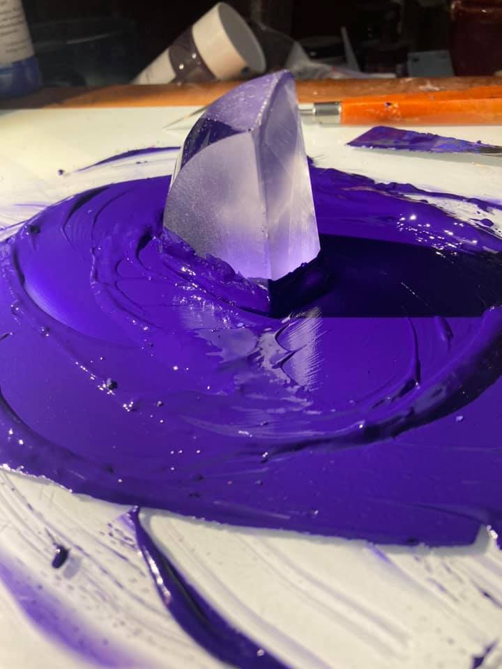
My first purple ever was a combination of manganese violet and ultramarine. It was pretty, but I found it lacked the depth of colour that medieval paintings tended to have, which led me down the path of looking at other ways to get it. The combination is a gorgeous velvety medium purple, but the thing with manganese violet is that it’s extremely modern, and when next to more period pigments, at least to my eyes, I find it a little jarring. (additionally, Han Purple was not in use in Europe, so while it is on my list of pigments to work with, it is not a purple I feel is appropriate to use for European-based art.)
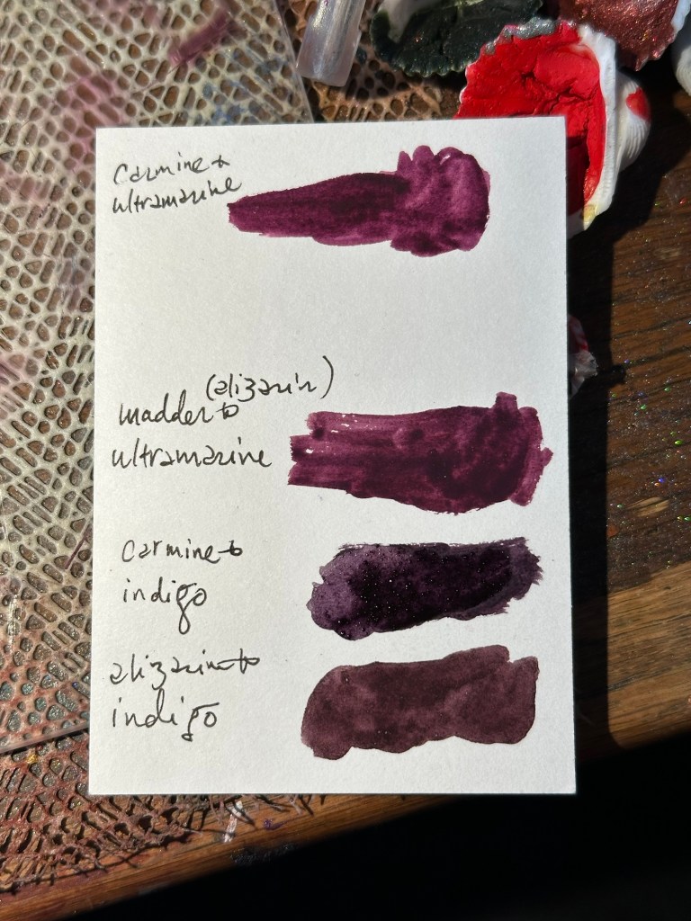
So, that’s when I started going back to other possible purples. The second purple I made after this used ultramarine and alizarin crimson. Alizarin crimson is the synthesized version of madder, and what makes madder red. It is a bright, cool red, and when mixed with ultramarine (a bright, cool blue) it creates a dark but vibrant purple. Madder was certainly available as a dyestuff in period, and at least in Theophilus’ time was being laked for use as a pigment as well, though Cennini does not mention it at all.
The next purple I tried to make was by using alizarin and indigo. Again, both were dyestuffs available as laked pigments in period. Cennini even speaks about using indigo mixed with lead white for painting on panel and with lime white for painting on fresco to create a less expensive blue to mimic azurite (Cennini, Il Libro Dell’Arte, page 36, Dover 1960). Mixed on the slab with alizarin, indigo’s slightly warmer blue creates a slightly muddy purple due to the colour theory of the warmer blue with the cooler red. For creating fabrics in paintings, though, this particular purple is quite lovely.
These two purples were my go-to for a couple of years. And then I got carmine, which is made from kermes lice (the word carmine comes from a Latinization of the Arabic word for crimson, which is kermes). Because I’m me, I refer to this colour often as “bug butt red,” because kermesic acid is extracted similarly to carminic acid from cochineal: pouring hot water on the dried insect (which was crushed into a powder) and laked with a metallic salt such as alum, then filtered and dried. Again, I mixed this up on the slab with both ultramarine and with indigo, and both with surprising results.
Carmine and ultramarine gave me a similar output to alizarin and ultramarine, though perhaps a little redder. This could have been due to my own eyeballing of pigments (which I tend to do anyway), or the strength of the carmine in general. It is still a lovely purple, and I plan on using it often.
The most surprising combination, though, was the carmine and the indigo. Unlike the alizarin and indigo, the carmine and indigo produced a dark, cool purple, which worked well to create shadows, but it’s also a lovely enough purple to stand on its own.
Lastly, I came across a thing about hematite red, where Cennini describes it as “This color is good on the wall, for working in fresco; and makes a color for you like a cardinal’s, or a purple or lac color. It is not good to try to use it for other things, or with temperas.” Cennini also describes the actual stone as “is the color of purple or turnsole, and has a structure like vermilion,” which, well, sure, hematite can look pretty dark and metallic, but I’m not sure I’d call it “purple.”
So, I went, wait, hang on, how is this bright orange pigment *purple*?
It’s not. It’s a very red orange colour, especially crushed into bits because hematite is ferric oxide. Y’know. Iron. Rust. Yeah, that. There are variants, such as modern day caput mortuum, which tend toward the purple, but it’s still a pretty warm purple by itself.
So, hoping for a little extra clarity, I went into On Divers Arts. There’s a colour mentioned as “violaticum” which also, isn’t really clear what comprises this colour. The two purples that Theophilus does mention besides violaticum are folium, which is turnsole, and menesc, which is probably madder, but the note I have isn’t clear.
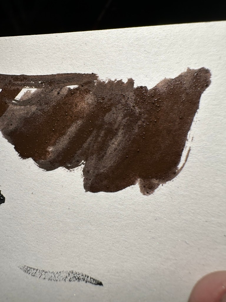
I got chocolate brown, which, okay, cool. I can use it, but also, I’m still not sure I could really call this purple.
But here’s the thing: indigo is a fairly lightweight pigment, whereas the hematite is *not*. I ended up creating what’s called a granulating paint. So, like the alizarin and the ultramarine paints, which the individual pigments end up having different weights due to the relative material components of the pigments, the painter gets interesting textures depending on the relative weight of the pigments. (Seriously, this is a thing in watercolour painting – some people actively seek out granulating watercolours to bring in unusual textures to their painting. Gouache typically doesn’t entirely granulate unless you’ve watered it down enough but it can still happen.)
What I did, based on colours that were known, was adding some indigo (which, BTW, is a giant hot mess because you’re adding a relatively cool toned blue to a warm toned red, meaning you’re going to get a pretty muddy brown) to try and make it look more purple, because indigo was something Cennini mentions with combinations of other colours, especially for greens.
Point is, once the paint got in use, I could kind of see how it could maybe look purple if you squint at it right.
Anyway, so, I still got a chocolate brown. I’m not mad at it, and while I still don’t entirely think this works for what I think is a purple based on modern colour theory (look, it’s brown with a lot of blue, but it’s still *brown*), it will be a good way to add shadows to purple objects in painting.
To sum up: we aren’t really sure if period artists were mixing on the slab or from individual paints – we know that mixtures did exist per Raman spectroscopy, but we don’t know where the mixing took place at this point per the manuals that were published in period. We do know that medieval painters can and did layers of various paints (and in various techniques), however. As this particular post is getting long, I’ll do another post about the greens I’ve made from period pigments, but that will be at a later date.


Pingback: Roman Rainbows | konstantia kaloethina