Goodness, it’s been a minute.

In my defense, I’ve had a lot of stuff happen in my modern life, and I still owe a couple of posts on the last three scrolls I’ve done. But also, with finding a job, buying a house, moving, and a lot of other things, it’s been a bit of a lot and finding the time to write about the research process on all three has been kind of hard to manage. (they’re coming, but yeah. There’s been some life. Y’all really don’t want to see my open tabs at the moment.)
That said, when this analysis paper on pigments found at Pompeii came out in March of 2025, I knew I had to see what what in there, and then cross-reference with Pliny the Elder’s Natural History to build a Roman palette, much like the Egyptian palette I did a couple of years ago. Thankfully, with Raman spectroscopy, it also meant that the chemical composition would be a lot clearer in a lot of ways, and it would help with my research on these pigments.

First, some base thoughts on this. Many of the pigments found at Pompeii were found for use with painting frescos (either buon fresco, or painting with raw pigments on fresh plaster, or fresco a secco, which is using dry pigments on dry plaster). Since a lot of my work in scribal is on paper (pergamenata) or vellum, there needs to be a binder to make sure that the art I’m painting stays where it’s supposed to. Much of the surviving art at Pompeii is in fresco form, which meant that raw pigment blends would be directly worked into fresh plaster and the plaster would act as a binding agent. (there are other fresco methods, but the buon fresco method was used primarily by the Romans during this period). While most of our work is not necessarily done using fresco, I did have to make a couple of changes to account for the difference in how and where the paint would be used. One, the pigments found at Pompeii were found in jars in either mixed powders or as pigment balls, which would not be useful for painting for SCA papers like pergamenata or papyrus. Two, I used a gum arabic solution as the primary binder for this project. Gum arabic was also known to Pliny the Elder (Book XIII, Chapter 20, Natural History) as acacia gum, so while the pigments for the study were found for use for fresco, we do know that gum arabic was used in the Roman period, though primarily in Roman Egypt for painting shrouds and the like.
I also worked with safer substitutes (heavy metal poisoning is no joke) as a substitution for more toxic pigments out there, so while there are some pigments that use period options in this study, there’s a lot of substitutions that I did make because I didn’t want to put myself, my spouse, or my cat at risk for health complications. These substitutions will be made in line with each colour that I go through.
Pliny the Elder outlined several colours within Natural History that will be discussed with each colour, but to assist, here is a table outlining all of the particular colours he covered. My citations and notes can be found here. (As a heads up, this is a living document and will be updated as I work on this.) Additionally, while this study does look at multiple finds from Pompeii, even in period artists were prone to some experimentation to find the blends of pigments that best worked for them and may have taken shortcuts and changes that may differ from other artists. This particular post looks at these blends from the Grifa study and replicates them to the best of my ability, but should not be used as the exhaustive source for Roman art, especially not the Pompeiian styles.
| Colour | Latin Name |
| Red | Cinnabarus (Cinnabar) |
| Red | Indian Cinnabar, or Dragon’s Blood |
| Red | Minium (red lead) |
| Red | Rubrica (Earth pigment) |
| Red | Sinopis (Sinopia or other earth pigments) |
| Red | Kermes (Carminic acid/carmine) |
| Red-brown | Armenium (Another form of iron oxide) |
| Red | Syricum (lead tetraoxide; https://cameo.mfa.org/wiki/Red_lead) |
| Crimson red | Sandyx (red lead) |
| Red/yellow | Sandarach (Arsenic orange; Realgar; https://www.masterpigments.com/realgar-pigments/?srsltid=AfmBOoqU0OxstINOYLNvRM8tzhS-aEN8ksU67E3Ut5uNwWsX1peVhbGA) |
| Yellow | Auripigmentum (Orpiment) |
| Green | Appianum (terra verte; https://www.palazzospinelli.org/argomed/scheda-argomed-eng.asp?ID=1822) |
| Greenish Yellow or Brown | Egyptian Earth |
| Greenish Yellow or Brown | Sil (finest quality pale ochre) |
| Green | Chrysocolla (malachite) |
| Blue | Indicum (probably Indigo) |
| Blue | Cæruleum (Egyptian Blue) |
| Purple | Purpurissum (Tyrian purple, but this could be imitated) |
| White | Anularian white |
| White | Melinum |
| White | Cretria/Eretria |
| White | Parætonium |
| White | Ceruse (white lead) |
| Brown/red? | Ochra |
| Brown/red | Usta |
| Brown | Sæpia (or Sepia); squid ink |
| Black | Atramentum |
| Black | Tryginon |
| Black | Elephantinon |
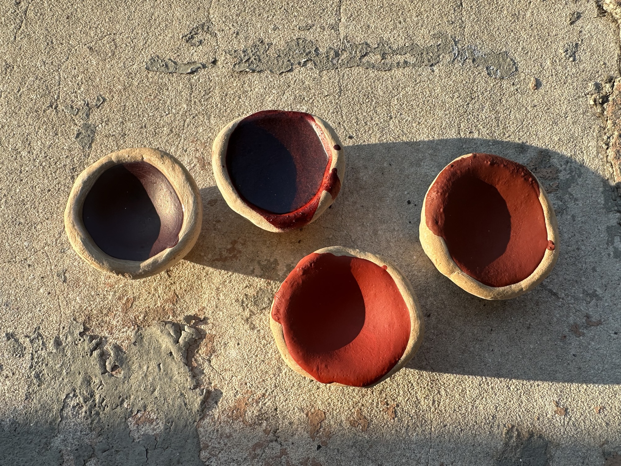
Pink

The study found four separate pinks being used. I made two of them. The first one is a madder-based pink (the darker, bluer pink on the right) which uses kaolin, diatomaceous earth, and alizarin (the synthesized form of the dyestuff that madder produces).
Interestingly, the study found evidence of use of both kaolin and diatomaceous earth used in the pigment blends. In my experience in making these, this does lighten the colour a little.
When I make this again, I have madder roots that I’ll be precipitating dye from onto the kaolin (much like in Maya Red does with cochineal). Per the Grifa study, this is likely what was done with the kaolin in the extant.
The second pink I made was using a combination of diatomaceous earth, hematite, and titanium white to mimic lead white (again, lead poisoning is bad). Per the study, Creta argentaria + rubrica + cerussa usta (or diatomaceous earth + hematite + red lead) makes for a pink. Hematite can be in a range of colours, and for this one I chose an intense tinting hematite from Kremer to better give the warmer tones as seen in the samples. I did add a bit more titanium white than what was outlined in the study as the intense tinting hematite pretty much says what it does on the tin, so to balance the red out, the white was necessary.
I did attempt to make the pink that included orpiment and Egyptian blue as colour correctors, but this ended up being more of a warm brown and less of a pink colour, which I think was due to the intensity of the hematite that I also used for this.
What is not noted is that the kaolin and diatomaceous earth both act as extenders in that while the colour remains, it takes less colour to achieve desired effects while using a gouache binder. If used in fresco, the natural white of the slaked plaster binder should lighten the colours somewhat.
Red
The Grifa study outlines three reds. I made four, leaning back onto Pliny for a couple of them.
Two of the reds are organic in nature: carmine and dragon’s blood. There is some confusion in Natural History, as there are notes that outline that some physicians prescribed minium instead of Indian cinnabar (dragon’s blood) and caused issues with the patient ending up being more sick in the process.
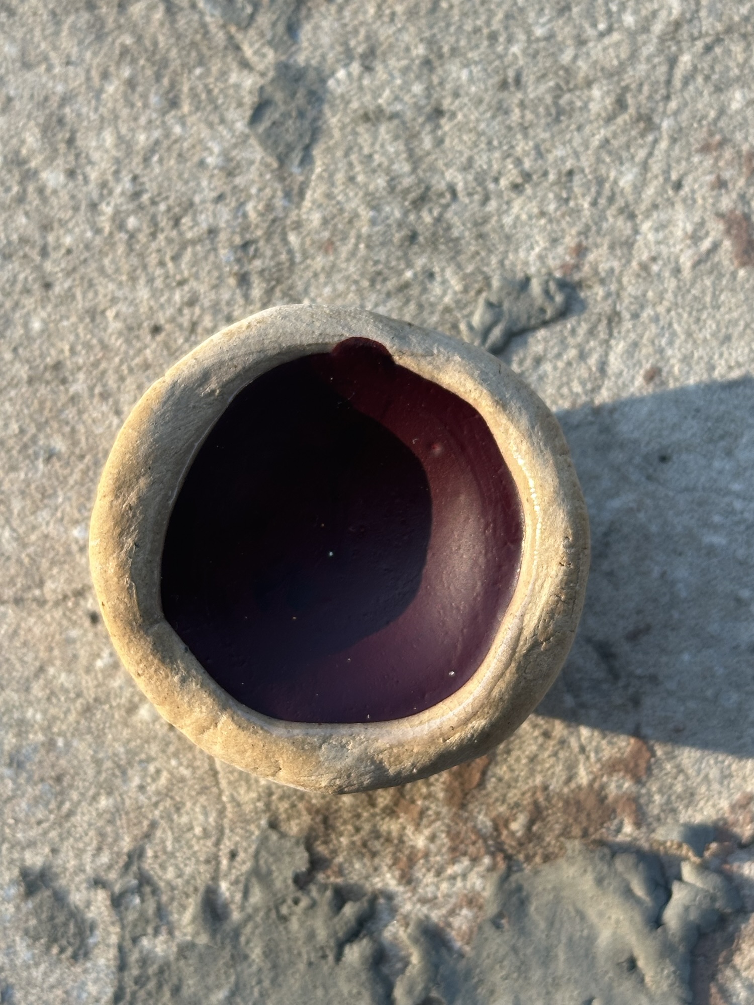
The carmine was easy to access, and even though Kremer uses cochineal instead of kermes lice in the production of its carmine, both produce carminic acid and are close enough for this project. It produces a dark, intense blueish red (what we generally refer to as crimson). I’ve mixed up carmine before (even using it to make mixes of purple). While the study does not directly outline this particular pigment in use, given Pliny’s mention of it in Natural History, I thought including this would be good to add, especially given the number of other painting styles he mentions later on in Book 33. The general focus at the time is still on fresco painting, however, even Pliny notes the use of painting elsewhere.

The dragon’s blood likewise was relatively easy to access. Kremer does outline that theirs is Resina Dracaena from Sumatra and comes from rattan palms, but as both Calamus and Dracaena plants are both cultivated for their use in creating dragon’s blood, there is some wiggle room on this. Additionally, as some plants that produce dragon’s blood are endangered or threatened, and on a personal note I made an attempt to go with as close to a sustainable source for this pigment because modern people and modern problems. The red is much warmer of a red, while still having a dark intensity to it.
The next two reds are outlined in the Pompeiian pigment study, and are mixes of other pigments. One contains a combination of kaolinite, quartz, calcite, hematite (the study has identified this as rubrica), and the other uses hydrated silicate, hematite, red lead, calcite, and quartz (the study identifies this as sandyx). Again, as I do not use lead or lead products in my studio, I’ve replaced these with cadmiums (still toxic, just less toxic and less cumulatively dangerous than lead).

One, the rubrica (red ochre) was mixed with kaolin and chalk (the calcite, in this case), and as neither really affected the colour of the red iron oxide I used, I suspect this was used to yet again extend the colour while also bulking out the pigment in use. It creates a warm, earthy red which contrasts with the more blue-toned carmine and dragon’s blood. Of note, red ochre is one of the oldest artist materials documented, with it being used in the Lascaux cave in Europe and in Cueva de las Manos in Peru. (People like pretty spaces!) The study also notes that at least three varieties of red ochre were used in this period, separated by light, medium, and dark shades of red (and as red ochre comes in a variety of shades naturally, this is easy to accomplish). (Of note, Kremer does carry a Pompeii red pigment, which they describe as a burnt natural sienna, and is more than likely a similar red earth to what was used in Roman painting.)

The sandyx that was found in situ used a blend of rubrica and minium (red lead). In my blend, I used cadmium red, medium and cadmium orange no. 2 to best replicate the look of red lead. The study goes on to state that the addition of rubrica was likely done to extend the colour of the minium. Both cadmiums and red lead are fairly opaque materials, and I think this is a close, safer approximation of the bright reds used within this period. The study goes on to add that the reasoning for the addition of the rubrica was “[lead]-based pigment to the red ochre can be attributed to two main reasons: 1) the willingness to obtain a more intense and brilliant nuance, 2) the need to lower the cost of the artificial cerussa usta, more expensive (6 denarii per pound) than the red ochre (2 denarii per pound) according to Pliny (Arena, 2020; Rackham, 1968)” Pliny also goes on to state that when “calcined with rubrica, sandarach [realgar] becomes sandyx.” (Natural History, 35.23)
The Grifa study did indicate that there were other reds that were not able to be analyzed due to a lack of material in their storage containers, however, previous studies also indicated the use of cinnabar and realgar within the paintings themselves.
Orange

While the study shows the possibility of a couple of options for orange, I only made one (I’ll have to add more at some point, but this is a later thing, much like adding to the pinks). This is an attempt to better find a substitute for the highly toxic realgar (arsenic sulfide) which has been documented in use in Pompeii and in Natural History. The study also calls for a mix of red and yellow ochres, or even a more orange coloured ochre, such as Terre Ercolano.
This blend uses two cadmium pigments: cadmium orange no. 1, which tends towards the hunter orange and can be a bit jarring, and cadmium orange no. 2, vermillion, which tends a bit more red. As realgar tends to be a very bright orange, I wanted to keep the brightness without going too fluorescent in tone. By adding these two pigments together, I think I was successful in this blend. Pliny describes the colour as being like “that of a flame“.
Yellow
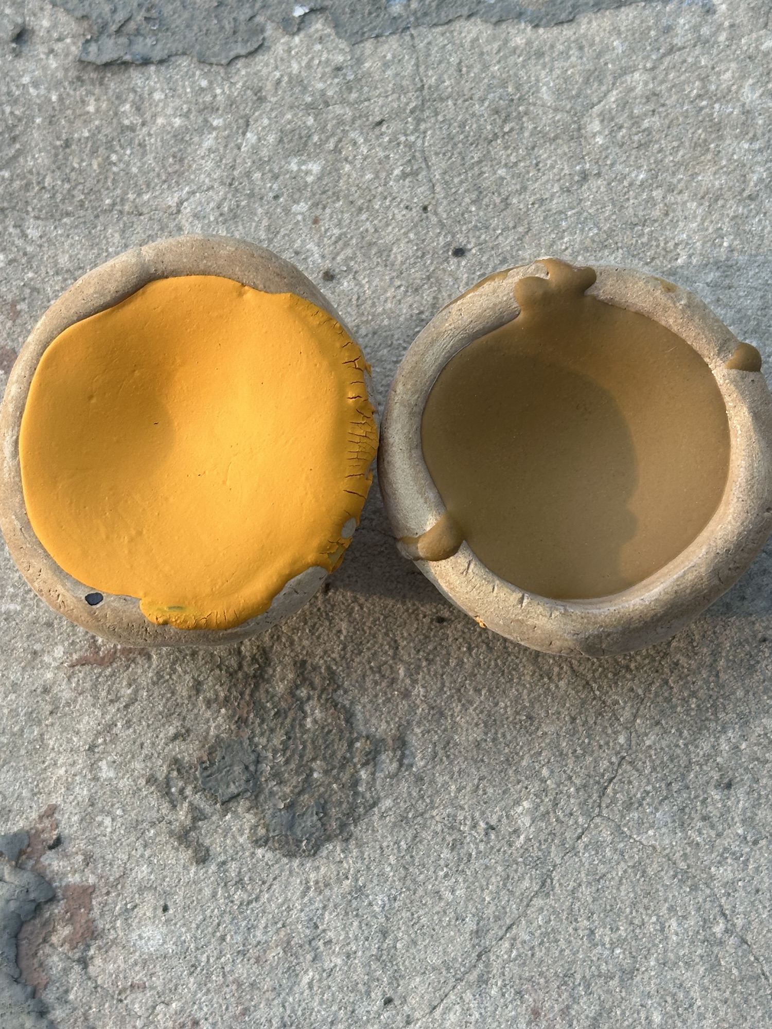
The study outlines two cases of yellow pigments found: one being orpiment, and the other being a yellow ochre (Grifa, et al discusses that this is jarosite as the main constituent of yellow pigments).
The jarosite was sourced from Kremer (who got it from a site in Cyprus), and is a greenish-yellow ochre. Jarosite is a naturally occurring pale yellow ochre, and like many other ochres is fairly opaque in coverage. No additional extenders were added to this paint. It is likely that this jarosite is the sil that Pliny speaks about in Natural History, which is corroborated by the study.
The second is a blend of two pigments to recreate orpiment in a less toxic manner. Orpiment is another arsenic sulfide, and like the realgar of the oranges above is highly toxic. In crystalline form, both realgar and orpiment can be found together, with the separation process between the two done mechanically. Orpiment also has a tendency to degrade based on light exposure, turning into friable white arsenic trioxide from the golden colour that it was. In contrast, bismuth vanadate and vanadium pentoxide are both fairly stable and lightfast pigments, with vanadium pentoxide used as a stain for clay bodies, and bismuth vanadate is stable, lightfast, and weatherproof enough for exterior use when used in paint. For this yellow, I used a blend of the vanadium pentoxide (which tends a bit more orange) to give the sunny, bright yellow of the orpiment, and to override some of the greenish cast of the bismuth vanadate. The result is a bright sunshiny yellow that mimics the look of orpiment, but is less toxic and will not degrade due to bright lights. Like the jarosite, no additional extenders by way of kaolin or diatomaceous earth were added.
Green

The Pompeii study outlines three greens. One is malachite, one is a green earth, and the third is a blend of colours.
Malachite is an exceedingly precious material in this period. Pliny notes the price at 7 denarii (one denarii was worth ten donkeys), and was “one of the most valuable pigments usually provided by the patron directly to the painter because of its preciousness.” (Grifa, et al) This is a mix of natural and synthetic malachite (because I ran out of natural malachite). Both have the same chemical composition (copper carbonate), but the natural malachite is found in the eastern Congo, while the synthetic is made in a lab. The colour is a bright, nearly teal green. Known in by Pliny as chrysocolla or armenium, this bright green is in deep contrast to the other two greens.

Green earth pigments are not unknown, and they certainly were not in Pliny’s day or even to the artists at Pompeii. Pigments like celadonite or terre verte (known as appianum in period) were also used, but as terre verte has a low tinting ability, additions like orpiment and Egyptian blue could be used to create greens. One of the blends I made used intense tinting hematite, vanadium pentoxide (because safety!), Egyptian blue, and terre verte to create a darker, more intense green. In some aspects, using the dark red of the hematite actually has some basic colour theory behind it in that the red cancels out some of the green, making a darker hue and chroma. By using the Egyptian blue and the orpiment to tone the colour, it also gives a more opaque green. It is still a very dark, very olive green. Pliny notes this green also as creta viridis, which was quite a bit cheaper than the malachite at 1 sestertius per pound (a sestertius was worth 1/4th of a denarius), and thus could be used a little less indiscriminately than the malachite.
Much in the same way the mixed green is a dark olive colour, the Verona green earth also is a dark olive colour. It, however, does not have the same opacity levels when used in watercolour or gouache, and can be used to create depth. (I am uncertain how this difference could have been used in Roman period, however, terre verte does come in a variety of shades and colours and much like red ochres might have been used to create depth in colour.) It does, however, appear that this is more used as a base for pigment blending rather than in an unadulterated form.
I think if I were to recreate this palette, I would not include the unadulterated green earth, but it’s good to have an idea of the difference between tinting strengths for gouache and watercolour use. For buon fresco work, it is unlikely that the difference between the adulterated and non would make a difference, but fresco is also not something I’ve had much experience working with.
One of the pigments that was known to Rome was verdigris and Pliny even talks about it in Natural History, but because of the acidic nature of the pigment to the point of it being brutally destructive to paper and vellum (it is not archival quality) and the combination of it with slaked plaster being unsuitable, I declined to use it for this project. (I have it. It is a beautiful colour, but it reeks of hate and battery acid and I cannot in good conscience recommend it for use in a palette like this. Yes, viridian exists as a decent substitute, and similar cool greens do appear in frescoes at Pompeii, however, the reaction of highly acidic pigments with alkaline substrates mean the use of verdigris is incompatible.
Blue
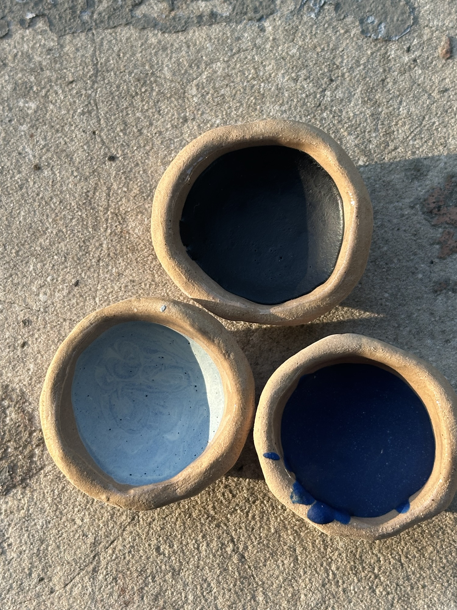
Four containers of blue pigment in either pigment balls or powdered form were found in situ. All of these included Egyptian blue as a part of the pigment blends, with differing shades of blue. For this palette, I chose to make three shades of blue, one of which was made using organic material as outlined in Natural History. The other two were made with Egyptian blue, the first synthetic colour. Egyptian blue is a calcium copper silicate (also known as cuprorivaite), and is made from a mixture of silica, lime, copper, and an alkali.
The study outlines that part of the reason for colour intensity is the pigment packing. As Egpytian blue is extremely granular in nature (frit, for those glassmakers out there), the colour intensity relies on how many frit particles are packed in together.
Per the study, Egyptian blue is the preferential blue used at Pompeii, with “an active production district in the northern part of the Campi Flegrei” (Grifa, 2025; Grifa 2016). We also see extensive use of Egyptian blue in other colour blends, either as a colour corrector, or as a part of compounding other pigments to make a specific colour.

Lighter shades of blue were made by mixing Egpytian blue with lead white to create lomentum, an even more expensive pigment (an eye-watering 10 denarii per pound). In my lower toxicity version, I used titanium white, Egyptian blue, and a tiny bit of vanadium pentoxide to recreate this colour. Titanium white tends a little cooler than lead white, so adding the vanadium to warm up the tone a little to better recreate this colour.
In addition to Egyptian blue, Pliny discusses the use of indigo as a pigment, which was added to a base like chalk or kaolin. The version that Kremer offers is precipitated with lye, pressed into cakes, and then further powdered for use. While none of the pigment pots in this study feature indigo, we do have evidence of indigo being used in funerary portraiture in Romano-Egyptian contexts, often painted with a red lake pigment (like madder or kermes) over it to create a purple tone. Indigo was primarily used as a dyestuff, but examples do pop up with the use of it as a paint, which is why I included it as a part of this project.
Purple

One purple pot was found at Pompeii in this study, and it was made using a mix of inorganic pigments, notably with high iron content. For this particular purple, I used a more violet shade of hematite (Iron Glimmer Violet), and combined it with Egyptian blue, vanadium pentoxide, and a bit of chalk to extend the pigments out and to build some opacity, as this particular kind of hematite does not have the same opacity as the intense tinting hematite. The purple is a warm purple, even with the addition of Egyptian blue. The Grifa study notes that this particular shade is the first evidence of an inorganic-based purple, as most purples from this time period tended to be made from Hexaplex trunculus Murex snails (or purpurissum).
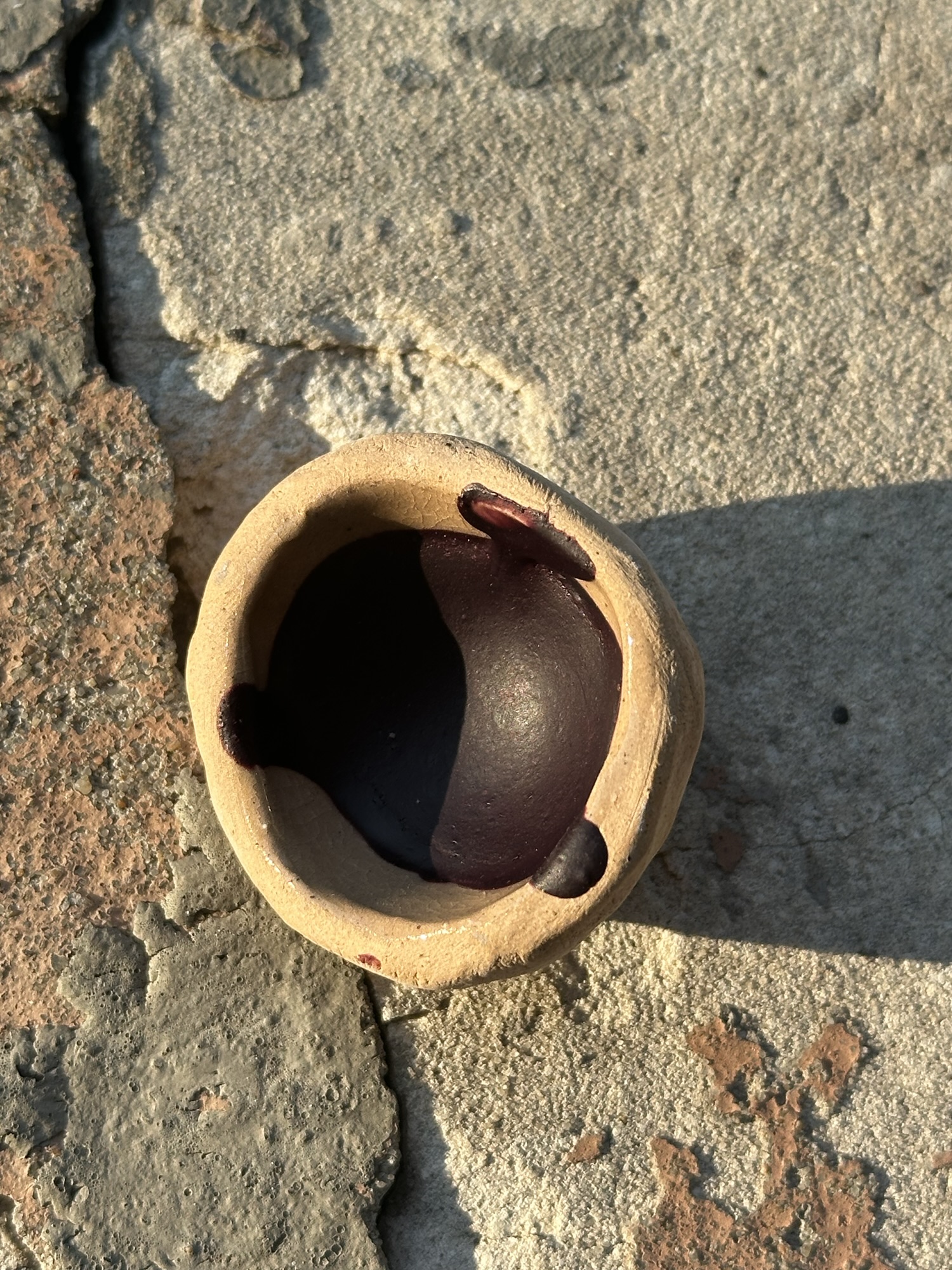
At the time of writing (September 2025), the cost of real purpurissum is $146.55 USD for a single gram of the stuff, which means it is firmly out of my budget. However, noted fakes for purpurissum were used in period, usually combining organic dyes like indigo and kermes or madder to create a strong reddish purple. For this project, I combined indigo and carmine and kaolin to create a reddish purple not dissimilar to Tyrian purple. I’ve outlined similar blends in my post on compounding purple pigments, and including it with this project was important given the use of Tyrian purple by the Romans. This is not the only way to achieve this colour combination, as layers of paint can also achieve similar effects. Within Natural History, Pliny notes that purpurissum can be used with glair or egg to create works on fresco, however, given the price (thirty denarii per pound depending on the quality), finding quality substitutions were necessary for artists to remain solvent.
White
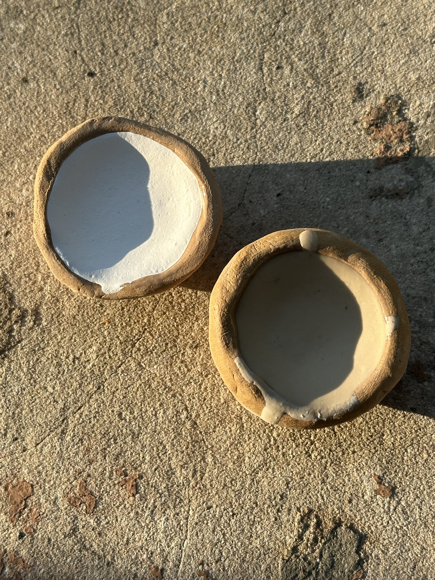
Two white pigments were analyzed at the Pompeii site. One was calcite (Creta calcarea), and the other was a combination of dolomite and aragonite (Paraetonium). Additionally, lead white was written about in Natural History (cerussa). For this project, I worked with chalk white and titanium white.
Titanium white was chosen instead of lead white due to safety concerns. It is a bright, cool white, with good coverage. Lead white tends to be a little warmer in tone, but for this project, titanium white is a good enough substitute to outweigh the risks of working with lead.
I chose chalk white over a more granular calcite as chalk is extremely common in African and European pigment use, including use by New Dynasty Egypt and other early-period cultures, and it is extremely inexpensive. My one kilogram bag from Kremer cost me $12 at the time (plus I could make a lot of jokes about having a kilogram bag of a white powder). With this pigment being so common, it made the most sense to have it as part of a palette.
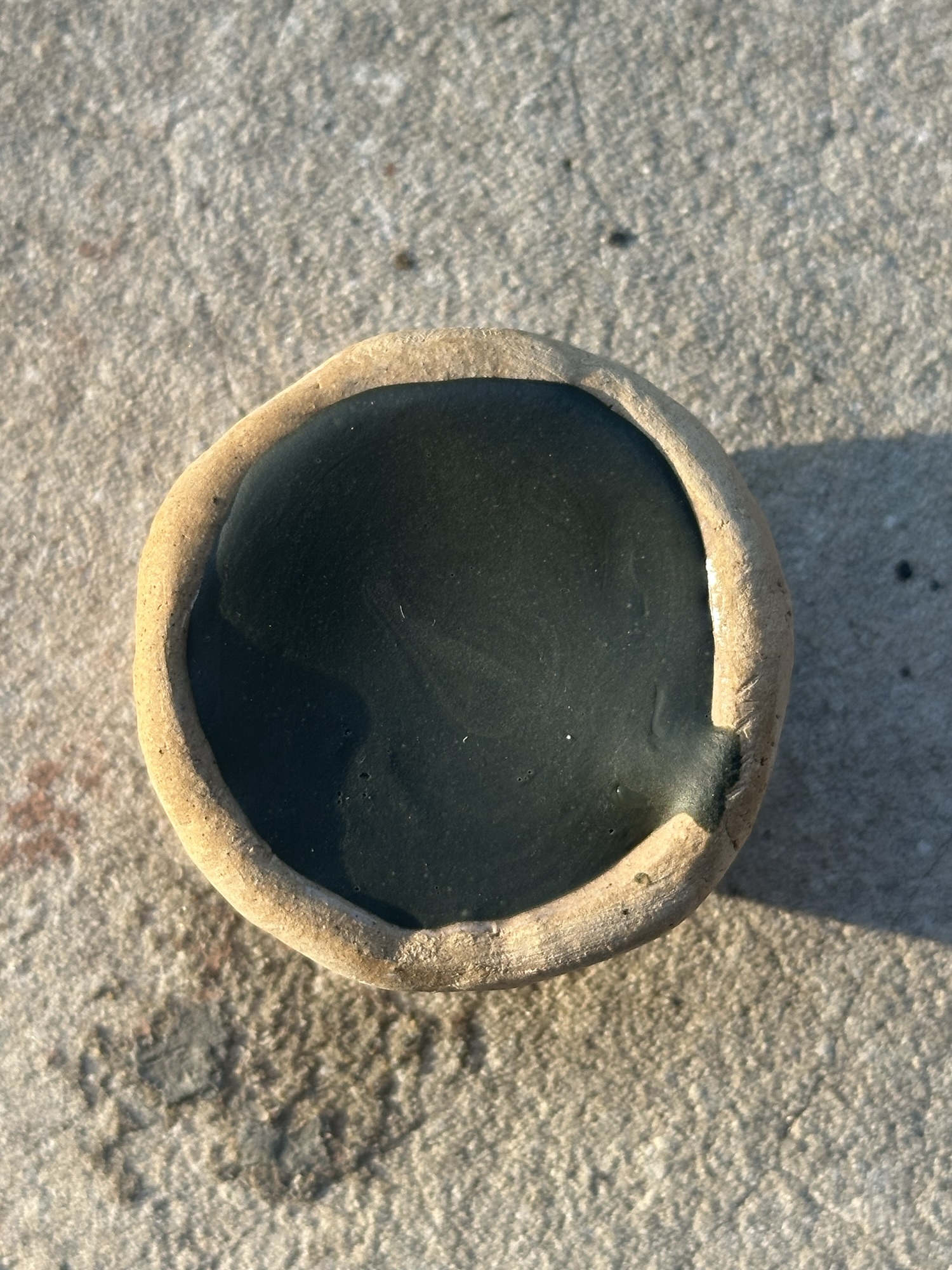
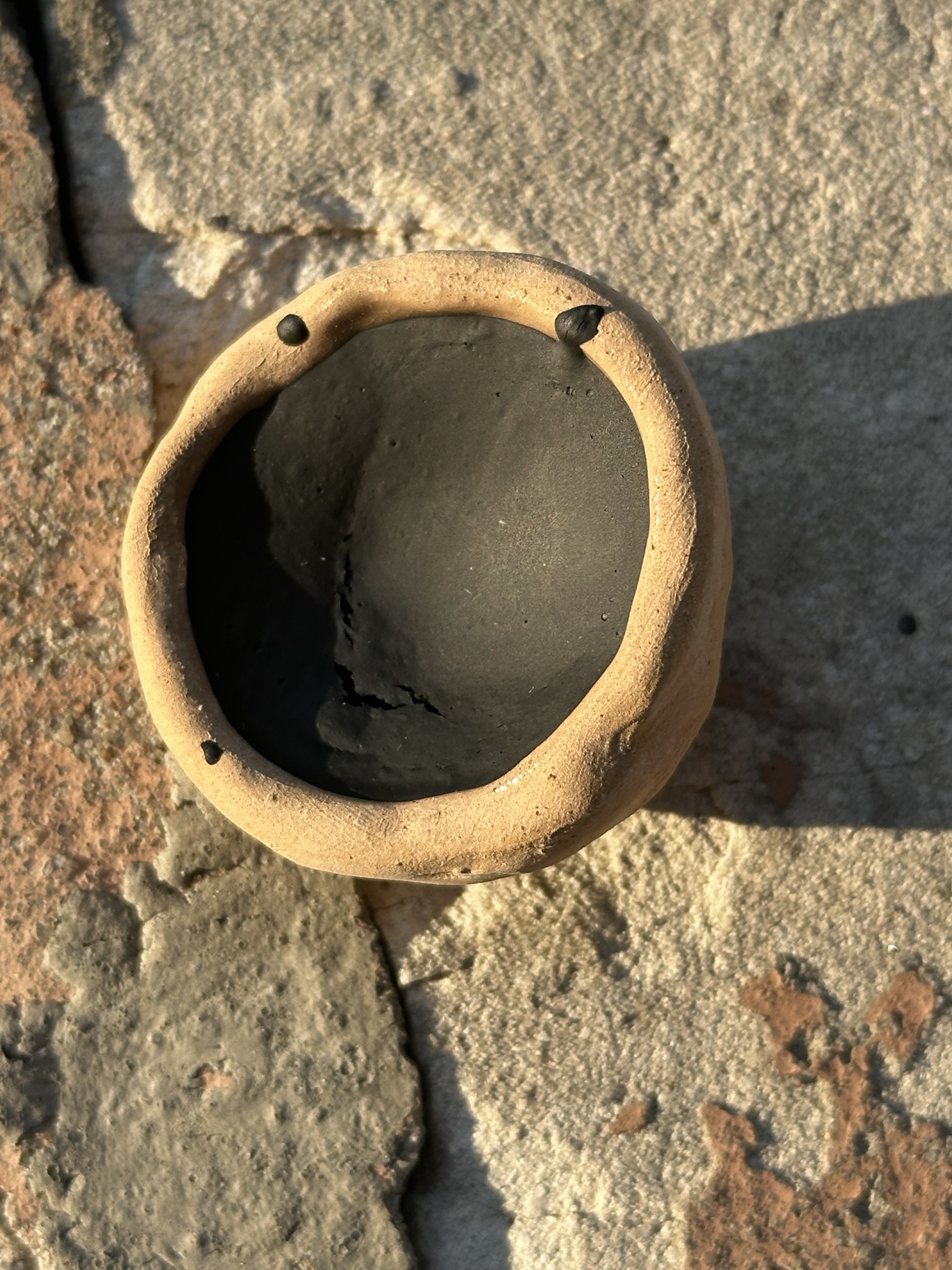
Grey

Pliny does not discuss grey as a singular pigment at all, so this was wholly reliant on the evidence found at Pompeii. Two pots were found with grey shades. For this project, I made one of those.
The spectroscopy reports show a complex recipe made by taking Egyptian blue, adding white from a carbonate-based white (chalk), and then adding red pigments (rubrica and cerussa usta) in small amounts as well as small amounts of orpiment. The second pot of grey was made using barite (which I did not have on hand), as well as quartz, Egyptian blue, “clayey minerals”, alunite (which is used in the production of alum), and calcite.
To create this, I took Egyptian blue, added chalk, and then added intense tinting hematite and vanadium pentoxide. Of note, this ended up being a little redder than anticipated, given the intensity of the hematite. To even this out, I added some kaolin and more chalk white, as well as a little bit of titanium white to get a more cool tone.
The grey still reads a little more brown to me, but in context, it leads to a fairly uniform palette.
Brown

I found that I didn’t have brown as a colour for this palette at all, which given the use of brown in some frescos found at Pompeii, I though it was important to add. While the study did not have a brown listed, Pliny listed a couple of browns, one of which is Sæpia, or squid ink.
Instead of using squid ink, and knowing that brown earth pigments existed in period, I chose a raw umber instead, given the relative use of it in art history. As a pigment, umber has a long history of use, and given the greenish undertones, I suspect that this is the Egyptian earth that Pliny writes about in Natural History, though it is not clear what this refers to. For this project, this is the main brown given the relative versatility of this pigment.
Black
Two blacks were analyzed at Pompeii. One was a carbon black, the other was a carbon black mixture. Pliny also writes of a few black pigments, including one made of grape husks leftover from the wine-making process, and another made from charred elephant ivory.
For this project, I chose furnace black, a strong high carbon black that was unlikely to fight being put into a binder like vine black (another carbon black) or be difficult to source (ivory black). Furnace black was known in period, with Kremer’s version being made by collection from brick chambers from the condensed smoke of a luminous flame, burning mineral oil, tar, pitch or resin.
The Grifa study suggests one of the blacks is atramentum, made from burning burning resins or resinous wood, which pulls this in line with furnace black. The other black that was analyzed was a mixture of chalk, black copper (or tenorite), hematite, and red lead. As I did not have access to tenorite, and furnace black was well documented, I chose this for the black in this project.
So, what did I learn?
Well, one, a lot of colour theory. In addition to colour theory, I also learned a lot about the process of mixing these pigments together for use in an SCA scribal setting, which meant that the intensity of the pigments was going to be different because of their application for fresco use. It’s also fun watching the six colour palette from Egypt expand to so many more colours and uses.
Is there a way to colour-match these pigments to modern paints? Absolutely. Since I’m using some modern substitutes, I recommend looking at the descriptions and finding pigment uses and cross-referencing them with modern gouache pigments. The Art is Creation, Color of Art Pigment Database (https://www.artiscreation.com/Color_index_names.html#.YNk64RNKjOS) has been an invaluable source for finding pigments that are commonly found in modern life (and may be even less toxic than what was used in period.
I’m excited to use these on my next Roman scroll.

Pingback: Roman Rainbows II: Colour Matching with Modern Paints | konstantia kaloethina