While doing research for another paint-making based project, I stumbled upon a couple of Egyptian palettes dating from the New Kingdom era, and with the last trip to my local art museum a few weeks ago with my partner, I got inspired. So, while I was primarily there to go see Judith and Her Maidservant by Artemisia Gentileschi while it was on loan from the Detroit Institute of Arts, we did stop into the Egyptian galleries, I started thinking back to the palette and how to best go with making colours that would work.
So, I got to work looking at the extant palette from the Met to figure out the colours that could have been used, and then do some reading in papers on pigments we know the Egyptians from this period used.
The extant palette itself is made of ivory with six wells, all containing pigment, and more than likely elephant ivory. At the same time, the palette that contains the paint was less of the focus. The paint, though, was what I wanted to concentrate the most on. The colours that were listed with any kind of certainty were yellow, red, black, blue, and green, which left one where there was a bit of uncertainty. Knowing that both white and brown were both used by the Egyptians in this period, and I could see how the remaining paint could be either white or brown, I figured it may have been best to make both to experiment with. So, what else was there to do, but to make two palettes? (I’m already incapable of making small amounts of paint anyway, so it was worth making both.)

The pigments I chose were due to a couple of factors: did I have it on hand? Were they relatively safe? How close could I get to the colours represented in the extant?
With that, I chose the following pigments for this palette. All pigments were mixed up into my standard Schmincke gouache binder standby as I want to be able to use these in an SCA scribal context.
Yellow ended up being Italian golden ochre. While this specific earth pigment may not have been in Egypt at this time, other yellow earth pigments were, and with a similar chemical composition of both (as stated in Kremer’s MSDS, listed as Fe2O3 · H2O and CaSO4) that compares closely with a sample found at the Palace of Apries II, which also dated from the New Kingdom, this was more than close enough for my liking. I also had a ginormous bag of it on hand, so in it went.
Red was a mystery red ochre that was given to me a few years ago at an event. I still don’t know what the composition is, but it’s a red ochre, which was the primary red colourant for Egypt in this time period. It’s a colour that’s literally everywhere in Egyptian art. Chances are, the mystery red ochre that I have is an iron oxide (like most other red oxides). Do I have the exact chemical composition? Nope! But is it similar to the colour in the palette? Yep! Could I have used a madder lake like alizarin crimson? Sure could have, as the Egyptians also used madder lakes, but for this, the red ochre also matched the extant the best.
Green ended up being malachite. While I had Egyptian green on hand, the brightness and the softness of the colour in the extant palette brought malachite to mind, not the dark green of the Egyptian green that I have. Both were heavily favoured by the Egyptians, with malachite also being used in cosmetic purposes (that said, for safety, please do not use malachite around your eyes because wow is it toxic). Additionally, malachite was also used during the Old Kingdom era, but also in the New Kingdom era as well. Verdigris was also used during this time, but again, with this palette and the bright light green in the extant, malachite was the best choice for this.

Blue also could have gone a couple of ways. Both azurite and Egyptian blue were good candidates with a very similar hue, chroma, and saturation. Unlike azurite, however, Egyptian blue is a much more stable colour. While both involve amounts of copper in various amounts, Egyptian blue is composed of quartz, lime, a copper compound, and an alkali flux and then fired at high temperatures, whereas azurite is copper carbonate that will eventually turn green on long-term contact with moisture and salts. Additionally, azurite is used rarely in Egyptian contexts, so Egyptian blue it was.
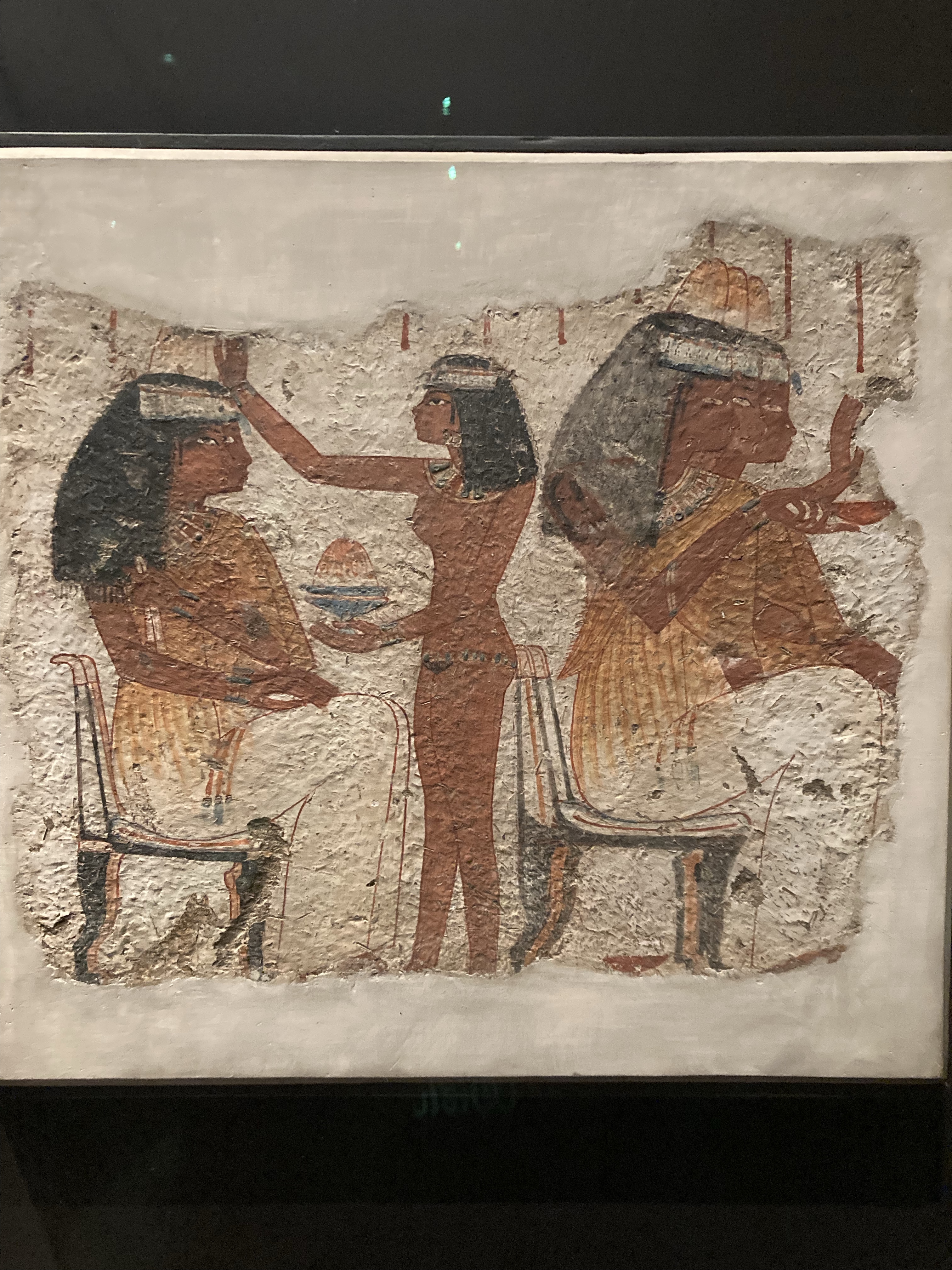
Black ended up being Roman black, or black oxide. I could have worked with vine black, as carbon blacks like vine black, ivory black, or lamp black are all period for this time period, but black oxides are also period as well. Now, Roman black is generally a warmer-toned black in comparison to carbon blacks, which typically go much more cool. I chose this warmer tone based on the painting of the banquet scene at the Nelson, where the wigs of the women were fairly warm toned, which would make the black oxide choice the better one.
Now, onto the alternate colours. Both white and brown show up in contemporary palettes, so as I made both, I looked at the pigments I had to best figure out what would work best.
White ended up being titanium white. It’s not period, but it’s safer than a lot of alternatives. That said, if I do this palette again, I will probably go with chalk white instead, as calcite (CaCO3), gypsum (CaSO4·2H2O) and anhydrite (CaSO4) are the most common pigments in painted decoration in ancient Egypt from the Predynastic Period through the Roman Period. I used titanium white because I had it on hand, and it’s probably my favourite workhorse colour when it comes to needing to do whitework or even mixing with other colours. It’s pretty stable, and it’s not going to cause issues after being mixed into a binder. That said, the extant could be brown. It could be a heavily stained white. We just don’t know.
Brown could have gone a number of places. I ended up using burnt sienna as it was similar in tone to the extant, but also because it’s a good neutral brown that is enough of a difference between the red ochre, which is pretty much a variant on brown.
I am excited to be able to use these in demos, and I’m especially excited to see how these will paint up on a surface like papyrus to really get the idea across.
Part of the reason I love being able to do hyper-local palettes like this means that we have a greater understanding of colour theory as used by groups and cultures in period, as well as better being able to match what they used. Limited palettes may seem difficult, but it gives a better understanding of how trade routes really influence art styles.

Pingback: Will It Paint?: Lucia’s mixed dye lakes and Samii Orange | konstantia kaloethina
Pingback: Roman Rainbows | konstantia kaloethina