A little bit ago, I discovered a pigment while window-shopping at Kremer Pigments‘ website and, well, I fell down the rabbit hole pretty hard. The colour had a couple of shades of a greyish, almost smoky blue, ranging from dark to light, and to find out that it was used in not only Mesoamerican stonework, but also as a part of a couple of Mesoamerican codices (the Florentine Codex and the Maya Codex of Mexico, which dates to the 13th century CE and is the oldest surviving Mesoamerican codex). I hit the rabbit hole hard. What I especially love is that this is a paint that was used by both the Maya and the Aztec, which means a ton of applications for New World personae.
Maya blue pigment is made by taking indigo dye made from añil (Indigofera suffruticosa) – known as xiuhquilitl in Náhuatl, wild indigo that is native to the subtropical and tropical Americas, including the southern United States, the Caribbean, Mexico, Central America, and South America as far south as northern Argentina, and palygorskite (magnesium aluminium phyllosilicate) clay soils, which is found in much of the Southern United States and more importantly in small pockets on the Yucatán peninsula in Mexico (these small pockets are tied to the use by the Maya and Aztec in period). Once the dye and clay are combined, it is then heat-treated (it is thought that within SCA period that this was a large part of the Maya rituals involving human sacrifice). One of the biggest things with Maya blue is its longevity and stability as a pigment. (and here’s an article from MIT on why Maya blue is so stable! It’s fascinating!)
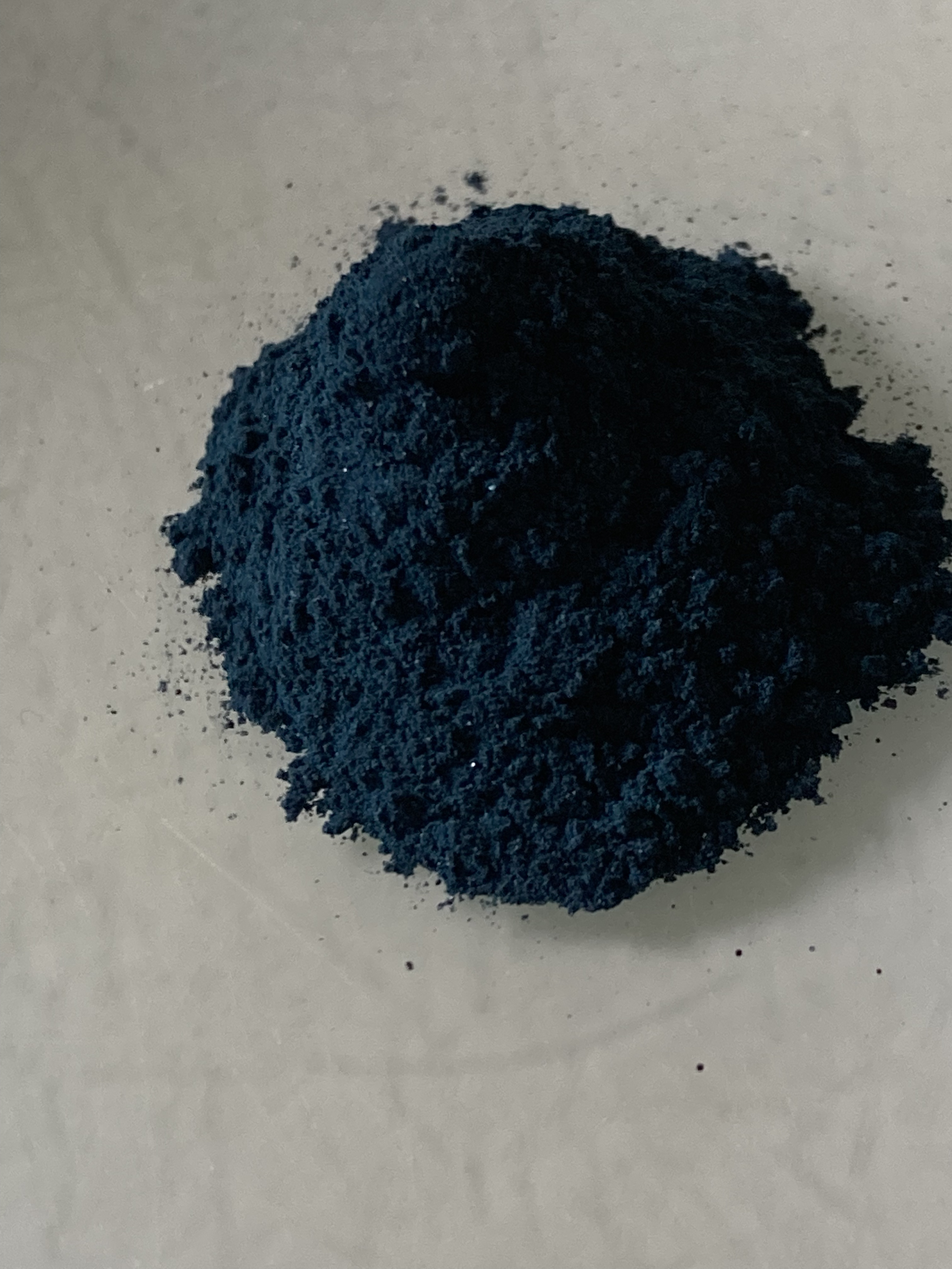
Thankfully, I can now get Maya blue with none of the ethical concerns of human sacrifice, and after saving up, I ended up with a small bottle of the stuff. The pigment that I picked up is a lovely dark shade of a blue-grey, which is definitely a bit darker than other variations. It’s a little on the grainy side, which I suspect is due to the palygorskite clay, however, this in no way affected my ability to mix it up with a commercial gouache binder (Schmincke Ready-to-Use Gouache Binder is wonderful stuff and it saves me time in making my own binder from gum arabic, honey, and water – it’s definitely a “close enough” recipe for my liking.)
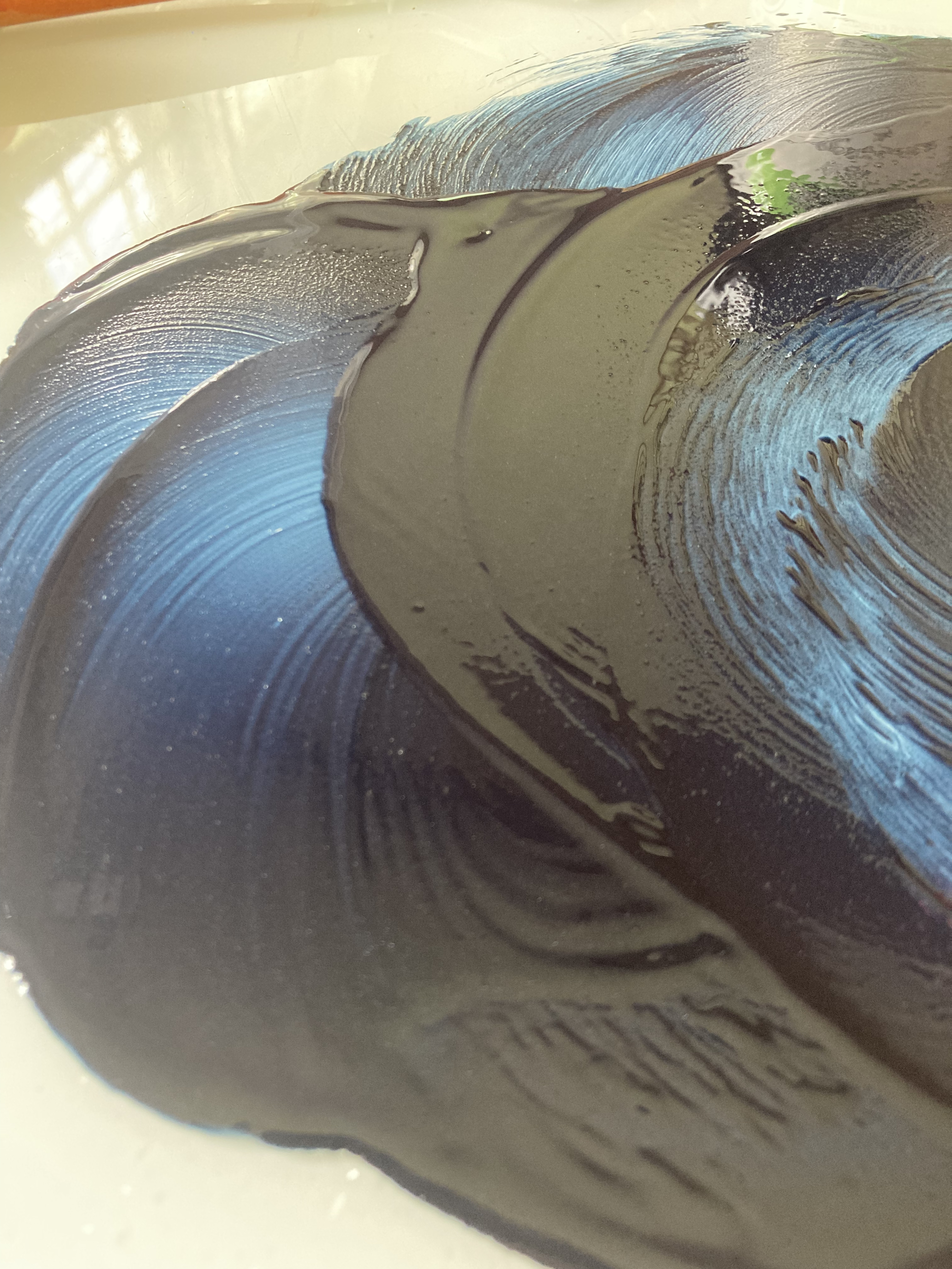
Anyway, it mixes up well with binder, though it absorbs a binder quite a bit. The colour is a smoky blue-grey, similar, though different from the straight indigo that I’ve also mixed up on a previous paint-making day. It didn’t take too long to mix up, a huge contrast with azurite, which, while also a blue, is derived from weathered copper ore deposits. (I once spent nearly an hour trying to mix azurite and it just. . . yeah, it’s not my favourite pigment to work with.) Unlike azurite, the longer one mulls Maya blue, it stays pretty stable and will not shift colour. Azurite will eventually go clear with enough grinding and mulling.
Quick detour here on the difference between dyes and paints, because I’ve been asked about them in the recent past. Both rely on pigments, however, how dyes and paints transform an object is different. Dyes are usually made from dye molecules suspended in a solvent (like alcohol or water), whereas paint is made from pigments suspended in a binder. It is possible to use a dye (like indigo, cochineal, or madder) to create a pigment, but it requires the use of a process called “laking.” This is the process of creating a water-insoluble pigment for painting from a water-soluble organic dye, and is only possible with dyes that work with a mordant. One fairly historically famous lake pigment in Europe (used by Swedish peasant painters) is schijt yellow, which was made from buckthorn berries. (And yes, it is exactly the same colour as used diapers, so the name is quite descriptive).
Anyway, back to Maya blue.
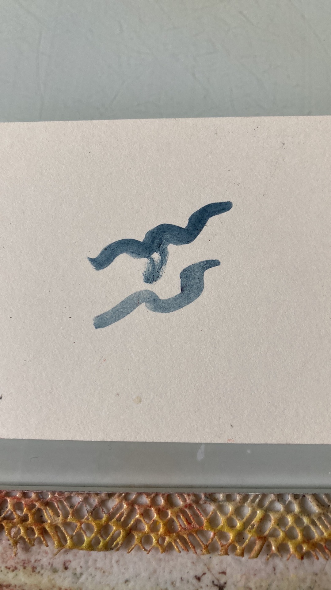
So, once I got things all mixed up to my liking, I did a test swatch, and it’s definitely not like the lighter Maya blues out there (which are closer to sky blues). It does have a lot of transparency, and I think if I watered this down enough, it’s going to be a great addition to my period paint arsenal. I’m definitely also going to have to order some of the lighter Maya blues that are out there to get the brilliant turquoise of the central American sky, but for this run, I’m pretty happy. (This is where I need someone to have a Mesoamerican persona and to let me do a full scroll in that style with period pigments – hematite reds, Maya blue, lamp blacks, and browns derived from cochineal on amate paper.)
So, yeah, I’m really pleased with this, and I’m excited to use it on a scroll, because the blue really is so very lovely.
