No rest for the wicked, really.
No sooner had I completed John‘s scroll, I got contacted by the Royal Scribe again on if I could get another scroll done. Now, this one had a challenge of time, with it being given out two weeks after I had gotten the assignment. Thankfully, for this scroll, I’m in a time in my life where I can dedicate some time to art, and so I was able to really put in some work on it.
Gawin has a late-period German persona, so, I could have gone a couple of routes: a woodcut style, similar to Hans Lützelburger and Hans Holbein the Younger, or I could go with botanicals (such as Mira Calligraphiae Monumenta) or an attempt at some of the more bonkers illuminations from the Northern Renaissance. That said, at the end of this, I had two weeks to get this scroll done. The text, done by the incomparable Chiara, was something I definitely wanted to do justice to.
So, I settled on the Mira, because it would give me the right general location (the calligraphy was done for Holy Roman Emperor Ferdinand I from 1561-1562 by Joris Hoefnagel, with the illumination later added from 1591–1596 by Georg Bocskay). The Mira is also unusual in that it shows off a bunch of different styles of calligraphy, but keeps the illumination fairly similar, using a botanical theme.
I initially wanted to use this page, but after I think four or so calligraphy fails (I’m really more of an illuminator, not a calligrapher), I went with a different page, using my .75 Brause nibs to come close to the calligraphy Hoefnagel used in the exemplar. I did my calligraphy first, knowing that this was the more difficult of the two things for me to do for this piece. (Look, I’m a left-handed calligrapher. Some things are just challenging, okay?) The hand is pretty close to Humanist minuscule, which was going to be much easier for me to accomplish quickly and neatly. (My spacing needs work. Then again, I am more an illuminator than a calligrapher.) I saved the capital letter to do with paint, using FineTec’s Olympic Gold and some very watered down ultramarine paint I’ve made to give the illusion of blue ink.

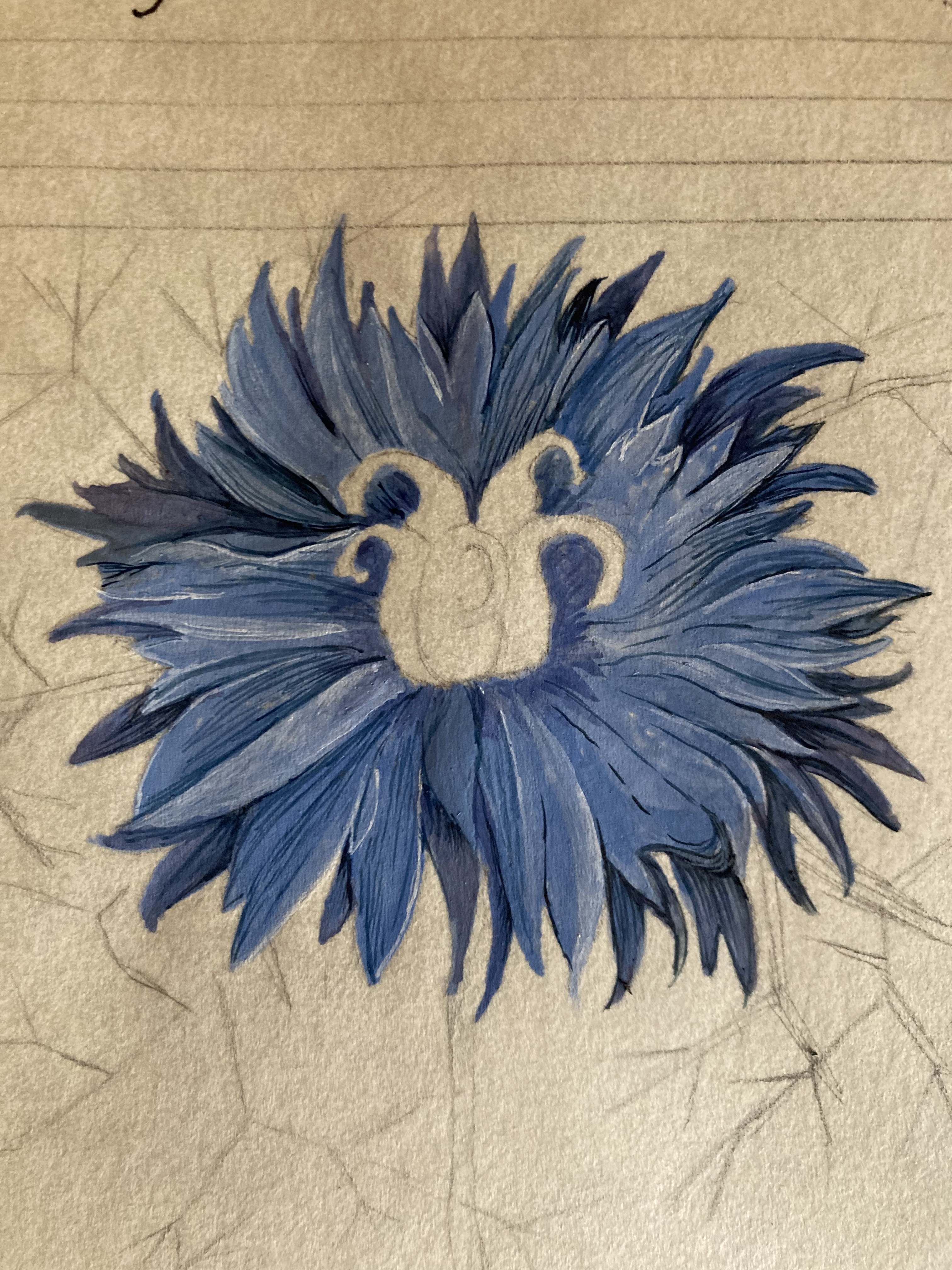
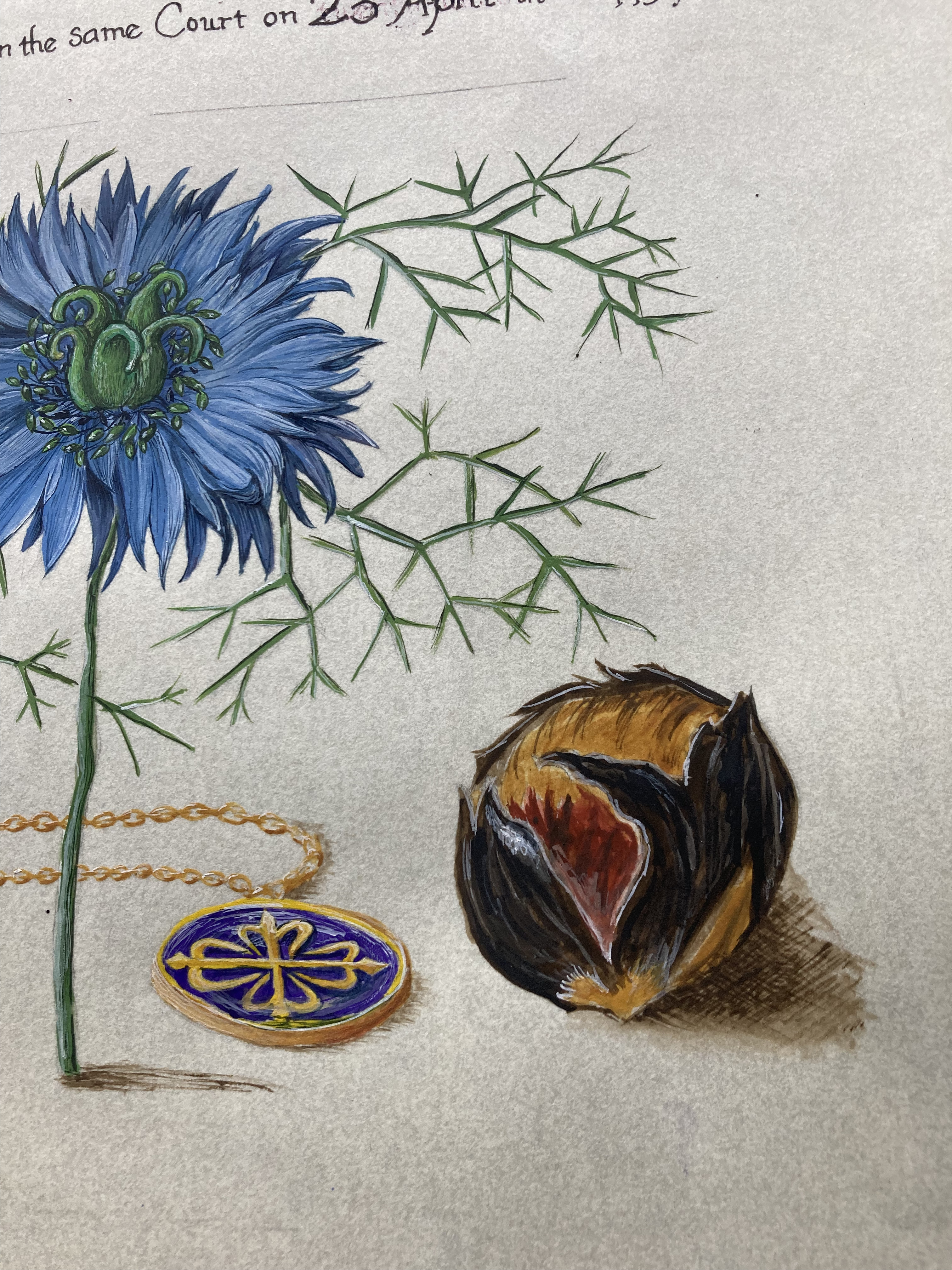
Once the calligraphy was done, I set to work on the illumination. I mostly used paints that I had made, but for the Love-in-a-Mist, I did have to resort to using commercially made paints because I didn’t have the right paints mixed up for this in my handmade paints, and I did in my commercial paint palettes – for example, I did not at all have the right green, so I ended up using a mix of Hooker’s Green, a cadmium yellow, and white to get the right green for the flower. I definitely used a darker blue than the extant, but after looking at the actual flowers, I’m not going to lose too much sleep over it. (Lesson the first: sometimes you have to learn to be happy with things, even if they’re not meeting your own personal standards. Don’t let perfect become the enemy of the good.) The other thing I added to this scroll, and why the proportions of the other items in it are a bit different than the extant, was a medallion of the order. The Mira has no evidence of this (it’s almost entirely botanicals), but other books from a few years earlier do have jewellery pretty prominently displayed.
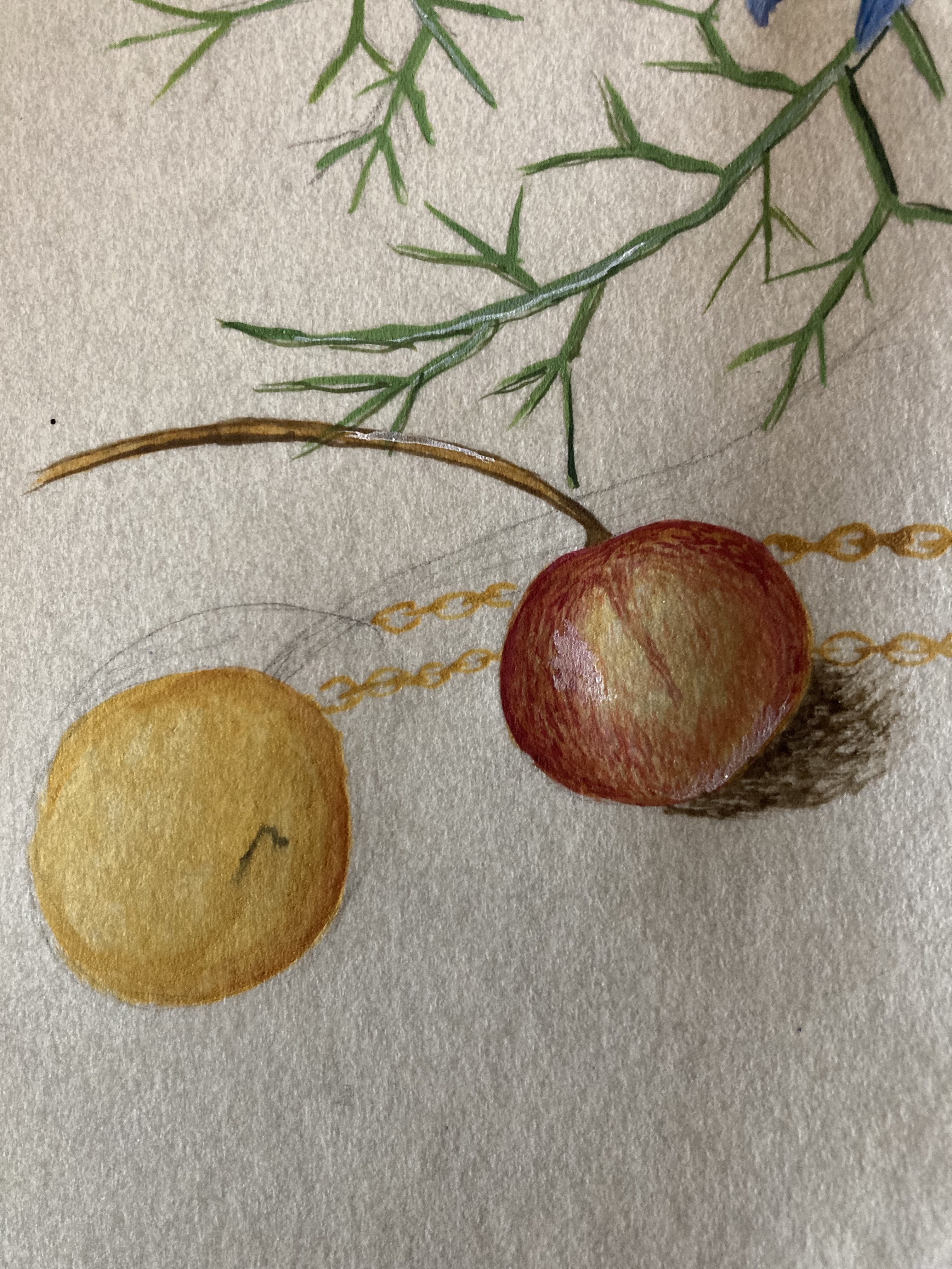
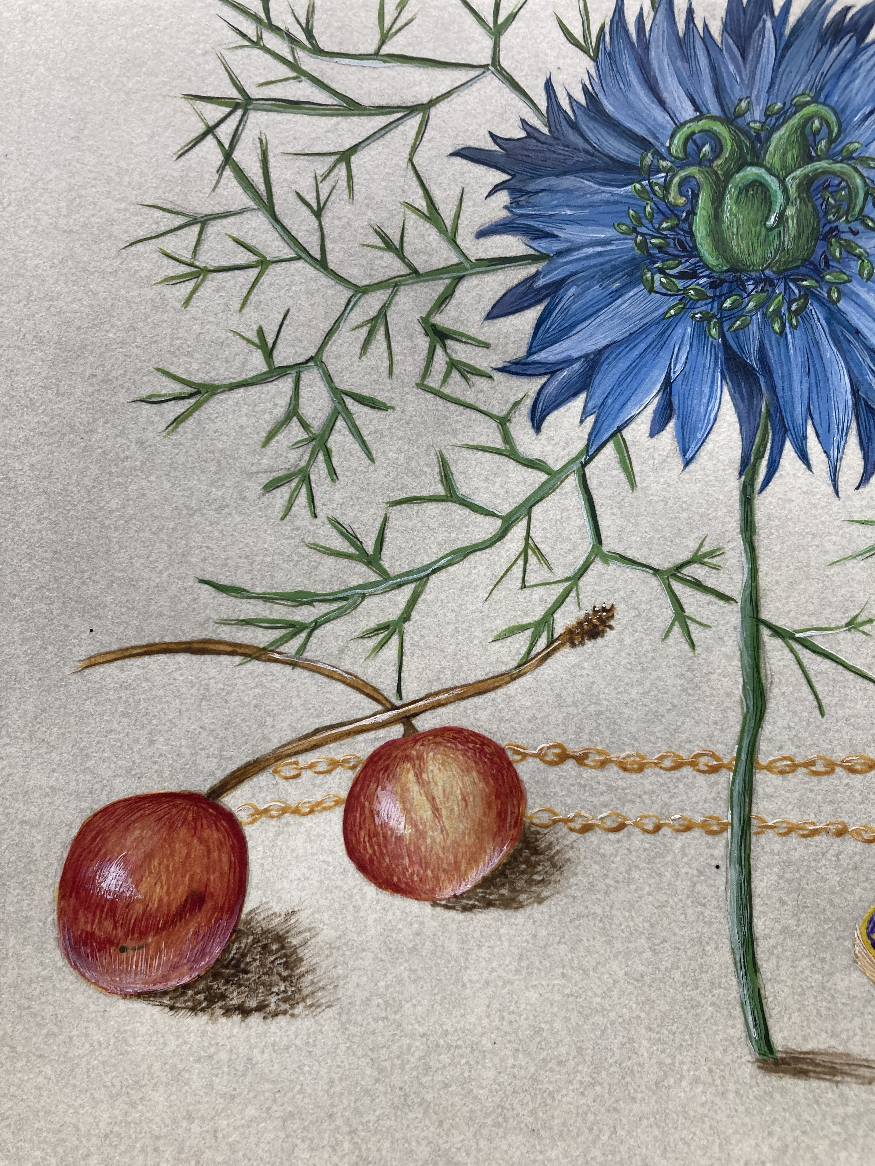
I’m not sure if the photo from above shows a drop of ink all that well, but I did accidentally drop a bit of ink while I was doing the calligraphy. Thankfully, I was able to hide it behind paint. With the cherries, I did a base layer of Italian Golden Ochre paint from my handmade paint palettes, and then carefully, using my 20/0 Velvetouch Mini-Monogram Liner brush from Princeton, I used very tiny brushstrokes of Alizarin Lake, Venetian Red, Titanium white, and Burnt Sienna handmade paints to cover the oopsie, but also give the impression of the extant to make them look like they could be plucked from the page. Lucky for me, the ink splotch was in a part of the fruit that would be in shadow, so I could use that to really help create the illusion of shadows. (Lesson the second: sometimes, you don’t have to start over. Sometimes, you can cover mistakes with paint like some tattoo artists do a coverup tattoo.) I think I was mostly successful in the coverup of that little bit of an oopsie.
Also, the amount of trompe-l’œil happening in this scroll also presented challenges. A lot of earlier styles of illumination are heavily stylized, while the Mira has elements that look as if they could be plucked off the page. I’ve traditionally done better in more stylized forms of illumination, but being able to make paint and paper look like a medallion, flower, fruit, and a nut was a challenge totally worth taking on. (Lesson the third: definitely make sure that the shadows and shines go in the direction that the light source is coming from, but also making sure they’re not the wrong size for the object being depicted.)
That said, I definitely pushed myself in this scroll. I’m pleased with some things, and others, well, there’s room for improvement for the next scroll based on the Mira. That said, I’m glad I got to use a lot of the paint I’ve been making on this scroll (by my count, I used just about all of the paints I’ve made – see the writeup on John’s scroll for an idea of what I mean by handmade paints).
Congrats, Gawin, and welcome to the Order, brother.


That’s amazing!
LikeLike
Pingback: Order of the Calon Cross: Gawin Keppler – Butterfly with Quill
Pingback: Interkingdom Shenani-plans | konstantia kaloethina