I had an excellent visit to Northshield at Knowne World Heraldic and Scribal Symposium ’23 in the Barony of Caer Anterth Mawr, which was located on the Marquette University campus. It was a lovely time, including seeing some gorgeous exemplars in Marquette’s special collection library.
One of the things I most love about KWHSS is being able to meet people that I’ve only interacted with online, but also to see old friends who live in kingdoms that are not my own. Sure, it’s not a war, but it’s really cool having conversations about interkingdom anthropology and learning things from other people.
One of those people is my friend Lucia, who is a dyer and will be running Knowne World Colour, a virtual symposium dedicated to all aspects of pigments and dyeing (yes, I’m working on a class for it already!) Lucia is a dyer primarily, and brought me some lake pigments that she had made from the leftover and exhausted dye baths from her work. I got a total of four pigments: exhausted madder, yarrow, Queen Anne’s Lace, and onion skins.

So, like all of my Will It Paints, I used the same binder that I use for most of my work: Schmincke’s gouache binder. I don’t much like fussing with making my own binders (though, I probably will at some point), so I use Schmincke’s binder.
Since a lot of the pigments had kind of clumped together, I did have to smash them down (this is why owning a mortar and pestle is pretty important to making paint!) to an even finer powder in order to work with it. While a muller helps with the grinding process, its job is more to help distribute the pigment into the binder, but that does mean that some pigments need a little extra bit of help. In this case, the yarrow was pretty clumpy and hardened, so, mortar and pestle to the rescue! It was stained from the previous Will It Paint with Master Alan’s Fireplace Gunk, but rest assured that it did get washed out before any of the lighter coloured pigments even made it into the mortar. (So, if you’re doing any work with pigments, I highly recommend getting a mortar and pestle. I got this one from one of my local Asian stores in their homegoods section for less than $10. Definitely also recommend not using a molcajete, and definitely recommend keeping this separate from any you might use near food.)

Anyway, once I got the pigments all smashed up, I added enough binder to basically get it to paint consistency. I did struggle with the exhausted madder (I may have put too much binder in, because the pigment load isn’t great, but it’s a very very very soft pink. The yarrow, Queen Anne’s Lace, and the onion, though? Nice soft pastels (the onion’s pretty brown, but I can use it!), and the Queen Anne’s Lace when mulling it was a lovely vegetal scent mixing it into the binder. Rather springlike, actually. The lake pigments all tended to be fairly translucent, which again could be based on the pigment load. For applications, these would be great in a style like a Koberger-style incunabule, where lighter paint washes went over a printed page. (this, by the way, is pretty good stunt documentation for Calontir’s preprints.) I could also use these in subtle colour glazing to create depth and dimension in botanical styles.
Of note, it’s also really good idea to swatch your work, especially to see how a handmade paint will behave. When I swatch a paint I’ve just made, I take a paintbrush, add a bit of water to it, and proceed to mix it up as if I were to actually use it. With the binder, it can be a little goopy, so, I add just enough water to get it to a workable texture, and then I paint swatches in a notebook I have nearby with other paint swatches. (my experiments with LIT powders are also in this notebook. It is a little disconcerting when pages start glowing from light exposure.)
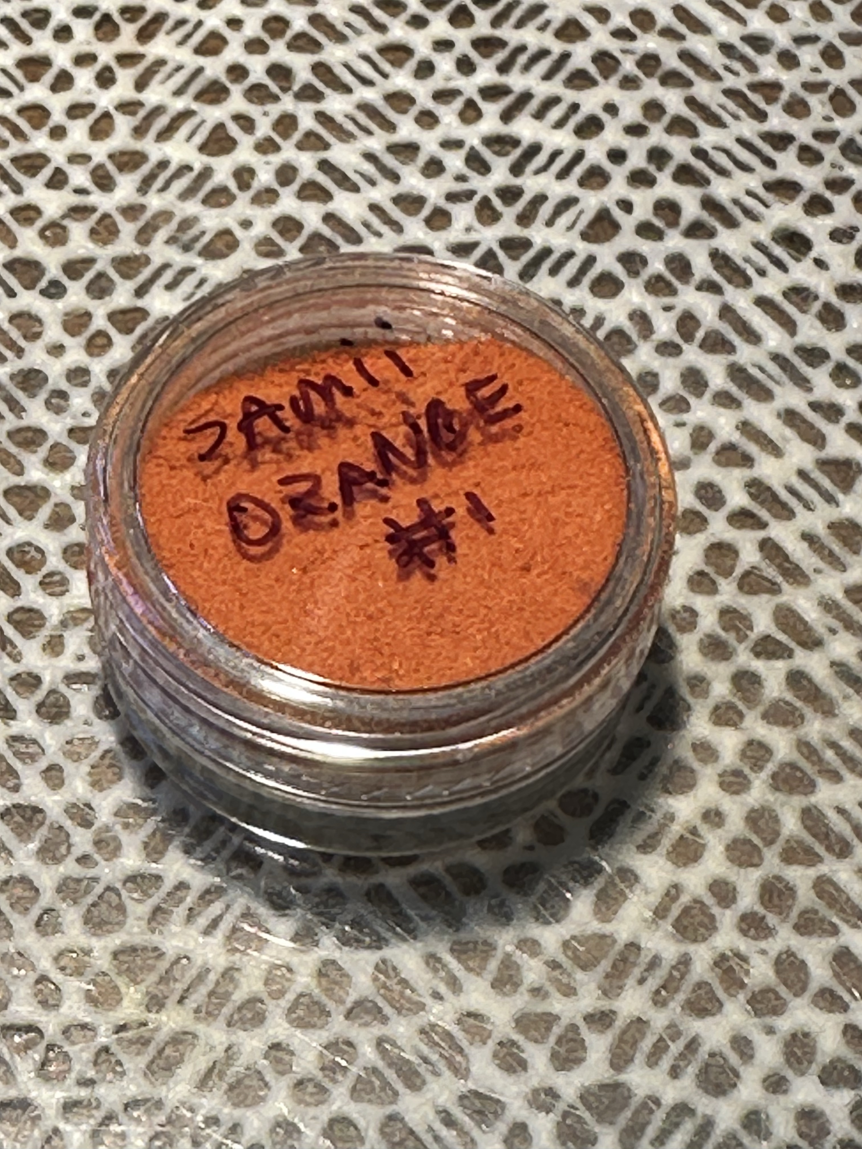
One of the other pigments I got was also leftovers from a dye project. My friend Samii worked on a leather dye, made with turmeric, saffron, and alum (also a lake pigment when it dried because of the addition of the alum as a mordant to the dye bath). It was violently orange in dry form. (the photo is close, but not quite there.) This one was pretty fine texture and did not need to be further ground in the mortar and pestle.
So, again, dumped the contents out, put the binder in, got it mixed. . . and I ended up with a paint that was literally the same colour as ketchup.

I made forbidden ketchup.
Now, in the work of making paint, some colours really do come out looking like food. It is critically important, though, to not actually eat them, even if they are made of a food-safe pigment (like turmeric or saffron). This one is no exception.
Samii Orange tends to be fairly transparent as well, and when I swatched it, the colour remained a fairly strong ketchup-y red-orange. This is where Calamus and I both discovered something interesting. I reported that I got forbidden ketchup. Calamus, though, reported forbidden Dijon mustard! “But how?”, you might be asking yourself (and maybe me, I dunno).
Process.
Both Calamus went “huh, that’s weird,” and we went down to our processes on how we made the paint. My process is pretty simple: plop pigment out, add commercial binder. Calamus’ is a little more different, as he makes his binder, and occasionally adds chalk white to increase opacity.
Bingo. Adding the chalk white knocked out enough of the orangey colour and lightened the paint to get to a much more yellow paint. (Just to double check, he also made a batch with just Samii Orange and got Forbidden Ketchup). Point is, comparing notes in the process is a great way to see the path and the story of a pigment.
Now, saffron, with enough sun exposure, should fade with time. I have not done any lightfastness tests with any of these paints, and with time, that may come. Until then, these are not as destructive as verdigris (which smells like hate and battery acid), but I’m going to exercise some caution before I go painting with either Lucia’s Lakes or Samii Orange on a scroll because I want my artwork to have some archival quality.
I’m going to be doing some catchup on some of the other projects I’ve worked on here. One of those items is the Egyptian palette that I covered in Egyptian Rainbows.
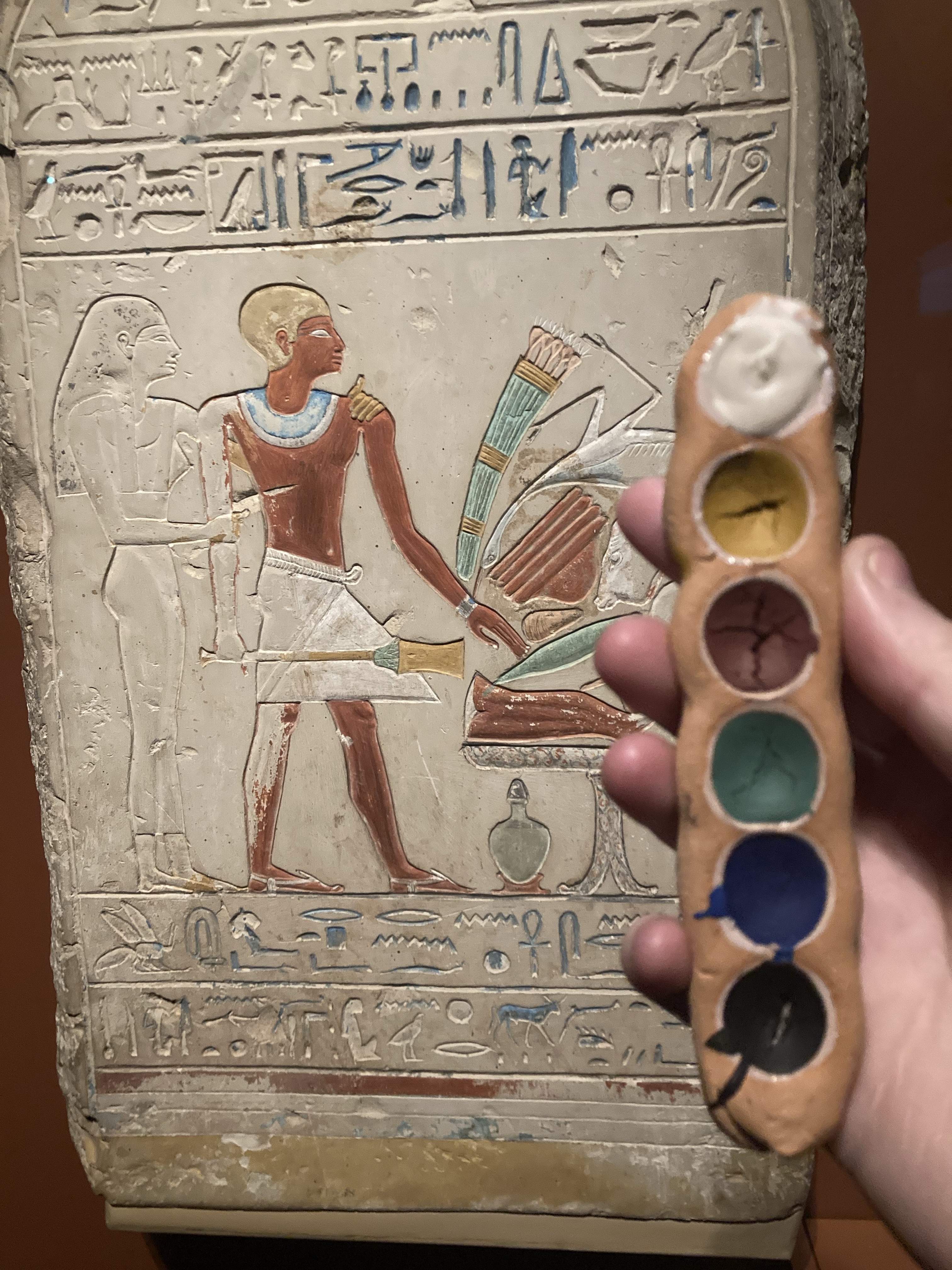
I used a titanium white initially, and I really wasn’t too happy with it. It looked far too antiseptic white, especially in comparison to the other fairly desaturated colours of the palette. I also have a bad habit of wanting to show my coworkers my projects, and in this case, the titanium white basically fell out of the palette.
Now, instead of getting upset, I replaced the titanium dioxide with eggshell white (or chalk white) and ended up with an even *more* period palette. The Egyptians used chalk white in surface preparation, and eggshell white is calcium carbonate at the end of the day, so as pigments are concerned, these are chemically the same, even if the name isn’t.
To check my work, I took the palette with the chalk white to my local museum, and played the “did I get close?” game. Looking at this piece from the New Kingdom era (the same era as the extant palette covered in the Egyptian Rainbows article), I’d say I got pretty close.
So, what are my future plans for this?
Well, I plan on making this again, but now, I have a piece of mammoth ivory (with papers, before you ask) that is almost the same size as the extant palette at the Met. I plan on carving this (and because it’s ivory, there will be a lot of handtools involved so as not to burn the ivory), and then will add the following paints into the carved palette: chalk white, yellow ochre, red ochre, malachite, Egyptian blue, and vine black. This might be one of the more bananas projects I’ve had, but it’s one that I’m excited to do. It’s just going to end up being a long-term project because of the scope. (and there may be some scope creep, but also, it’s a good excuse to put some of the skills I learned from carving tagua ivory to work)
As for the finished clay palettes – these will be given to Their Majesties Calontir to use as They see fit, complete with notes as to the time period and how to use the paint.
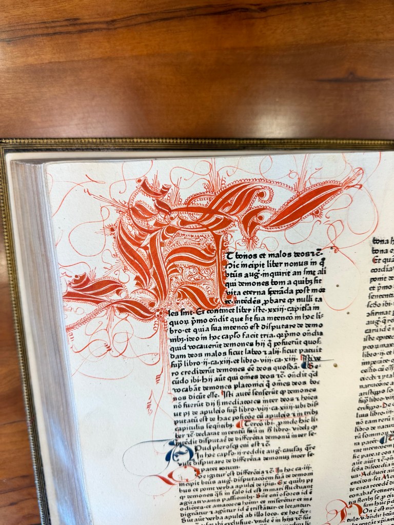
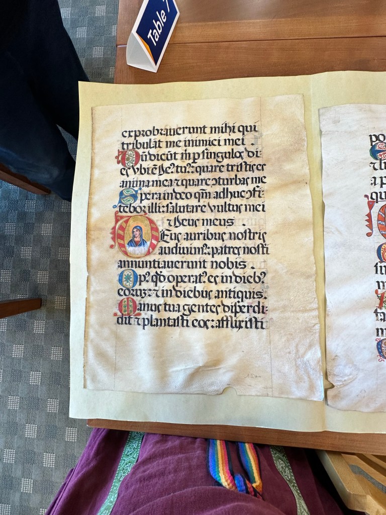
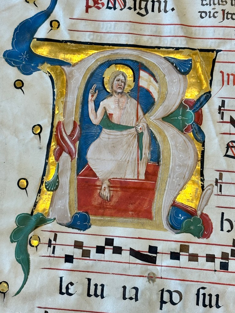
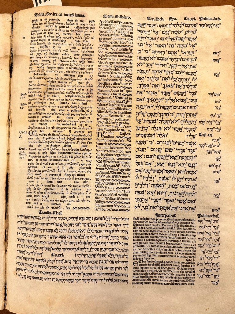
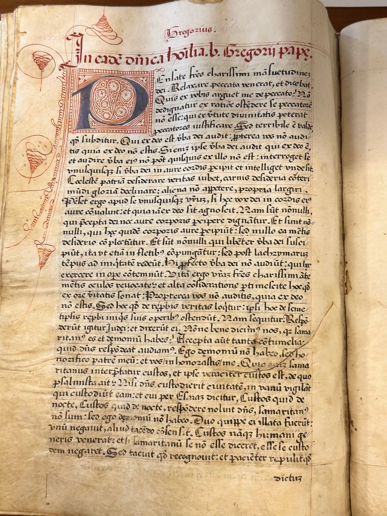
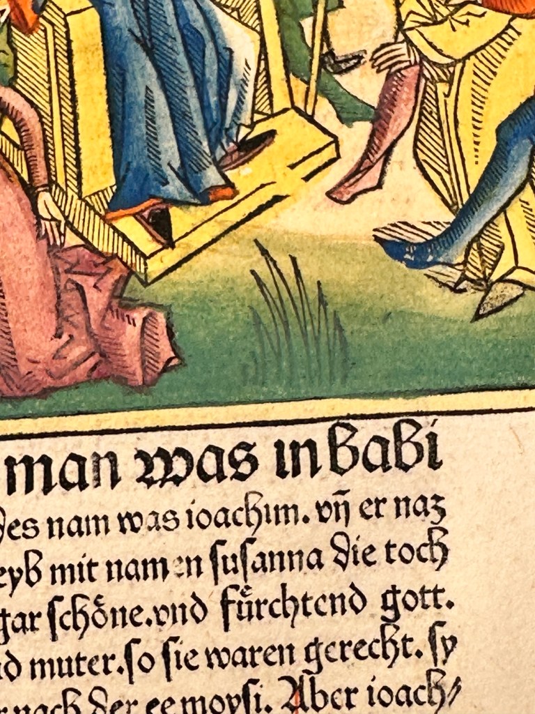
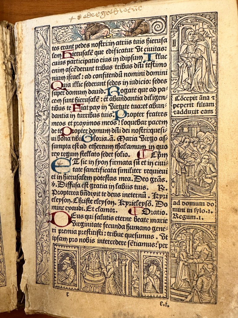
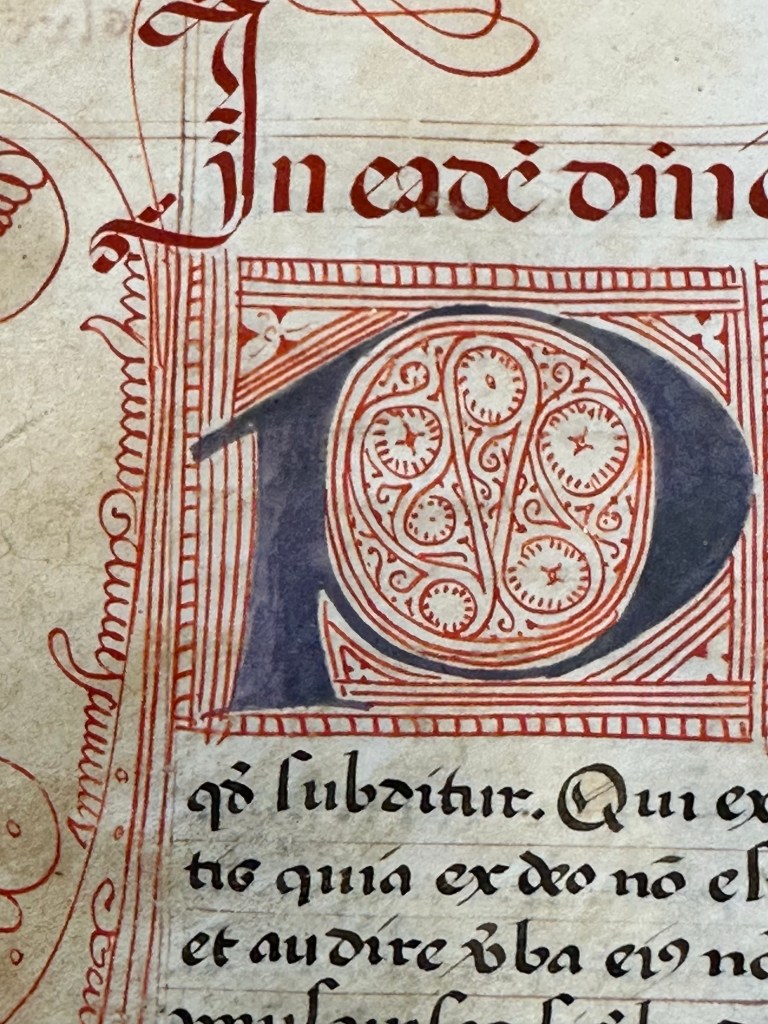
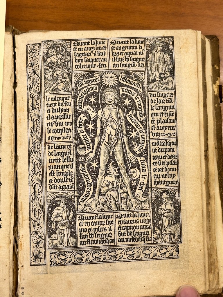
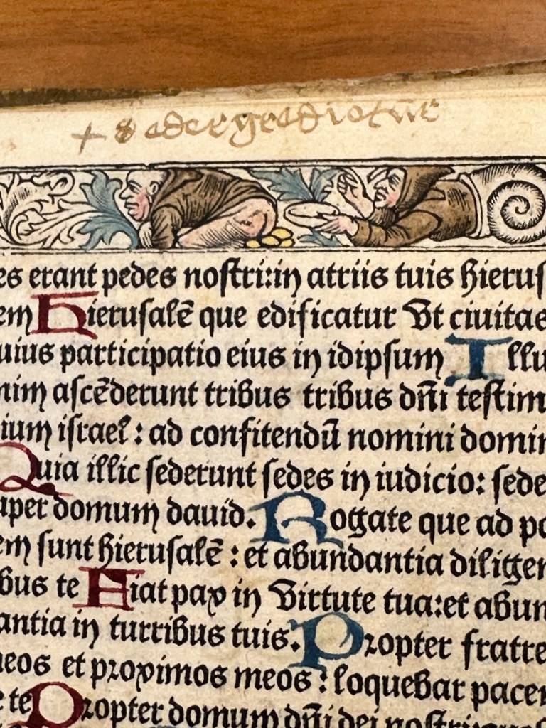
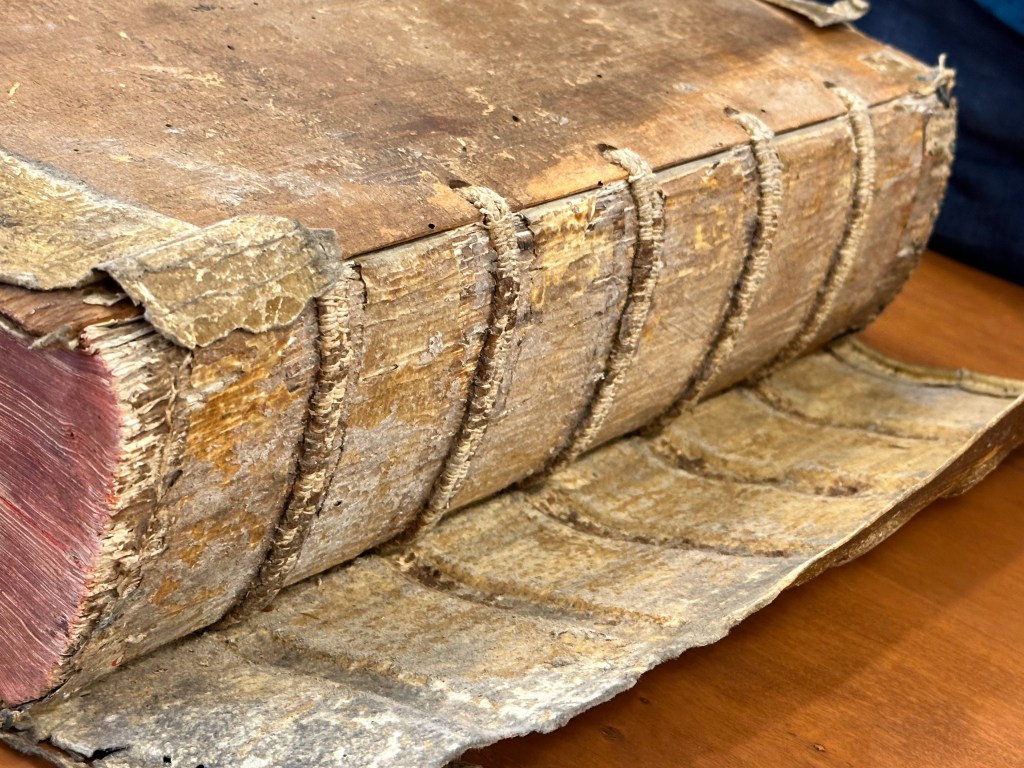
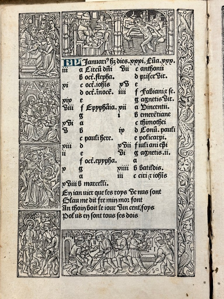
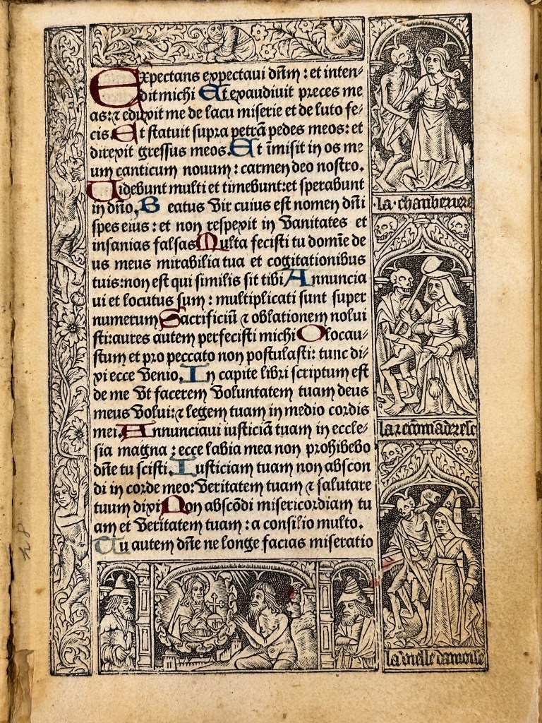
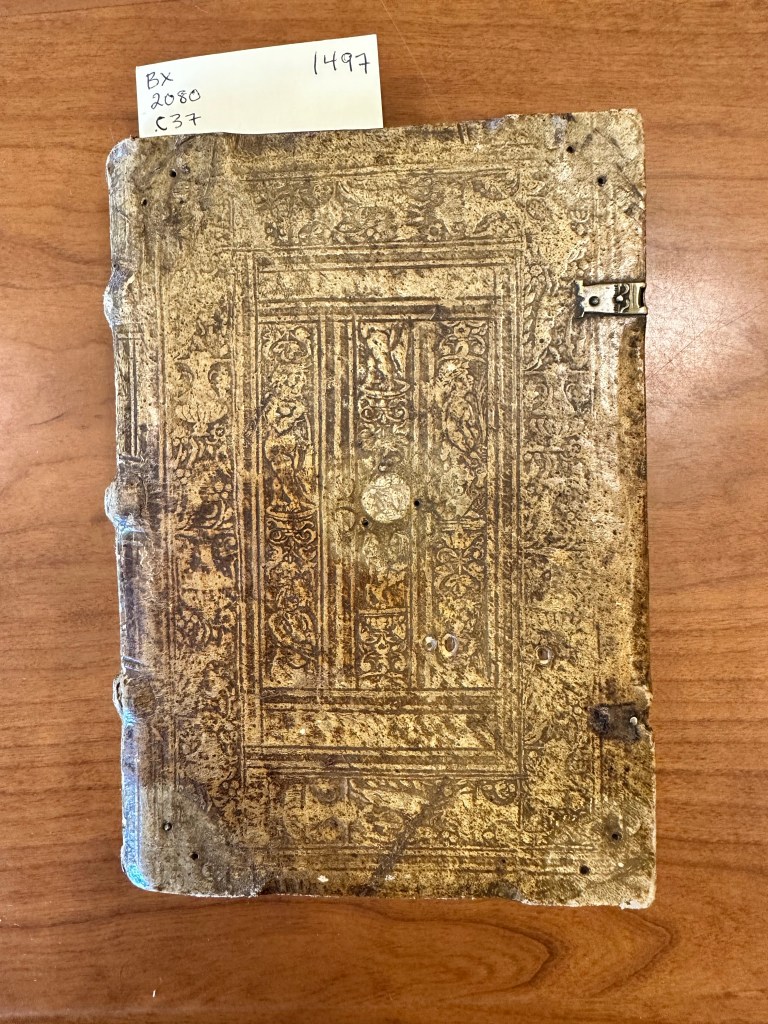
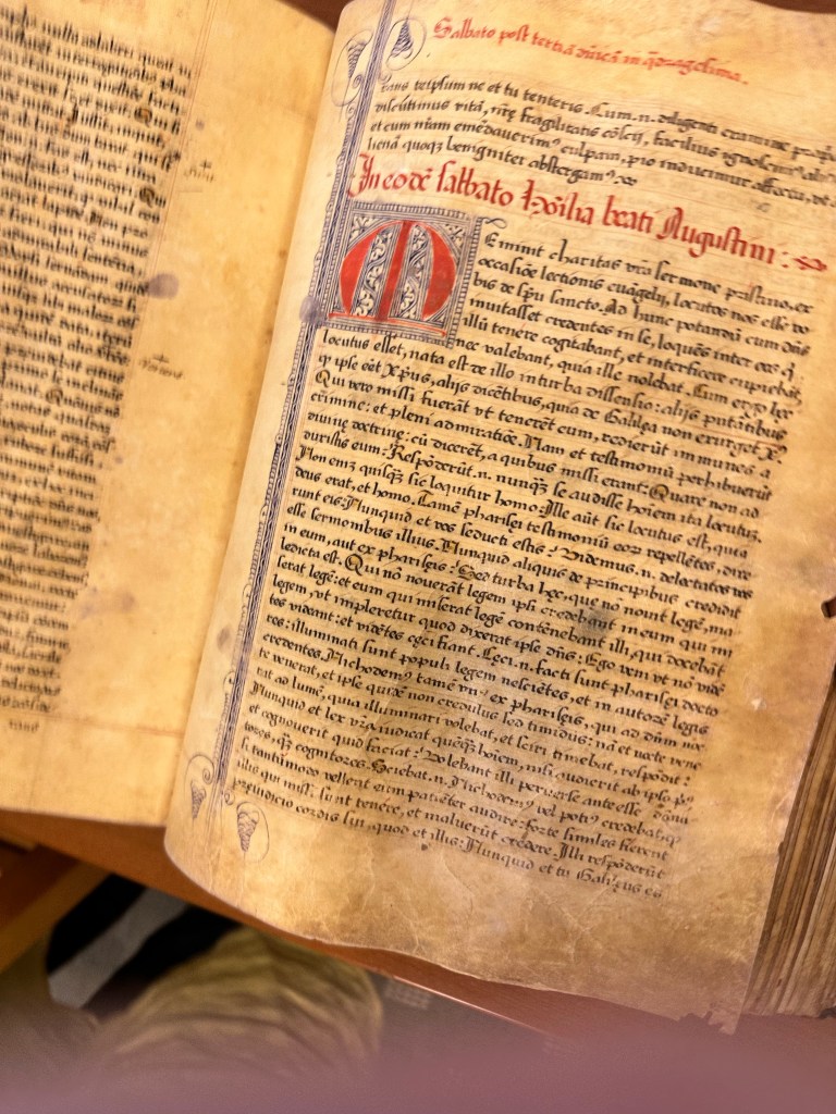
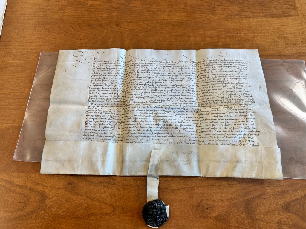
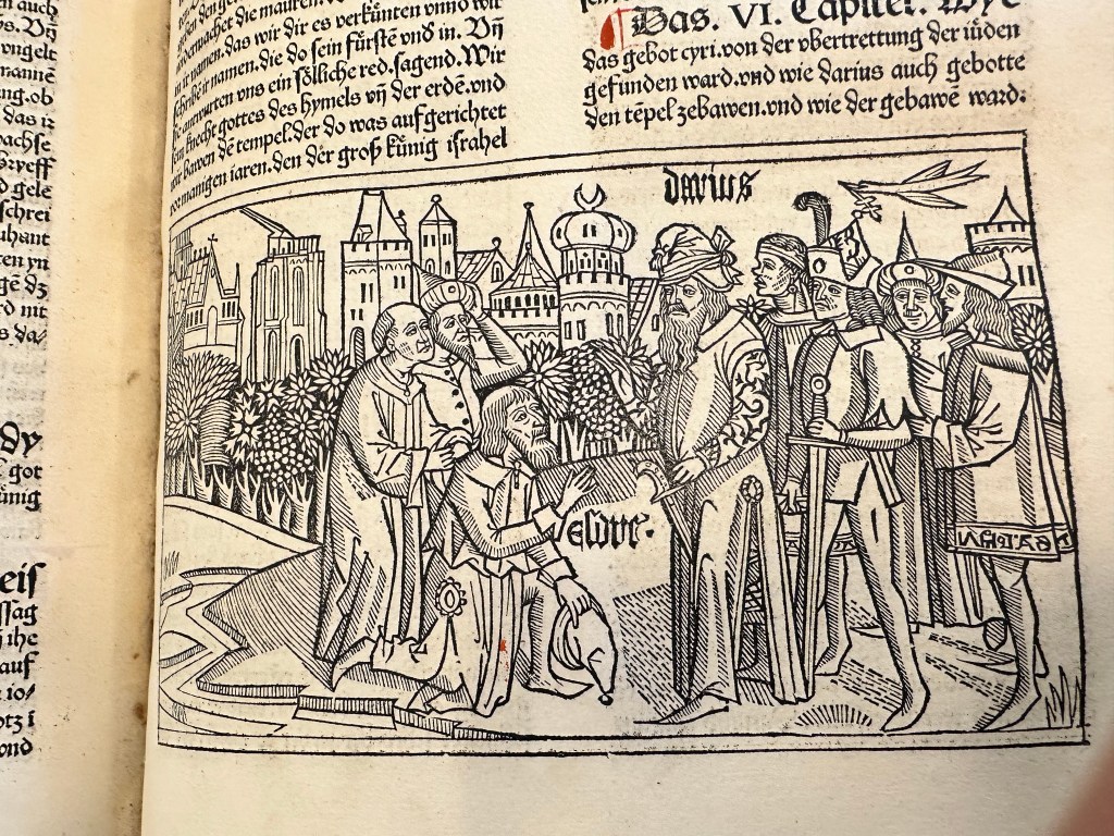
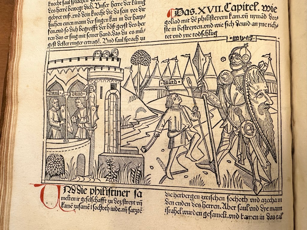
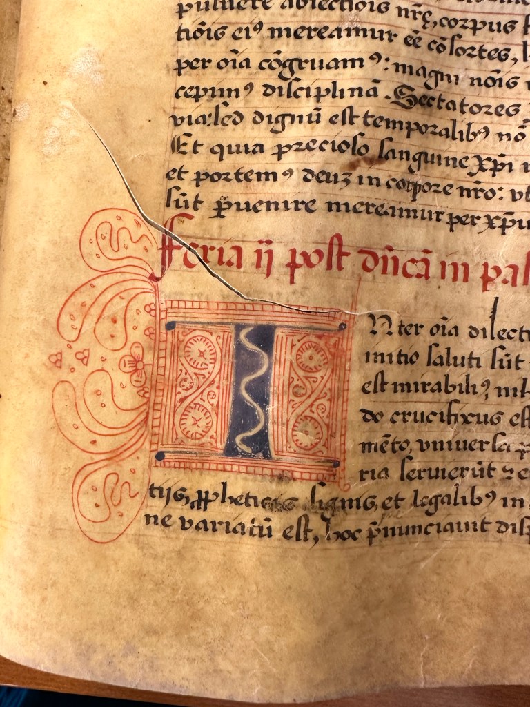
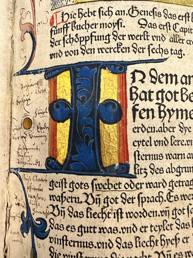
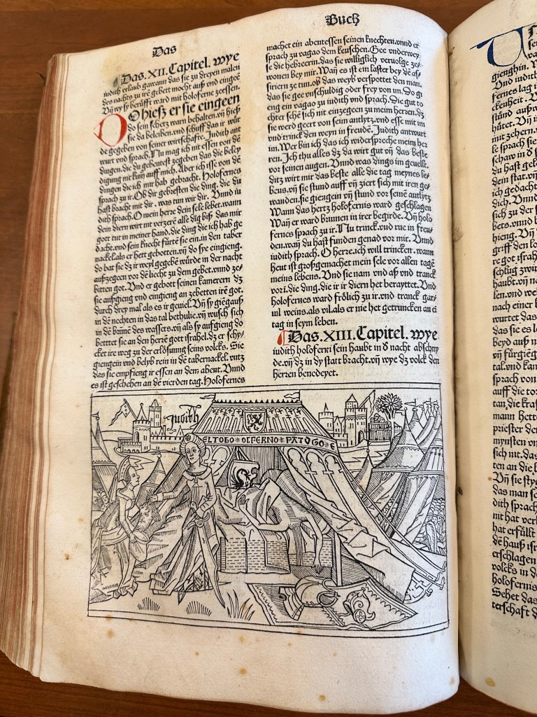
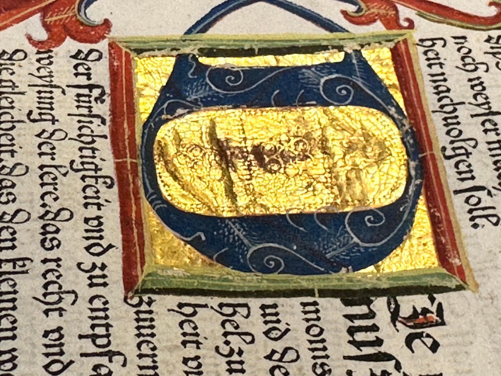
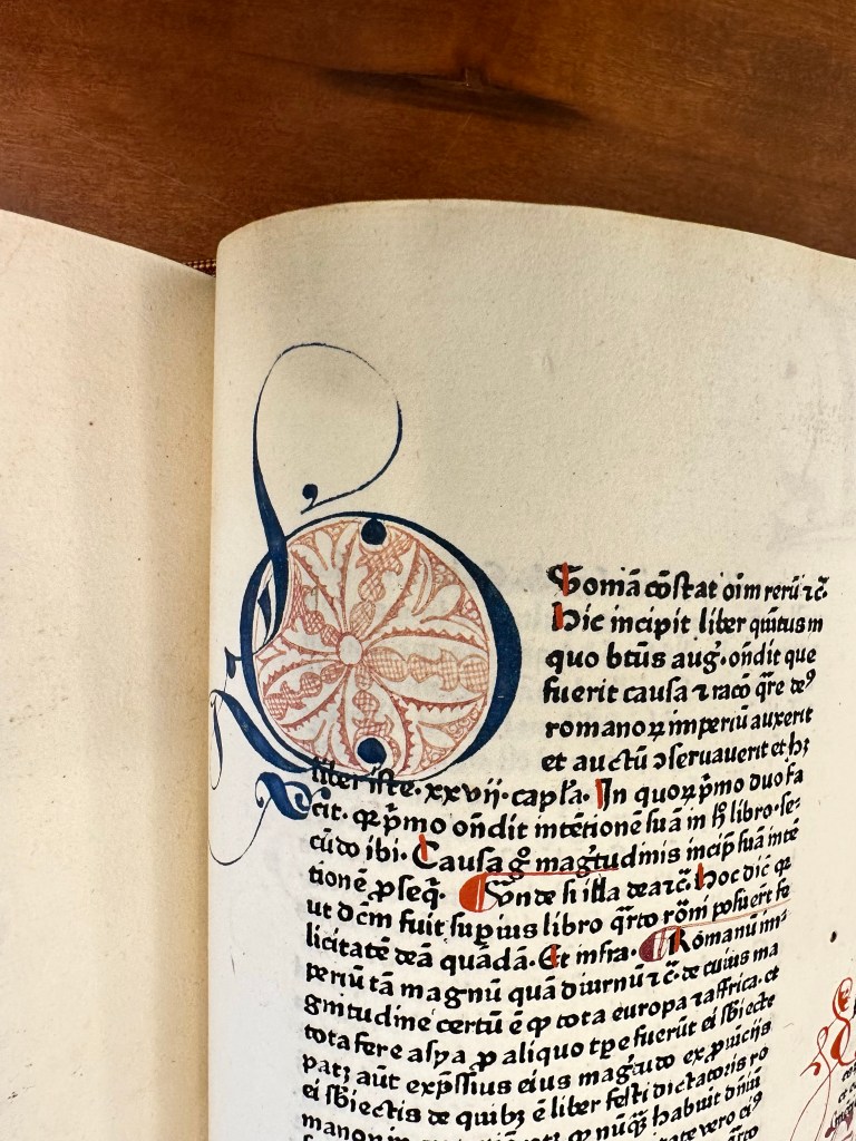
Back to KWHSS for a second. I did visit the special collections at Marquette, and got to handle manuscripts and incunabula and other documents from about the 12th to 16th centuries and yes, I got photos of a lot of items. Please enjoy the photos from this trip!