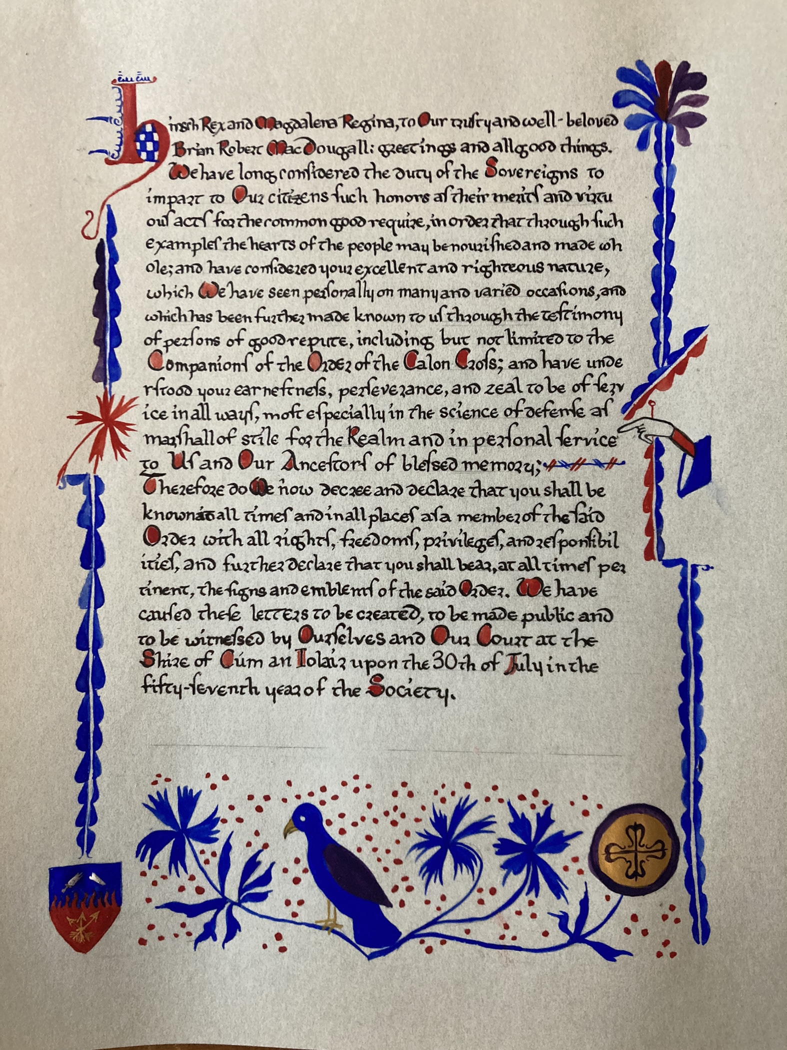
Generally, I try to post about a scroll when it gets presented, but attacks of life happen. This was one such scroll.
Back in July, I got asked if I could do a scroll for a friend (one of many that went out during the last reign), and I said that I could. With Brian’s wiki telling me that he has a 13th-14th century Irish Gallowglass persona, it definitely helped inform the scroll art I’d be doing. At this time, I had just finished two scrolls for Lilies, but had not yet settled on what I was going to do for Gwen’s Knighting scroll, so I had a bit of time to work on something.
I did know that I wanted to do two things. I wanted to really sink into the style of the piece I was basing the calligraphy and illumination on, and I wanted to use more of my period paint set. There’s not a lot of surviving Irish illumination or calligraphy out there, but there’s enough that I could put together my own ductus (that is, my own calligraphic style) based on the extant piece that I ended up going with. The text was written by the unparalleled Chiara, and I appreciate the chance to work with her words again and again.
I chose Harley 3724 because it fit in the time period, and as it wasn’t a legal text, there was plenty of room for marginalia. The original text contained Topography of Ireland, the Bull ‘Laudabiliter’ (f. 48), and various short religious texts in a combination of Latin and English. F.41 contained the bulk of my inspiration, having a border, flowers, and a fun little hand, which I used to point out why Brian was receiving his award.
A note about legal texts and SCA awards: most awards in the SCA are based on the concept of granting of arms and nobility. Most places have grants and patents of arms, and these are legal texts. The problem that I have as a scribe is that a lot of the really gorgeous grants and patents in period are largely ceremonial texts and are legal documents. Legal documents, from a scribal perspective (okay, my scribal perspective) can be pretty boring – a lot of times, they contain text, the arms, and maybe some flourishes or cadels, but that’s about it. Additionally, the timeframe where many of these grants come from is out of period or location for a good number of people (self included). It’s perfectly fine to desire to be as period as possible, but for many of us in the Society, we have to make some decisions that are wholly anachronistic, and this was no different. I kind of lucked out with Harley 3724, because it had more than just religious texts, but I looked at a lot of legal texts from Ireland in the late 13th and early 14th centuries and was just kind of underwhelmed from the art perspective. (and as much as I can do calligraphy, I really adore doing illumination.)
The paints I used were cadmium red and ultramarine blue, as well as my new standard Calontir purple (made with alizarin crimson and ultramarine blue), and then I mixed the cadmium red and the ultramarine together to create the rather muddy purple of the extant on the leaves, and I used a black fast-drying ink in my calligraphy (I think it was Noodler’s Bernanke Black, but don’t quote me). I did also use a tiny bit of my Finetec in his device and in the badge for the order, which were non-period conceits, but I knew he’d appreciate it.
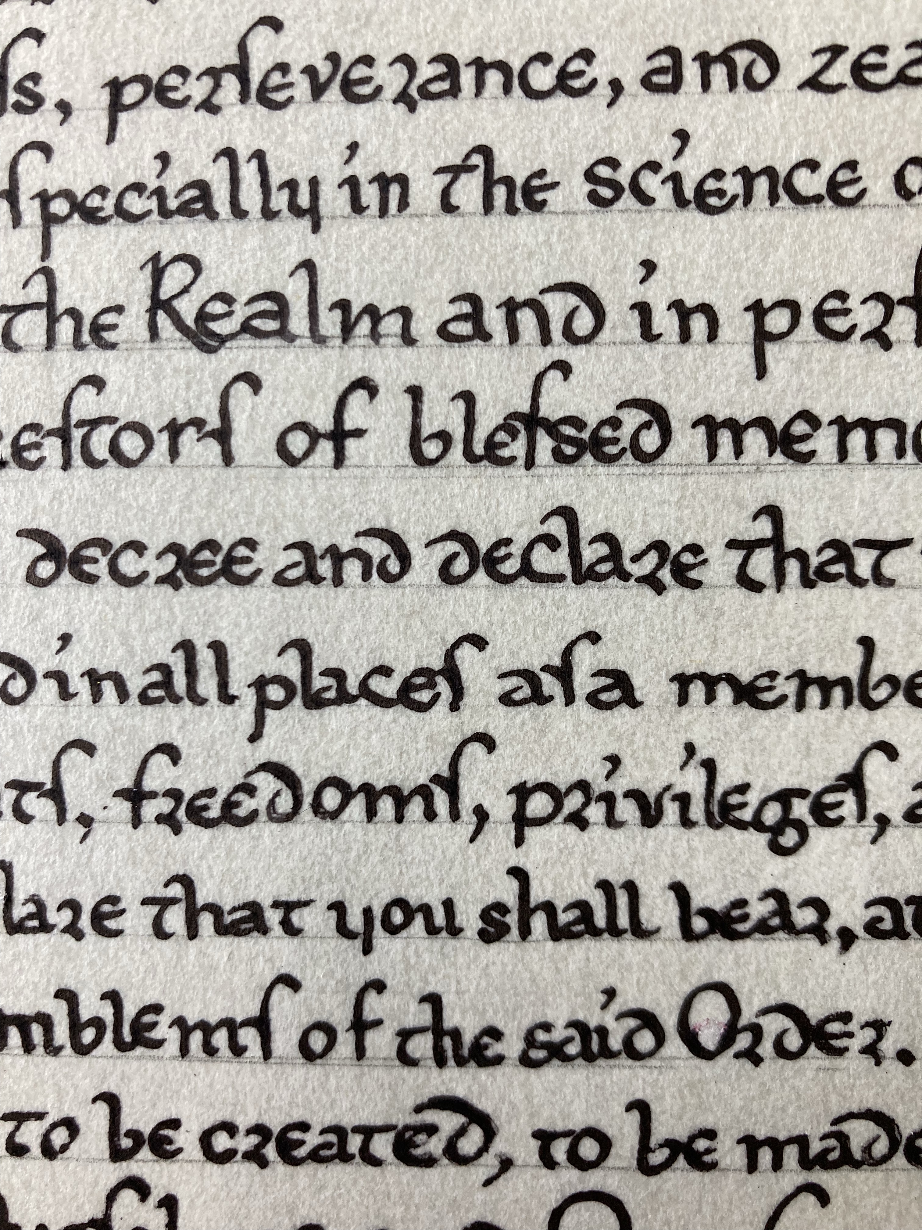
More about creating the ductus – I looked at individual letters in the extant, and if I could replicate them (I could, for the most part), and on a scrap piece of paper, and then I used this piece of paper to inform me of how I should form my letters. Of note, it was fun to create alternate letterforms for s, r, and others, but not as fun to go back and scrape when I forgot that I needed to stick with the letterforms. (It’s better to let things dry before scraping, and it’s even better to attempt the letter it should be, let it dry, and then scrape carefully around the letter. Especially on perg. Otherwise, it’s scraping everything and then burnishing everything, and I’ve never been particularly successful with that.
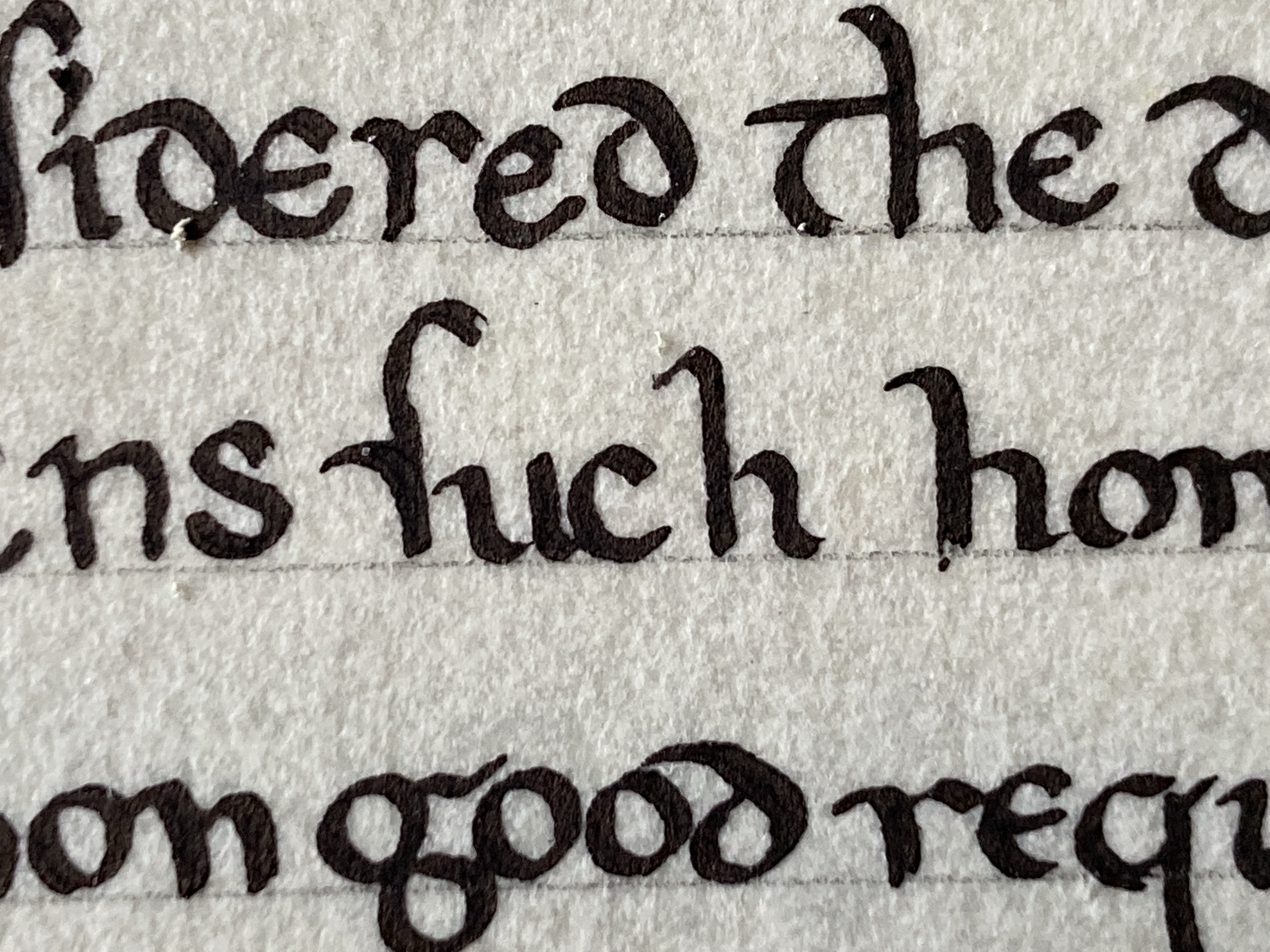
So, the thing about alternate letterforms is that sometimes, unintended consequences of letterforms we’re not as familiar with (looking at you, long-s) mean that some words look far more rude than they’re actually meant to be. See also this instance of the word “such,” which, because of the long-s looks like another word that probably shouldn’t be said in front of the kids.
One of the things I particularly loved about this scroll was that everything was basically in the same case – capital letters were marked with a bit of paint. I suspect the extant actually used ink, however, I had paint, and I loved the bright red with the cool tones of the ultramarine. One of the things I did do to make the paint look more like ink was watering it down, and then using it with a fairly watery brush. I just had to be aware that the ink I was using was not waterproof, so I had to use it very carefully. I also loved using the hand element (pointing to the word “service” as Brian was being inducted into the Order of the Calon Cross, Calontir’s Grant order for service).
The good part was that because this particular scroll was simple enough, it was done in a couple of weeks. (I was also unemployed at the time, so I had time to dedicate to getting it out the door as well.) Unfortunately, I think, for all of us, Brian had an attack of life, and was not able to be present at the event it was supposed to go out at, nor at other events. But, he was able to come to an event, and it had the chance to be presented to him there, and I’m pleased that not only do I have a new brother in the Order, but that I could do this scroll for him.
The wait was absolutely worth it. Welcome to the Order, Brian.

OOOOH! I love that! I feel like it would be better to look at in person.
LikeLike
The blue is especially strong, which I particularly like about it.
LikeLiked by 1 person
What pigment color is it? It’s beautiful.
LikeLike
It’s Kremer’s ultramarine, deep. It’s my favourite.
LikeLiked by 1 person
Ooh. I’ve always wanted to try Kremer’s Paints but they’re wayyy too expensive. You make me wanna splurge. *o*
LikeLike
So, this is more of my handmade paint, made from Kremer’s pigments. Definitely worth the splurge, but it is inexpensive in comparison to some of their other blues. (Definitely go with their synthetic ultramarine.)
LikeLiked by 1 person
Ahhh. That’s a good idea. I’ll consider that!
LikeLike