As a scribe, I’m often asked what I use for my gold paint, and that’s where I kind of hem and haw a bit. You see, like any other art nerd, I have collected a few different supplies here and there, and have experimented, and well, now I have a post coming.
I’ve gathered the gold I have on hand and have taken photos of how the paint looks dry. I used Fluid’s hot press 140 lb/300 gsm block, not pergamenata/vegetable vellum, mostly to show the types of gold on light-coloured substrates, but also because it’s a similar smooth texture to perg. I have, however, experienced pretty decent coverage on pergamenata with all of these paints.

Each section will have two photos – one with a direct light overhead and also indirect light in the room I was working in. It was a cloudy day here on the day I took photos, so the light is particularly dim, but I think it gives a pretty good idea of what to expect in most home displays. I only did one layer of paint, just to give ideas of what coverage would look like.
I also broke these up into two different categories: pans and tubes. Pan paint takes a bit to rehydrate, so I took a dropper of clean water, added a drop of water to the pans, and let it sit for a couple of minutes. Tube paint, though, is soft and doesn’t take much water to become useable (unless one lets it dry and sit in a pan, in which case, it still doesn’t take too much to get to a point where it’s paint-like).


First off on the list is the Kuretake Gansai Tambi Starry Colors (Amazon, Blick). This set of paints from Japan are pretty soft, meaning that it doesn’t take much time (at most 2-3 minutes) to rehydrate the paints. This six pack of paint has a pretty wide variety of shades in fairly large quantities. The colours reviewed are Blue Gold No.901, Red Gold No.902, Yellow Gold No.903, Champagne Gold No.904, Light Gold No.905, and Silver No. 906. It doesn’t cover as well as I’d like (ideally, it needs a couple of layers for a good depth of colour), but for a beginner, it’s a great, inexpensive metallic watercolour set.
You’ll see that at least with direct light, they’re pretty shiny, though in indirect, you can see that with one coat, it’s perhaps not quite enough coverage. That being said, even with the coverage issues, I find that the colours run true.
Downside is that pans aren’t sold on an individual basis, so if a pan runs out, a whole new set has to be purchased, though the sets are pretty inexpensive.
Verdict: These are a great gateway paint to metallic paints, especially for SCA use. For scrolls, I’d use Blue Gold No.901 or Yellow Gold No.903.
Next up are the Coliro round pan gold set. (John Neal, Amazon) This set has a very similar colour scheme to the Kuretake, though the names are a bit different. The colours reviewed are Tibet Gold, Inka Gold, Arabian Gold, Gold Pearl, Moon Gold, and Sterling Silver.
These are a bit harder than the Kuretake, and I find that water needs to sit a bit longer in the pans – about 4-5 minutes – to get nice and creamy. The coverage is good, and I find that the quality of the shine is really high. Tibet Gold is a bit more brown than I’d like, but I’ve used Arabian Gold and Gold Pearl with good effect on scrolls. Shades blend well with one another (great for doing dimensional work). However, because the pans are filled a certain way, voids in the pan do form. It is possible to get replacement pans from John Neal at a decent price, however, I have yet to find them in a local store. Additionally, the Coliro sets come in fairly flimsy plastic packaging, which I’m not fond of using if I have to mix a particular shade. In my experience, I find that this sticks the best to pergamenata.
Some scribes have even been able to use these with their dip pens. I have not had that luck, but I am not exactly well known for my calligraphy.
Verdict: Again, a good starter palette, though I’m not fond of the plastic packaging. For SCA scrolls, I’d use Gold Pearl or Arabic Gold.
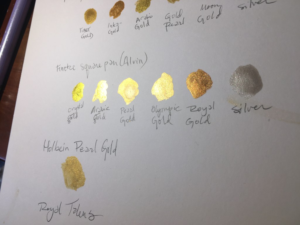

FineTec (not to be confused with Coliro; is distributed by Alvin here in the US) (Blick) is a separate company with a similar name with a slightly different formulation than the Coliro. I find that these paints are far more shiny than either the Kuretake or the Coliro. The price point, though is a bit higher, with individual pans priced out to about $7 each, versus the Coliro at about $5.
The palette that I tested does not have the same colours as the other gold palettes, however, many of the same colours are in the 24-pan set as the 6 pan gold set. I tested Crystal Gold, Arabic Gold, Pearl Gold, Olympic Gold, Royal Gold, and Silver. The pans for the Finetec are metal (the noted exception is the 24-pan set, which has a plastic bottom with a porcelain-enameled metal lid).
The amount of time it takes these to get ready is similar to the Coliro – about 4-5 minutes, with similar coverage. This, though is where I feel the comparison ends. Due to the slightly different formulation, these have a different sheen, making them look more metallic than the Coliro. It’s hard to see in the photo, but in real life, the difference is pretty clear. That being said, I have had some issues with FineTec sticking to pergamenata, and like the Coliro, due to the process in filling the pans, voids are found, and may be in some inconvenient locations.
Verdict: the metal container, as well as the coverage are absolutely worth the splurge. The depth of colour really is fantastic. For scrolls, I would use either Pearl Gold or Olympic Gold.

Back to Coliro for about half a second. John Neal carries Coliro’s Heart of Gold pan, and while this is a beautiful little pan, I find that the colour just isn’t quite right for a SCA-type scroll, as I find it’s a closer to a rose gold rather than a true gold.
Like the other Coliro pans, water needs to sit a bit longer in the pans – about 4-5 minutes – to get nice and creamy. The coverage is good, and I find that the quality of the shine is really high. Unlike most Coliro pans, this one has an embedded heart of gold paint in the center of silver paint, allowing for variances in colour. It’s a beautiful little pan, and while there’s a lot of bang for the buck for the amount of colour, it is difficult to get a good consistent colour.
Unlike most Coliro pans, it is a bit more expensive at $7.50, but this is more than likely due to the extra work of embedding the gold heart. This is a special edition paint, and while I don’t want to dissuade people from purchasing it (it is so gorgeous), I have a hard time justifying use of it in medieval-style art.

That being said, though, if you’re interested in experimenting with shading, or as an effect for modern work, this is a great pan, with some beautiful colour in it.
Verdict: Fine for non-medieval pieces, less okay for medieval ones.
That’s it for the pan watercolours. Up next are the tube watercolours!
Tube watercolours are just that – paints in tubes. Admittedly, I don’t have as many as I’d like, but I’ve mostly stuck with paints that I’d describe as Old Faithfuls of the scribal world. Because these are paints that are coming out of tubes, they are the softest of all of the paints I’ve reviewed. It doesn’t take much water to get these to a workable texture, and finding them at any average art store is pretty easy, as well as on the whole relatively inexpensive.

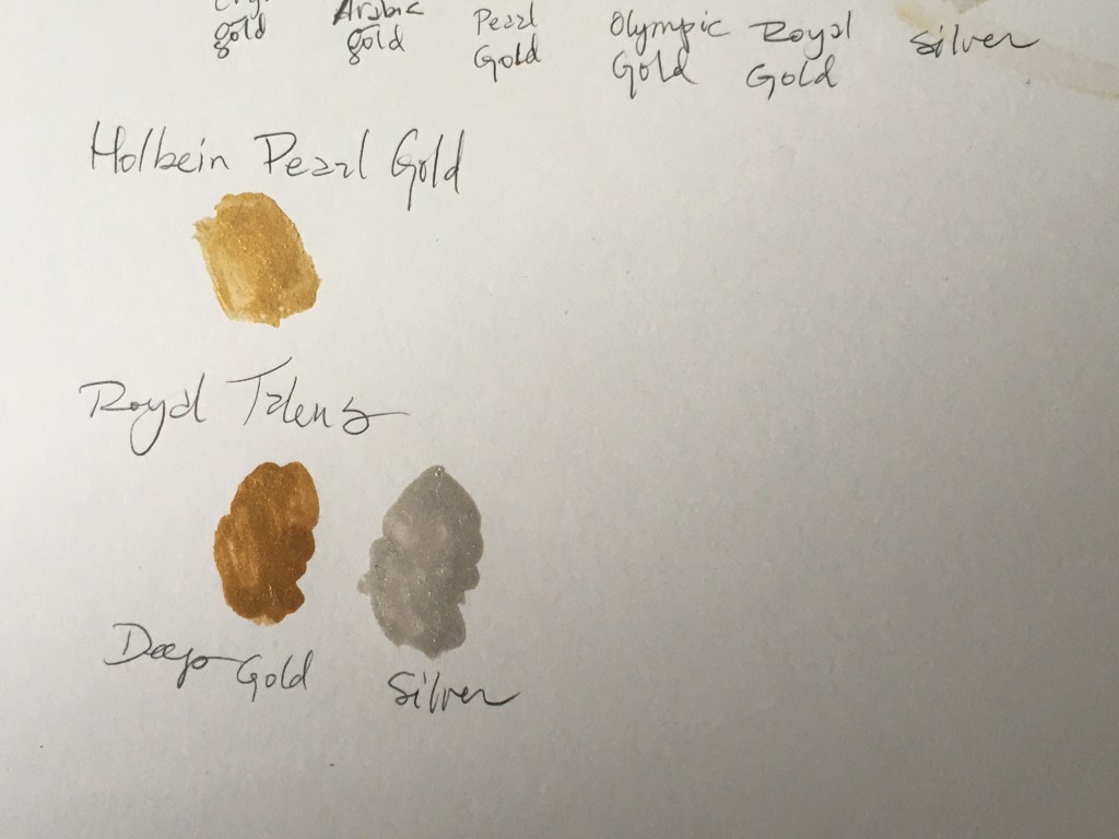
First up is Holbein’s Pearl Gold. (Blick, Amazon). For many scribes in the Society, this has been held up as a standard of scribal work. It’s relatively inexpensive (around $12/ 15mL), and is easy to work with. It is also a bright gold, smooth as silk, and covers well. It also rehydrates well, and doesn’t take much water to get to a workable consistency.
Holbein’s Pearl Gold is also a gold that looks similar to shell gold, as it’s a bright, yellow-y colour, and it has a gorgeous sheen to it.
I will admit that I don’t use it as much when I’m painting scrolls (I’ve really fallen in love with the FineTec), but it’s still a good standby, especially for people starting out. It doesn’t take too much paint to really add to a piece, and with it being accessible at both big box and smaller art stores, it’s a pretty easy way to really add the look of medieval art without too much additional investment.
Verdict: This is a staple, and has been for several years. If you prefer the texture of tube paints, I absolutely recommend this paint.
I have a soft spot in my heart for Royal Talens (Blick, Amazon) – this was the paint I used when I first started doing scribal over a decade ago. I lucked out and ended up getting several large tubes for less than $50, which might explain why I still have so much of it today. That being said, the paints (and especially the metallics) really aren’t that bad. The coverage is nice, and with the tubes being 20 mL, there’s a lot of paint in there. The silver is nice and bright, and while I purchased the deep gold (and not the light gold), it still doesn’t look egregiously out of character for a period piece. It doesn’t take much paint to cover large areas of scribal real estate, either.
Downsides: the paint is soft, though there are occasionally some grinding problems where the pigment is a bit clumpy. Even then, it has a good depth of colour, and the silver stands out really nicely (and I think better than most of the other paints on this list). It does take a bit more water to rehydrate after being allowed to dry, especially in comparison to the Holbein.
That being said, I’ve had a difficult time finding it at my preferred art stores, as well as the aforementioned grinding problems (it could have been that batch, but I’ve seen it within their non-metallic paints, too).
Verdict: If you can find it, try it out. It is inexpensive, and covers well, so a tube lasts for a while.
That’s it for now! I’m always searching for new paints and processes for adding gold to our artwork, and who knows – there may be more reviews like this in the future.

Pingback: So You Want To Start Scribal: building your scribal box | konstantia kaloethina
Pingback: Interkingdom Shenani-plans | konstantia kaloethina