In Roman Rainbows, I talked about making paint from commercially made pigments based on texts like Pliny the Elder’s Natural History and reports, such as the paper by Celestino Grifa et al. in the Journal of Archaeological Science. But, not everyone wants to make their own paint or has the ability, time, money, or other resources to make their own paint. There may even be health considerations of the painter or others in the home environment, too. This is, of course, perfectly okay because what we do is a hobby. And, as someone who sells my own paint, I’m also not able to go to a ton of events with my paint so people can shop in person.
That said, I’m also really big on giving people the tools to create the same look while also not going broke, because again, this is a hobby, and we are modern people with bills to pay and other places to spend money besides our reenactment hobby.
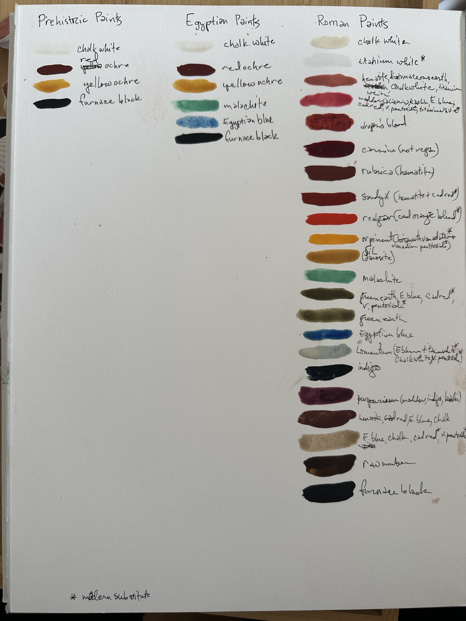
So, I’ve gone through the entire list of paints outlined by Pliny the Elder in the last project, and cross-referenced it with three other commercial paint makers.
Every pigment contains a number, and being able to cross-reference these numbers with makers will give you a better idea of how to replicate the general look of a period piece with modern materials. Also, some colours might be made with another blend of pigments, and these have the word “hue” in the name. So, alizarin crimson is not a particularly lightfast pigment, but alizarin crimson hue is made of a bunch of other pigments that are.
Keep in mind that colour is extremely subjective, and even individual paints can vary by brand and by pigments used, even among paints with the same name and from batch to batch and even from monitor to monitor. My main resources for determining good matches were The Art is Creation, Color of Art Pigment Database and Artists Pigments.org, with both describing the pigments used. The three brands I used were Winsor & Newton, Holbein, and M. Graham, as these tend to be the most common in SCA scribal circles, but please do your own research if you use a brand that isn’t listed here.
Of course, you are absolutely welcome to make your own tests. Some brands even produce dot cards with dots of paint to sample things out. You might find that you also like making blends from two or more colour to come closer to what you want. And, of course, it’s perfectly okay to mix paints from different brands together.
Without further ado, here’s my breakdown.
Red
Rubrica (hematite) was probably the easiest for me to find as red ochres and oxides are still in use as pigments for paint. If you’ve seen red ochre or Burnt Sienna, these are earth pigments with a long legacy in the pigment world. For modern usage, check out Winsor & Newton: Red Ochre or Venetian Red, Holbein: Chinese Orange or Burnt Sienna, or M. Graham: Burnt Sienna.
Red (Minium – red lead) and Red (Cinnabar), while being chemically different (though frequently confused for one another) make similar colours: a bright, brilliant orangey red. For this, Cadmium, Napthol, or Pyrrhol red pigments all work well to substitute for this colour, though Napthol and Pyrrhol Reds are generally a little more transparent than Cadmium Reds. Winsor & Newton: Flame Red, Holbein: Cadmium Red, M. Graham: Naphthol Red or Pyrrhol Red
Red (Dragon’s Blood) is a warm, blood red. This was perhaps a bit harder for me to match, this red tends to be strongly red, but dark and warm. Much of the commercial paints out there typically do not use this pigment as it shifts brown and fades easily. That said, if you want to replicate the look of it, try W&N: Perylene Maroon, Holbein: Cadmium Red Purple or M. Graham: Alizarin Crimson. You may need to add a warmer colour to ensure enough brown tones come through for the Alizarin Crimson.
Red (Kermes) is a medium to dark red, which can change colour depending on the pH of the base of the precipitate the dye latches onto. Generally, though, this red tends to be a pretty decent neutral to blue-red colour, and the use of alizarin (another deep blue-red) can mimic the look pretty well. Additionally, madder, where alizarin derives from naturally, was known to the Romans within period. For commercially made paints, try W&N: Alizarin Crimson, Holbein: Carmine, or M. Graham: Alizarin Crimson.
Orange
Oranges tended to be made either from earth pigments (mixing yellow and red ochres together) or from realgar, which is arsenic sulfide (known as sandarach to the Romans). While cadmiums also are toxic, it takes a lot of cadmium to get acute cadmium poisoning. For this reason, I’ve included cadmiums on this list, but a few of the commercial paint makers do make cadmium-free formulas for their products. The orange used by the Romans tended to be a bright, intense orange.
My recommendations for this bright orange are W&N: Cadmium Orange or Cadmium-Free Orange, Holbein: Brilliant Orange or M. Graham: Cadmium Orange mixed Naphthol Red or Pyrrhol Red. If you would like to try mixing an earthier orange, try mixing W&N: Red Ochre or Venetian Red with Yellow Ochre, Holbein: Chinese Orange or Burnt Sienna with Yellow Ochre, or M. Graham: Burnt Sienna with Yellow Ochre.
Yellow
Yellows, like reds and oranges, was often derived from either earth pigments, or highly toxic materials. In this case, orpiment, another arsenic sulfide (and both realgar and orpiment were found in the same deposits), which can cause a lot of other health issues. In light of this, pigments such as cadmium, azo compounds, and combinations like bismuth vanadate fill in a lot of the gaps on less toxic or non-toxic formulations.
For a way to replicate orpiment yellow, try W&N: Permanent Yellow Deep, Holbein: Permanent Yellow Orange or Marigold, or M. Graham: Gamboge. Transparency might be an issue, so definitely experiment and find a good strong matte pigment for your use. Orpiment is on the orange side, so try to find a more orange-toned yellow.
For earthier yellows, ochres are still used for commercial paints, but to match the paler yellows that were in use by Roman painters, consider adding in a mixing white (zinc white, for example) to better match the tone of pigments like jarosite. Consider W&N: Yellow Ochre, lightened with some Zinc White, Holbein: Naples Yellow*, M. Graham: Yellow Ochre, lightened with Zinc White.
*A quick note about Naples Yellow: in (slightly later) period, this was a lead-tin antimonate. Holbein’s pigment use is Cadmium-Zinc Sulfide, Hydrous Iron Oxide and Titanium Dioxide. While not as toxic as the period Naples Yellow, cadmium is still toxic.
Green
Greens in Rome were either made from malachite or from earth pigments (or a combination of green earth and colour correcting red, yellow, and Egyptian blue). The hard part is that malachite as a pigment has a tendency to become more grey the longer it is ground or mulled, and the expense and levigation to get a brighter green is more time consuming than developing a close enough solution. For malachite, a sharp, light, nearly turquoise green, you may need to mix colours to get close enough. I recommend W&N: Cyprus Green, lightened with Zinc White, Holbein: Cobalt Green Pale, Turquoise Green, or Cyprus Green, all lightened with Zinc White, or M. Graham: Viridian lightened with Zinc White.
Likewise, earthy greens are not always produced by commercial makers. Terre verte has a tendency to not be a strong pigment (it wasn’t in period, either), in that it has low tinting strength and low covering strength, but it is a powerful pigment to have in your paintbox, nonetheless. Neither Winsor & Newton nor M. Graham carry terre verte in their gouache catalogues (but W&N does in their watercolour line), so if you want this particular shade, you can try to mix it or you can mix paint brands and use Holbein’s Terre Verte. W&N: No true substitute for a green earth pigment; try mixing Yellow Ochre with Sap Green and Zinc White, Holbein: Terre Verte, Olive Green, or Moss Green, M. Graham: No true substitute for a green earth pigment; Hooker’s Green mixed with Raw Umber
Blue
With the exclusive bright blue of the Roman empire being Egyptian Blue, finding a substitute for this grainy, glassy frit-based paint means that while a colour match was possible, a texture match might not be. Egyptian Blue is a bright, almost sky-blue paint with high lightfastness, but very low coverage. Blues that could be used are W&N: Cerulean Blue or Sky Blue, Holbein: Cerulean Blue or Peacock Blue, or M. Graham: Cerulean Blue.
Indigo was also a pigment used by Romans, and while some companies use indigo, most don’t. Instead, a pigment called Prussian Blue, the first modern synthetic pigment, could be used to mimic the appearance of indigo given its dark blue appearance. Indigo tends to be a little less lightfast than Prussian Blue, and Prussian Blue is an actual pigment, whereas indigo is a dye that has to be precipitated onto a metallic salt for it to be used as a pigment. For paint, try W&N: Indigo or Prussian Blue, Holbein: Katsura Blue or Prussian Blue, or M. Graham: Prussian Blue.
Purple
Tyrian purple is extremely time consuming to make a tiny bit of dye, so you need to process a lot of snails (one gram of dye needs 10,000 snails). These two aspects combined make for an extremely expensive pigment. Thankfully, we do have evidence that similar colour was achieved through mixing indigo and madder. Furthermore, with modern pigments like quinacridone violet and dioxazine violet, humans have been able to develop colours that mimic this expensive dye. Tyrian purple does come in a range of blueish purples to almost brownish maroon, so feel free to make your mixes as you need to. W&N: Perylene Violet, Holbein: Mix of Rose Violet and Violet; might need a bit of brown mixed in, M. Graham: Quinacridone Violet
For that purple hematite colour, try colour matching. None of the brands presented in this particular post have the more purple type of hematite as a part of their paints, however, try seeing what is out there. Try mixing browns like raw sienna with a bit of purple to replicate the purple found at Pompeii.
Brown
Earth pigments are fairly easy to get a hold of. Several of the ones from antiquity are still in use today: siennas, umbers, ochres, and oxides. For this project, raw umber was the dark brown that I saw most often, and with a dark brown-green cast to it, it’s the one I recommend for replicating your own palette. W&N: Raw Umber, Holbein: Raw Umber, M. Graham: Raw Umber.
Alternatively, if you wanted to try the squid ink brown, or Sæpia from Natural History, but you didn’t want to wrestle a cephalopod for it, two out of the three paintmakers have something that comes close. W&N: Sepia, Holbein: Sepia, M. Graham: None exists.
White
Chalk white is commonly used as an opacifier in modern paint making and doesn’t have outstanding coverage power. Nonetheless, it was used in Roman period as a pigment. It is a warm white, which can add depth to your work. For this, however, you may need to mix your colours to get close. I recommend mixing your colours with a light hand here, and while Zinc White typically doesn’t overpower things, it does not have the same coverage ability of titanium white.W&N: Zinc White with a touch of Naples Yellow, Holbein: Zinc White with a touch of Naples Yellow, M. Graham: Zinc White, with a touch of Yellow Ochre.
Replacing Lead or Flake White with Titanium Dioxide is a safer option on the whole (lead poisoning is not recommended, especially for a hobby). Unfortunately, Lead White is a warmer toned white, whereas Titanium Dioxide is not. Titanium Dioxide also has a much higher coverage rate than lead-based counterparts. That said, commercially, the best white for our purpose, even if it’s not exactly perfect, is W&N: Permanent White, Holbein: Permanent White, or M. Graham: Titanium White.
Black
It sounds weird to talk about tones of black, but as any goth with multiple black items in the wardrobe knows, there are a lot of them. The two blacks I’m featuring here both work, but if you have a preference between the two, use what you like using. All carbon blacks here have excellent lightfast qualities and are extremely stable pigments, and much like the siennas, umbers, ochres, and oxides from the browns, these are extremely old pigments still in use today.
Ivory black is a brownish black, made in period from burning elephant ivory. Nowadays, it’s made from burning bones and crushing the burnt product into pigment. It is a carbon black (one of the most common types of black pigment), and both ivory black and bone black were known to the Romans. W&N: Ivory Black, Holbein: Ivory Black, M. Graham: Ivory Black.
If, though, you want a carbon black with a bit more oomph behind it, consider using Furnace or Lamp black. The process is a bit different, but the results are similar. Furnace black is made from collecting soot from brick chambers from the condensed smoke of a luminous flame, burning mineral oil, tar, pitch or resin., where lamp black is made from collecting soot from burning oil lamps. The black tends to be a little more blue in tone, and in my experience, tends to appear a bit darker. Consider using W&N: Lamp Black, Holbein: Primary Black, M. Graham: Lamp Black.
I hope this post is helpful for you in selecting paints that better recreate the look of Roman frescoes. If you use this, please show me what you’ve made. I’m excited to see what you do.
