Hi. It’s been a minute since I last posted. When we last talked, I had basically stopped doing a lot of SCA projects because wedding planning had eaten my brain. Now that the wedding is over (photos are here), and I’ve recovered some of my brain from all of that, I also needed to write up the last large SCA project I undertook before I went into all wedding all the time/all panic, very little disco. This last huge project happened to be the banner for Uji’s Laurel.
When my friend Uji got announced for the Laurel, I knew that I had to make time in the middle of wedding planning to do a banner for him because well, this is what friends do. And of course, I wanted to go with something really period for his persona and time period. Uji has a very late period Japanese persona, as in it is almost always 1600 for him. As far as Japanese eras go, this is Tokugawa/Edo period.
So I started researching. A lot. Japan’s way of doing painting and work with pigments was a little different than they were handled within Western Europe (which makes sense), and especially within Uji’s time period, which made it fascinating from my perspective as someone who makes more western watercolours and gouache.
The following show the process from making the nikawa (bone glue binder) and the proposed project all the way to when I was done painting it. I learned a lot in the process, especially regarding a style of painting that’s a little finicky.
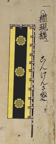
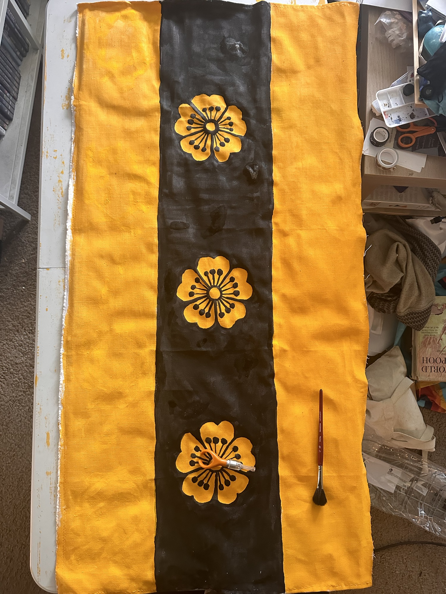
I first mocked up a banner using O-Umajirushi in Photoshop, the book I 100% recommend if you have any interest in Japanese heraldry, and specifically late-period samurai heraldry. It’s beautiful and shows that contrast rules matter for visibility across the field of battle. Uji uses a design that works well for both medieval European and feudal Japanese heraldic aesthetics: Or, on a pale sable three cherry blossoms Or, and translating this design into a general design for a type of flag used by the samurai-class. Of note, there were several other types of flags and standards (sashimono, nobori, hata-jirushi, etc.) I could have chosen to do, but going with the large size was more exciting to me as a project.
My next step was determining how these were created in period. There aren’t a lot of surviving Edo era banners, but I did find a few, mostly showing them as being made out of leather or silk. Unfortunately, neither were in my budget, so I started looking at woven textures and eventually settled on a duck canvas fabric made of hemp. I chose hemp over cotton because hemp was much more period to Japanese textiles during this time (though cotton calicoes did exist thanks to Portuguese traders). The other thing I explored were paint binders used at the time within Japan, and settled on using bone glue. Could I have done applique? Sure. That was definitely a technique I saw with some of the banners I had seen, but my sewing skills are not great, so the next best thing was to paint.
Could I have used acrylics? Sure. There’s a lot to be said in creating period-look with modern materials, and that’s totally a thing. On the other hand, exploring a new period painting technique is also interesting. I found numerous Japanese websites on painting with bone and skin glue binders (nikawa), which were also known to Europe for painting canvas and preparation for other substrates. The other thing I started looking at were pigments. Carbon black was an easy choice, as carbon blacks are easy to manufacture and source, and have been used in Japanese industry for millennia, especially in things such as inksticks, but also in nihonga-style painting (which is the painting technique using nikawa). I also could have used ochres for period yellows (Italian Gold Ochre really would have popped nicely), though Uji stated that the school bus yellow was more to his liking, so I masked and gloved up and used vanadium pentoxide for the yellow. (It is a very good ceramics colourant, but I’ve had decent success in using it for as a paint pigment, too. Dead ringer for orpiment yellow but also a little less toxic but still not good for inhalation; I am obligated to say that if you choose to make paint from it, please be careful.)
Nihonga-style painting was in use during the Edo era, though the terminology for this technique was coined during the Meiji era in answer to Western-style painting techniques being introduced to Japan. Prior to this, nihonga-style painting was divided into the different schools of painting (Kanō school, the Maruyama-Shijō school, and the Tosa school for yamamoto-e genre, etc.). Most Nihonga-style painting is done on silk or paper, not canvas, but it was worth examining for plausibility at this point.
The actual physical size of the banner was also interesting, from a 1 to 1 ratio. I looked at a lot of the Met’s catalogue (much of it not photographed, but the descriptions of size also helped considerably), both of the actual banners and the supports themselves. As sizes varied dramatically between banners, I asked Uji. He told me “large.” The final banner ended being about four feet tall by about 15 inches wide, so I think this fit the bill. It did end up being a little oversized for period banners, but for this, I was willing to let that slide a bit because of what Uji wanted.
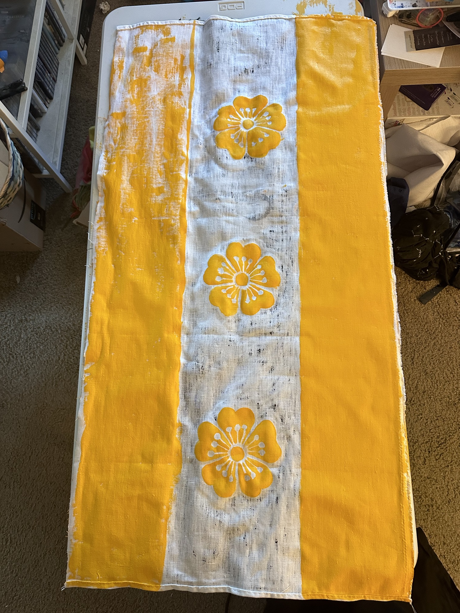
I used an optic white hemp canvas purchased from Dharma Trading. I also chose the optic white because it would be easier to make the colours pop than if I used a more natural colour (it was also much easier to source the optic white over a more natural colour in a price point much kinder to my wallet).

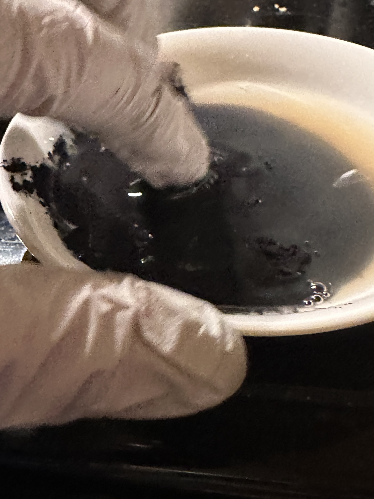
To start, I’d have to make my own binder. I purchased bone glue pearls from Kremer, and let them sit in water overnight (I eyeballed this, but a 100g bag of pearls in a 1 pint Pyrex measuring cup got me very close to where I wanted to be). At this point, I started calling this “forbidden boba,” and because this is basically painting with the equivalent of ballistics gelatin, it reeked (traditional natural-based ballistics gelatin is not food-grade gelatin). Once the gelatin had bloomed, that is, fully hydrated and most of the pearls had gotten to a fairly gooshy consistency, I stuck them in a double boiler and heated this up slowly so that the gelatin would melt and get the right consistency. In hindsight, it is probably true that this was made with not enough water, but it did work pretty well in adhering the pigment to the canvas, so, go me.

Once the forbidden boba had gotten to a more liquid state, I let it cool enough to not melt the plastic containers I was using to store it in my fridge. (one was an old shampoo bottle, the other had a past life as a Ghiradelli caramel bottle) The thing is, my darling husband is fancy coffee kind of guy, and that meant clearly labeling the containers so that he would not have an unfortunate surprise when he made his morning coffee.
Of note with nikawa – it is one of those binders that really should be made every single time one works with it. I did not have that luxury, but by putting it in the fridge, I extended the working time just a little bit more by putting it into the fridge and heating it up every time I painted. Reheating went the same way as it did when I initially heated the nikawa when I made it – double boiler system, and much easier to chuck the bottle into the pot rather than the measuring cup.
When I mixed up the pigment into the binder, I gloved and masked up, put some nikawa into a shallow dish (which I picked up from my local Asian market) and then eyeballed the amount of pigment I needed to add to get a good mix while also making sure it would adhere to the canvas. Once the pigment and nikawa were both in the little dish, I then mixed the traditional way with my finger, massaging the pigment into the nikawa. (the traditional method suggests not wearing gloves; I have some sensory issues with some substances plus also using vanadium pentoxide meant I wanted to be a bit more cautious with my materials and my health). Now mixed, the paint was ready to go and I could put it onto the banner. I will say that from the perspective of someone who doesn’t like squidgy, warm textures combined with barnyard-y smells, this is not the painting style that I would recommend if you have problems with textures or smells. (Acrylics generally don’t smell and some organic watercolour pigments like indigo, sap green, and alizarin do have scents, but not ones I’d consider completely unpleasant. Bone glue is up there with being one of my least favourite art related smells.)
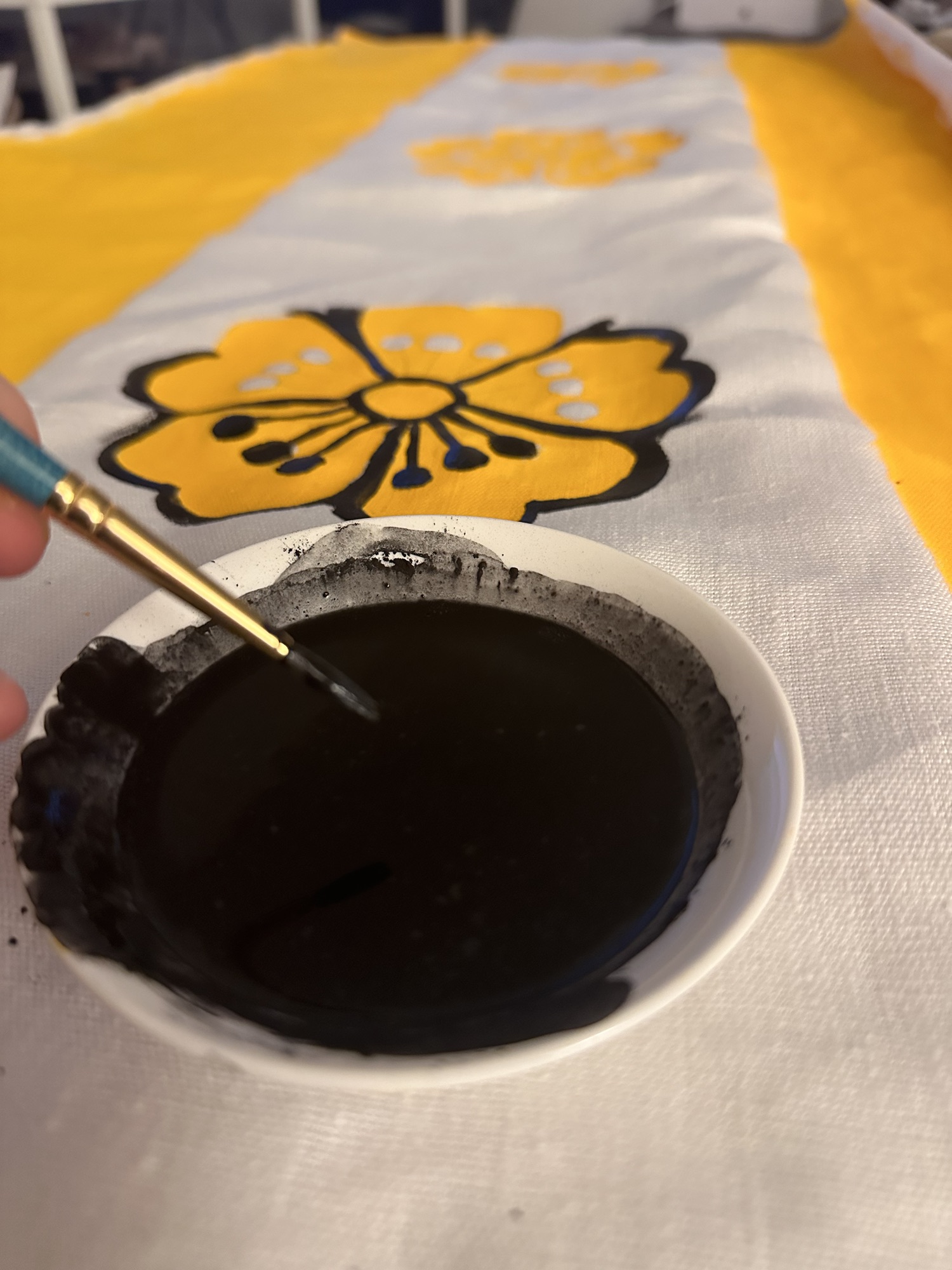
Painting with this technique is different than painting with watercolour or with acrylics in that the weight of the pigment is what determines the layering and how it covers. In acrylics and watercolours, the process generally suggests that lighter colours go first, and then are built up to darker ones, so this required rethinking my existing process and if I made mistakes along the way. Additionally, depending on the concentration of pigment to binder, the particle size of the pigment, where the paint layers are being laid within the context of the fuller piece, and even the weather also can affect how well the strength of the bone glue needs to be. (As much as I personally say to not fight your materials, this is a process that is a battle between many aspects of the environment around us.) That said, I still painted the yellow first, then went in with the black, as the black ochre I ended up using was quite a bit lighter than the vanadium pentoxide. That said, it made the most sense to paint all of one colour at once on one side, wait for it to dry (which did not take long in mid-July with the windows open), and then paint the other side, colour by colour. The good news is that I could see where the paint had bled through from the other side, which made a really good guide for the other side.
I tried a bunch of different brushes, including a hake, traditional Japanese Sumi brushes, and regular craft round brushes. I found that I had a little better control with round craft brushes (and they were inexpensive, so if I ruined one, it’d be okay). The Japanese brushes got used for the wider, less ornamented sections, but I found the best brushes for my process being cheap brushes meant more for acrylics. I mention cheap because while nikawa is not as forgiving when painting, it also can get gelatin stuck in your brushes. The good news is that it is gelatin and is water-soluble, but I had to spend a lot of time cleaning it out.
One of the things I tried to do but was ultimately unsuccessful with was gilding with nikawa. It is absolutely possible to gild with nikawa, especially on wooden panels. I, though, struggled with it on the canvas, much like I do on vellum. (I am not fond of gilding, but I’ll absolutely keep trying until I find something that works.) I suspect some of my issues are patience, but by this point the original nikawa I had made was starting to lose strength and was starting to not adhere as well. So, thankfully, I still had a pack of rabbit skin glue powder (also used for period nihonga painting) and made up some more nikawa. This also did not work, so I had to make the heartbreaking decision to go carefully over all of the gilded cherry blossom petals and laurel wreaths I had put on with a very sharp blade and then repaint with the new nikawa. (Heartbreaking, yes. Learning experience, also yes.) The good news is that I was able to cover most of the scraped portions away with more paint and no one was the wiser.

Last thing to do was to trim down the edges, which, this is where this particular paint binder is similar to acrylic and fixes cut edges down perfectly. I was not able to get the ties on (I ran out of time and hand strength) but provided plenty of the fabric for him to do so when he had time. The banner at this point was like a lightweight leather in terms of texture, and handsewing the ties took more strength that I had in my hands.
Lastly, finishing this also meant making nikawa with alum to inhibit mold growth. Unfortunately, I ran out of time and did not get this done. That said, I suggested that it be sprayed with an acrylic clear spray to fix the nikawa in, and also suggested that it not be displayed in poor weather. (others have done it, but I’m worried that my proportions were not where I want them to be for fully permanent work.) That said, for indoor display, this would be perfectly fine. Am I happy that it wasn’t complete when I handed it over? Nope. But was it worth putting together something this cool for a dear friend? Yes. And sometimes, having perfect be the enemy of the good or the learning process is where we start having problems. I’m still really thankful I got to take on this project.
Thank you for the opportunity, friend, and a most hearty congratulations on this new big step in your SCA life.

Pingback: Two Scrolls for Thomas De Marr’ | konstantia kaloethina