It’s not every day that I get a message with “hey, can you do this” for kingdoms outside my own. Most of the time, I double check to make sure that another person in a kingdom’s scribal college can do it before I can, because shipping scrolls can be fraught. This time, though, with a three week time period from notification to having it mailed and then arrive, it was better to just do the thing instead of shoehorning in a scroll in an already over-worked scribe’s list of work.
I know, I should be planning my wedding.
But, when the recipient is for one’s sib from another crib, it’s really hard to pass up. When Kay Leigh, Ryan’s wife messaged me with “So heyyy….. What’s the shortest lead time you’ve ever worked under?”
I generally like to ask for at least a month, if not more than that. While I’m relatively fast as a painter, I struggle with calligraphy on even the best of scribal days, and as such, I like fairly long lead times (usually 6-8 weeks, depending on what else I’ve got going on). Three weeks, including shipping times, was pushing it. What that means, though, is that I had to source a text, do the calligraphy, and do the illumination in about a week.
With short lead times, it means that something has to give. Larger pieces usually mean more detail, which take more time to paint, though it also means that calligraphy may not be as much of a struggle because I can use normal-sized nibs. Smaller pieces can appear more impressive based on size, but long scroll texts may not fit. (and as I live and play in Calontir, where the average scroll text is somewhere in the neighbourhood of anywhere from 100-300 words, this is something I often see.) That said, I also have been wanting to do an extremely small scroll for a while, and this was the perfect opportunity.
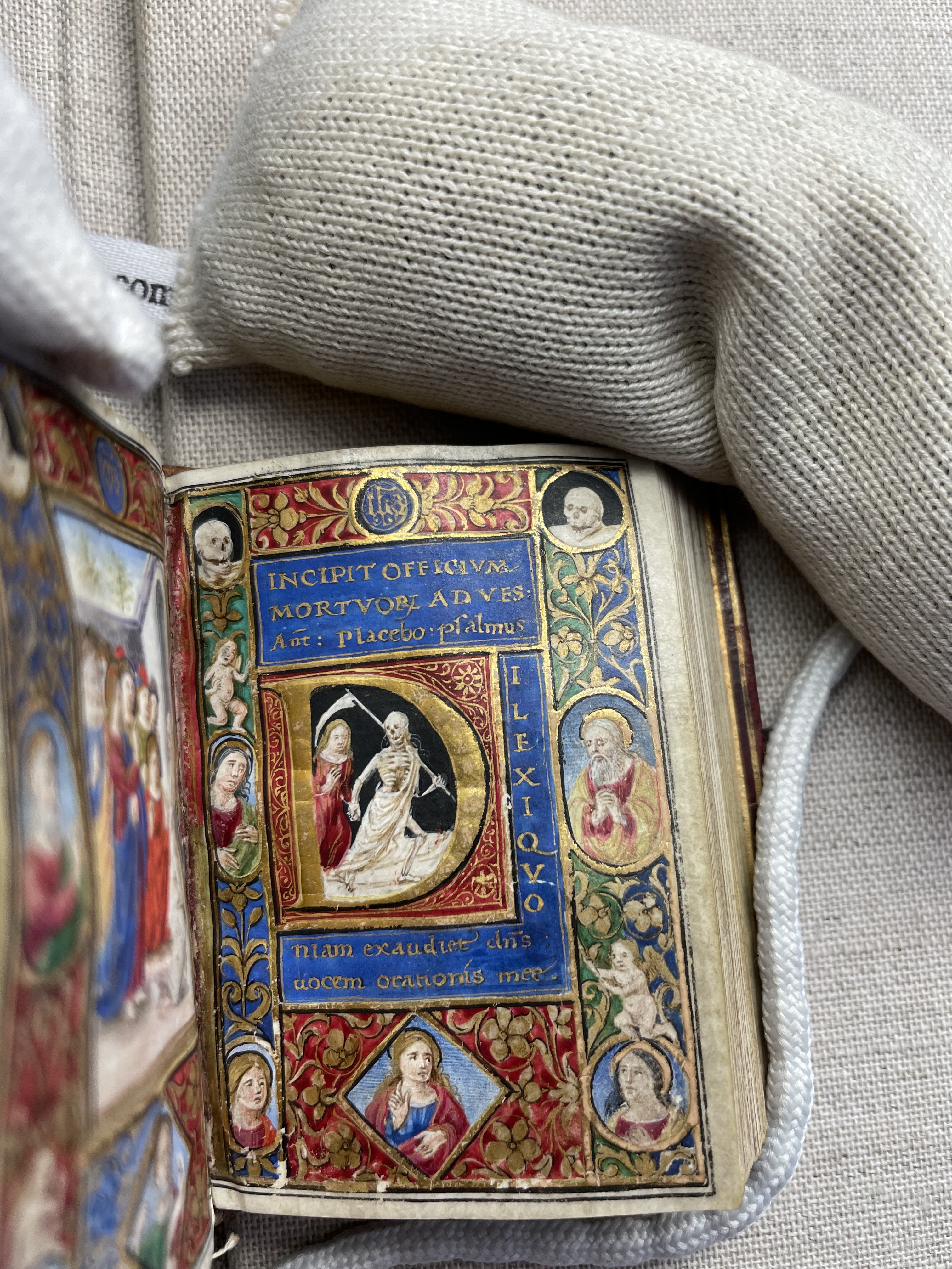
I’d been looking at this manuscript, which is currently a part of the Rauner Special Collections Library at Dartmouth College. It hit the complexity I wanted, but was small enough that I could manage to fit everything in and would be enough to knock the socks off Ryan (who had one of my scrolls already, but that was given well over a decade ago and definitely not indicative of my more period work). Thanks to another friend out East (thanks, Gun∂ormr!), I was able to get a couple more photos from his visit to the Rauner, and I used those to come close to the particular style.
The manuscript is very small (8 cm x 5 cm), and was painted on uterine calf parchment, or slunk. It was prepared in an Italian atelier (Attavante di Attavante) circa 1495. While Ryan does not have an Italian persona, I knew that he wouldn’t be terribly fussed if I pulled out the stops. In addition to photos of the heavily decorated pages, I also was able to see pages that were a bit more plain, which was good, as this gave me room for royal signatures. It also would allow me to situate any scroll text that would invariably overflow to an additional page. I chose the page that started with the Office of the Dead, as I liked the general layout, the skulls, and the floral elements. I also loved the colour scheme, and I knew that I had similar handmade paint on hand.
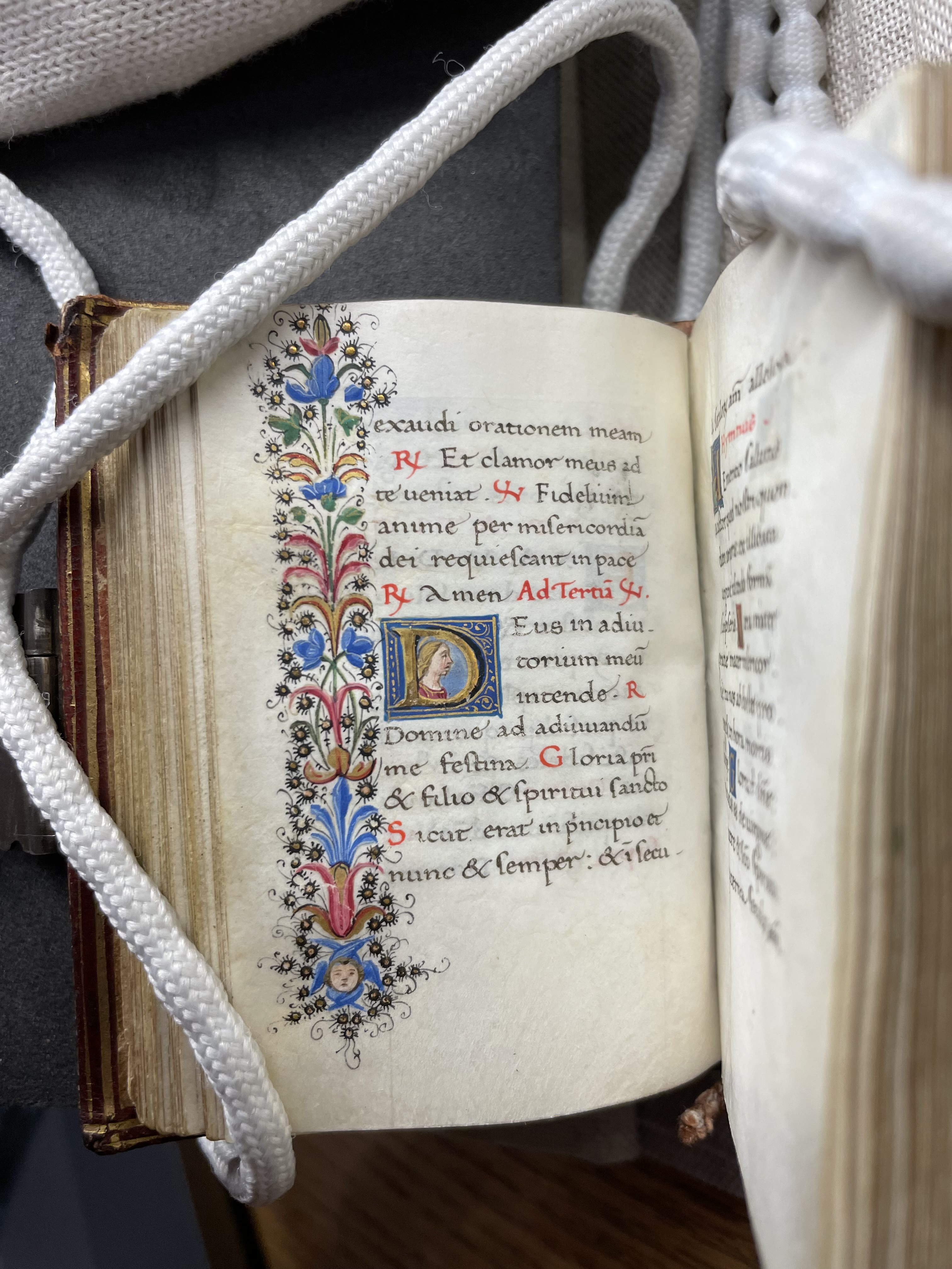
For the overflow page, I chose a page that had a small bit of text, a historiated initial, and a small little seraph in the illuminated border. (For those not in the know, one of my heraldic badges is a seraph with rainbow wings.) I was pleased to see that the particular hand used was an Italian foundational script, which I’m rather fond of normally, and one that would be easy to do with a small liner pen if I didn’t have a nib small enough (in case you were wondering, no, I didn’t have a nib small enough).
I didn’t have time to think about a scroll text, so I contacted my friend Jarlskona Feilinn, who 1) knows scribes as she is one, and 2) could help me brain a bit better on texts. Instead, she provided a kick-ass scroll text which was the absolute perfect length.
For superior fire power done with a Tyger’s ferocity and skill, We Tindal and Emerson recognize Ryan Mac Whyte as a Companion of the Golden Mantle.
One of the other things I had to do was claim the scroll assignment from the East Kingdom Signet (hi Camille!) and like the scroll I did for Marguerite in Atlantia, I double checked the rules and the things I’d have to keep in my head, including time tables.
Now that I had this put together, I had to start working on the scroll itself. It was now Wednesday, two weeks before it needed to arrive at the intended location, and I had to get to work. Wednesday is also my D&D night, and Ryan is my DM. I’d have to be sneaky in how I worked on the scroll. Thankfully, I was able to keep my camera off, and I notified them that I was working on a project for an upcoming Big Deal event that I also had in the works. (that is coming, so stay tuned!) During D&D, I was able to quickly draw out the general design on a piece of 5″x7″ perg, and after pinging Kay Leigh back and forth several times during the design process, I was able to start laying down paint that night. As the main colours of the extant appear to use lapis, malachite, and vermillion (mercury sulfide), I stuck close to this, using ultramarine, malachite, and a medium cadmium red. I used FineTec Olympic Gold for the shell gold, and a combination of yellow to brown ochres to create the trompe-l’œil effect of the extant. Since I was using reference photos, I couldn’t quite tell if the extant used ochre or shell gold in these floral patterns from the photos, so I erred on the side of caution and used ochres to create the gradient of colour that would make it look like it was popping off the page. I could always come back in with a little bit of FineTec to add another level of dimension if I felt like it.


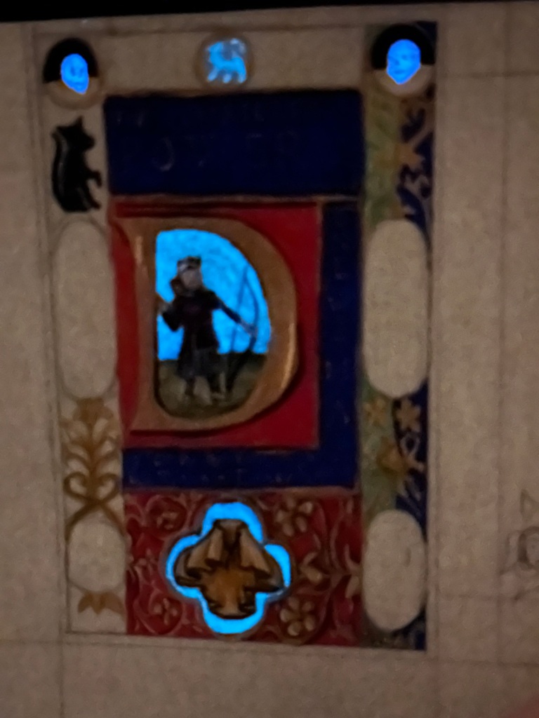
After a night off from the scroll, and a full day of working my job, I got back to work on the scroll that Friday, and knocked out as much of it as I could stand. I wanted to make sure that I had plenty of Easter eggs, so I included Flex Luthor, his feline overlord, a skunk (his favourite animal) in one of the portrait areas, a crossbow, which he uses when doing combat archery, his arms, Sparky, the populace badge of the East, and a couple of Team Blue Squares, which consist of a blue delf with a tail. I also knew that Ryan would get a kick out of a less serious scroll, so I made sure to use glow watercolour that I made from Blue LIT as well as a glow pigment that also has UV colour-changing properties which I also turned into a functional watercolour. Neither are period, but sometimes, knowing what the recipient would appreciate is a much higher priority than if it’s completely period from tip-to-tail. The entire time, I sent Kay Leigh status messages to show her where I was on this project. There may have been a lot of cackling. Totally worth it.


Once the bulk of the main art was done, I knew I’d have to switch to do the calligraphy. Thankfully, the text was blissfully short, but I ran into other problems. I specifically bought a 005 Micron for this project (I didn’t have a nib small enough) and I couldn’t find it at all. So, on a separate sheet of paper, I started looking at pens that I had that would work. Thankfully, I found my other trusty micro pen, a Staedtler Pigment Fineliner, to do the work of the calligraphy. The red portions would be done with a 20/0 Velvetouch Monogram Liner brush, and the paint I used was my handmade medium cadmium red, which is a bright, juicy, orangey red. I think if I were to redo this, I’d use a 003 Micron (which is about .15mm, so, tiny), as well as redoing my spacing so that the Golden Mantle text didn’t look quite so uneven vertically. I also probably should have done a ductus, but also, time was not working on my side for this).
Once the calligraphy (really, micrography) was done, I worked on the last bit of decorative stuff on the text page. Thankfully, this was pretty easy, as it’s typical floriated design. I made sure to put my seraph in, and instead of using the blue of the extant, I used my rainbow-coloured badge to effectively sign the piece. One of the other things I did was use the historiated initial in the extant to derive one for this piece. As an R did not give me a lot of room to do portraiture like the extant did, I put in a Team Blue Square. I also took this opportunity to also make the blue glow so that it would visually connect with the more decorated piece.


At this point, I was functionally done after about 20 hours worth of painting and calligraphy. I did have to cut it out of the piece of perg (both very neatly fit on a 5″x7″ piece of perg), but I’d definitely have to make sure to cut it out carefully, which I did with scissors. Incredibly nervewracking, but it was better than working on the extant size and losing a portion. Next time, I’m making sure that I’ve included enough space to account for cutting out the scroll so that I’m not so worried about cutting into the actual scroll.
The next thing to do was to make sure it would get to the East Kingdom unscathed, so I made a scroll case out of washi tape, glassine paper, and cardboard and stuck it inside of a blank greeting card (I signed it and thanked TRM Emerson for making this part much easier to do. And then I waited.
I’ve often talked about the patience part of creating awards, and it’s always the hardest part. It’s exciting seeing my friends get recognized for their hard work, and since I couldn’t make it out to the East to see Ryan get recognized (or hear the response itself), I’d have to depend on being told the reactions. Thankfully, photos were taken. My thanks to Kay Leigh and Arabella de Mere for these photos from court.


Being able to make that magic moment happen from a few states away is absolutely worth it. I am told that Ryan cursed my name when he realised that I was behind this, and that was also absolutely worth it. So, yes, while, I’m technically on a break, I’m glad I broke it to do this.
Supplies used
Pergamenata, white (John Neal Books)
Handmade paint (titanium white, furnace black, vine black, vanadium pentoxide yellow, cadmium red medium, cadmium red dark, ultramarine blue, malachite, terre verte, yellow ochre, Italian gold ochre, indigo, purple [carmine+ultramarine], alizarine crimson, blue LIT, Ren blue)
Staedtler Pigment Fineliner, 005
Princeton Velvetouch Monogram liner 20/0, Mini-round 12/0 and 0

Pingback: Two Scrolls for Thomas De Marr’ | konstantia kaloethina