I got a scroll commission from our Royal Scribe to do a scroll for my friend Grimwulf, whose service towards creating hundreds of digitized award badges for the Knowne World was the impetus for his Calon Cross (GoA-service, Calontir).
When I start off doing scribal work, I start by researching their persona, along with items that they could have come in contact with. So, in Grimwulf’s case, who has a 14th c English persona, I went with a contemporary piece: the de Bar Hours, a French book of hours that has been dated to 1310. While Grimwulf is not French (rather, he’s got an English persona), but as the book was either given or used by a family with noted English links (on both sides, no less), and France and England were only a few decades from the start of the Hundred Years’ War, meaning that English and French connections in illumination could have been made.
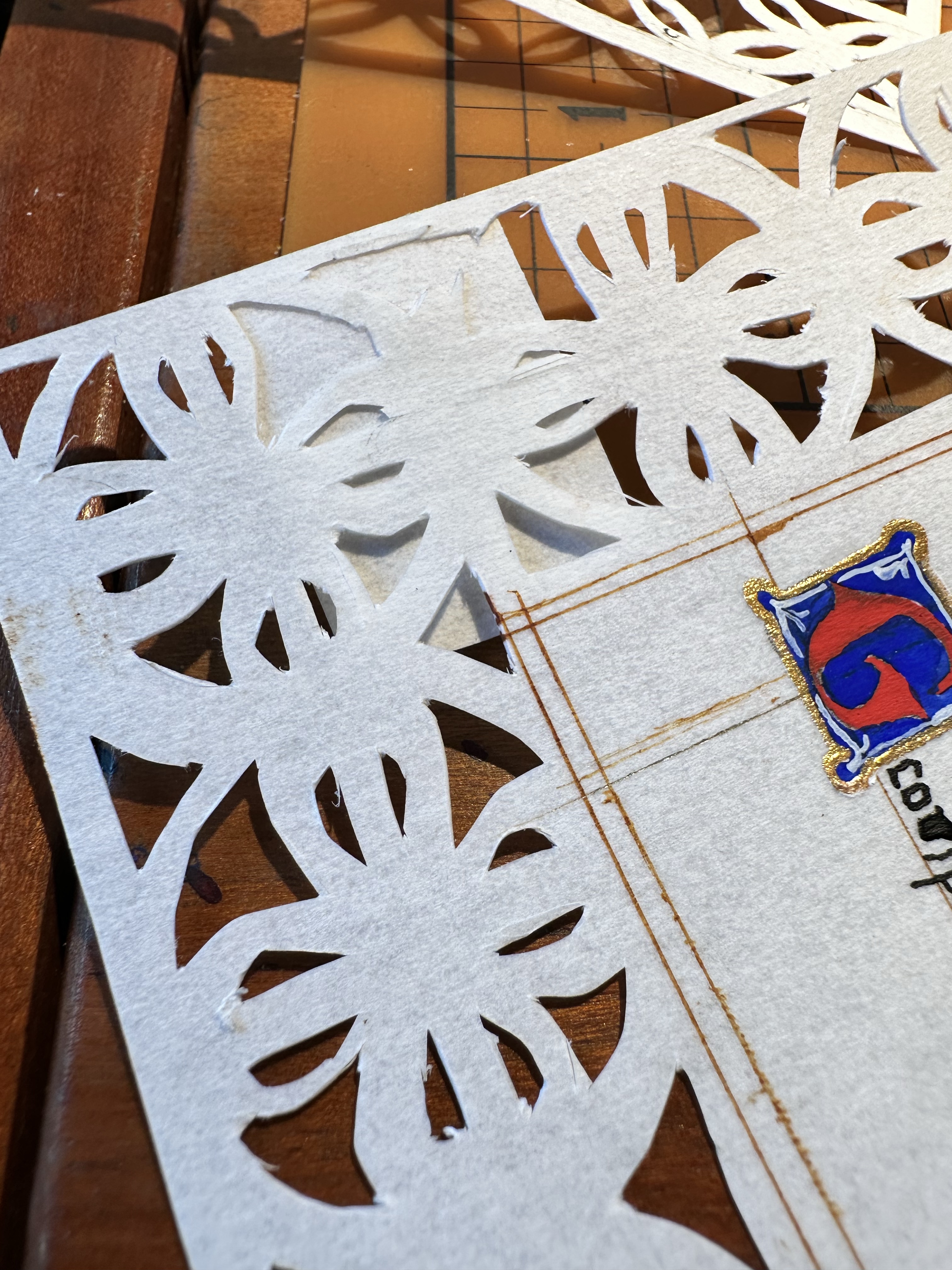
What is unusual about the de Bar Hours is the intricate canivet pages. I’ve actually done a blank border with the canivet technique before, but sized up to an 11″x17″ piece of perg, but I opted this time to work as close to scale as possible, meaning that I had a working space of mere inches to situate text and if I wanted to do any illumination. It would be a challenge, but hey, what’s a bit of ambitious project between friends, right?
So, I got started.
In the exemplar, the cuts were done across four folios, however, as the extant was made from parchment, it is likely that it was constructed from smaller gatherings. The journal article regarding this particular book of hours did note a couple of things: the book structure is made of quires of four pages, instead of a more typical standard of a quire of eight pages. Of those four-page quires, the knife marks on the extant match across all of those pages.

I chose to do two pages. This was planned, much like the extant’s four-page quires.
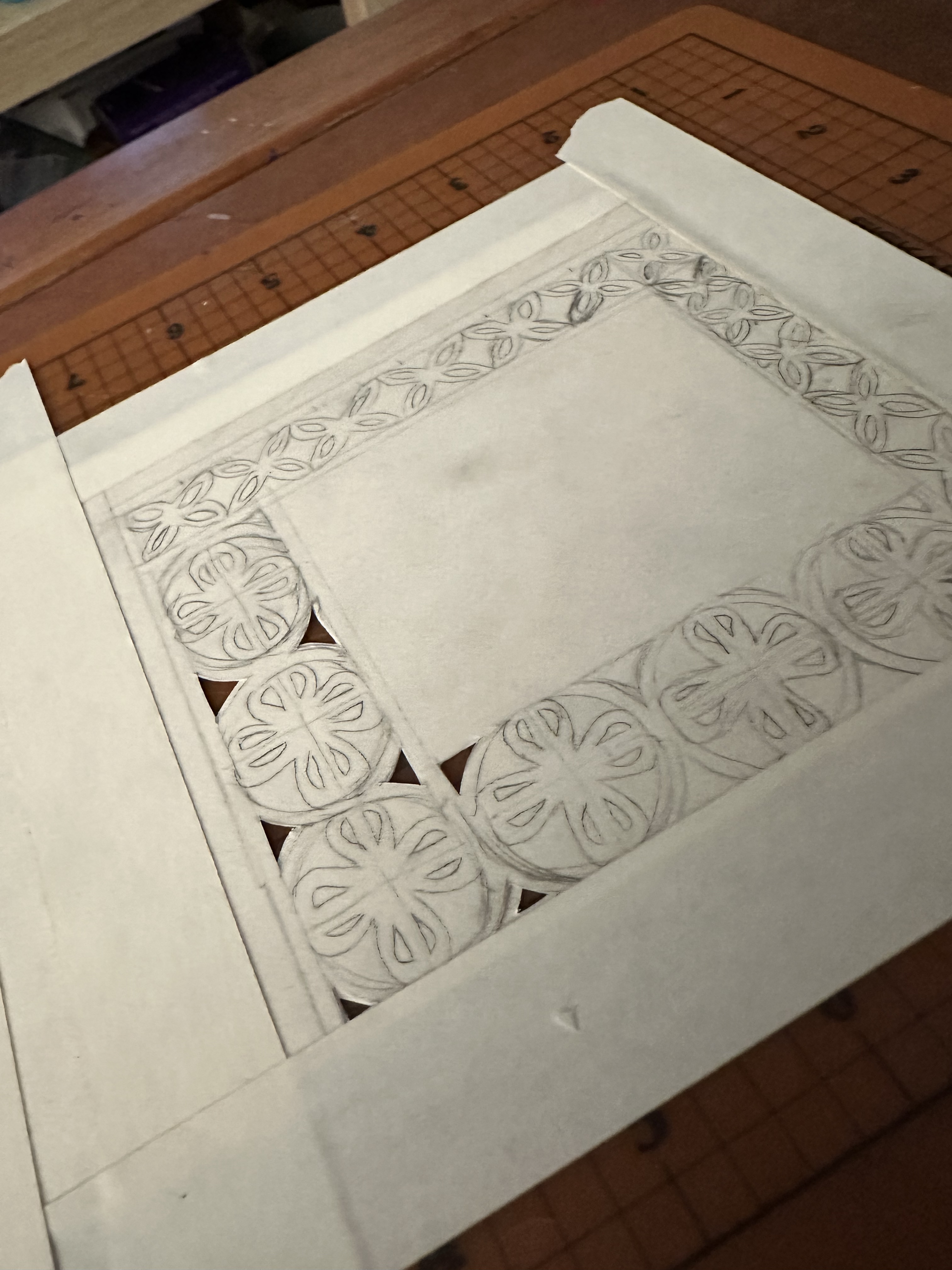
At home, I had taped two pieces of 5″x7″ pre-cut perg from John Neal Books together with low-tack artist tape onto a self-healing mat and hoped that it wouldn’t shift too much. I also had lightly penciled out the basic layout on the top so that I had a decent guide. The journal post from the Walters that went into detail about the entire book of hours also cleverly gave details about the rosettes and the size (about a cm round). I went around my place, measuring round things that had the right size, and it turned out that a standard bottlecap was the perfect size to create the rosette.
In my design choices, I decided to go with playing with the design of the award badge for the order, which is “Or, a cross of Calatrava within a bordure purpure.” Obviously, by cutting out the background, it would be difficult to show the gold background, but at the very least, the idea was there. (The extant does have at least a page that has paint on the cut outs that appears to be done intentionally, but due to the general fragility of the pages themselves, the book has not been further digitized.)
At any rate, I penciled out the basic layout on the top sheet. You can see in the photo to the side that I did not cut away any other part of the page, because with these long, straight cuts, I could use a papercutter (which was the original plan) to cut out these longer swaths. It also gave a little more purchase and on the whole kept the bottom sheet (which was not adhered as well to the cutting mat) from moving too much.
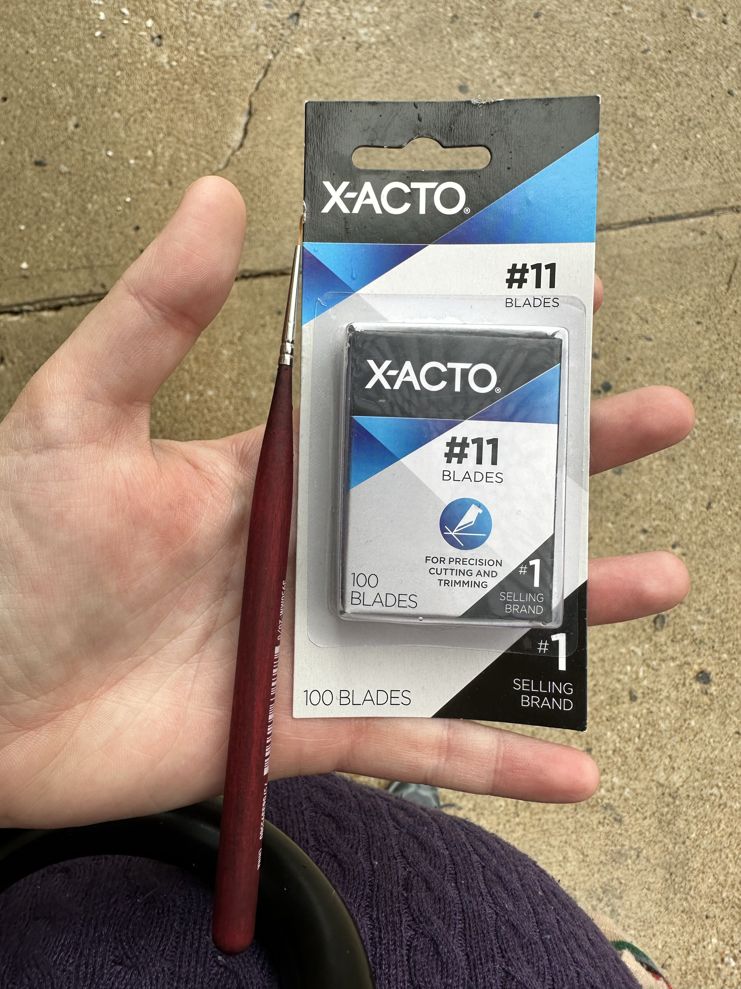
That said, I proceeded with cutting, but I kept running into an issue where every three cuts, I’d have to replace a blade, and after changing to my last blade, I knew that I’d have to have better blades, and ones that would put up with cutting through two layers of perg in one go.
One, we don’t really talk about how expensive scribal supplies actually are, and two, this is what $60 USD of art supplies looks like in 2023 (Yes, that’s a 20/0 paintbrush and 100 #11 X-Acto blades. And I used both for this project, though, thankfully not all 100 blades, and yes, I still have plenty more.). And three, let me introduce you to art philosophy with your auncle Konstantia:
Don’t fight your art supplies.
Art Philosophy with Auncle Konstantia
What I mean by this is that if you’re struggling with your art, process may be a part of it, but it might also be your supplies. Think of it this way: if your paint isn’t covering as well as you feel it should and you as the artist don’t like how it’s working, it may be time to find a better paint for your purposes. It could be your brushes!
Does this mean that you should go out and buy all new art supplies? Nope! But it does mean that it’s also okay to try out new art supplies. (and what works for one artist may not work for others.)
So, lesson the first: don’t fight your art supplies. (or fight with them. This stuff’s expensive.)
Anyway, back to Grimwulf’s scroll.
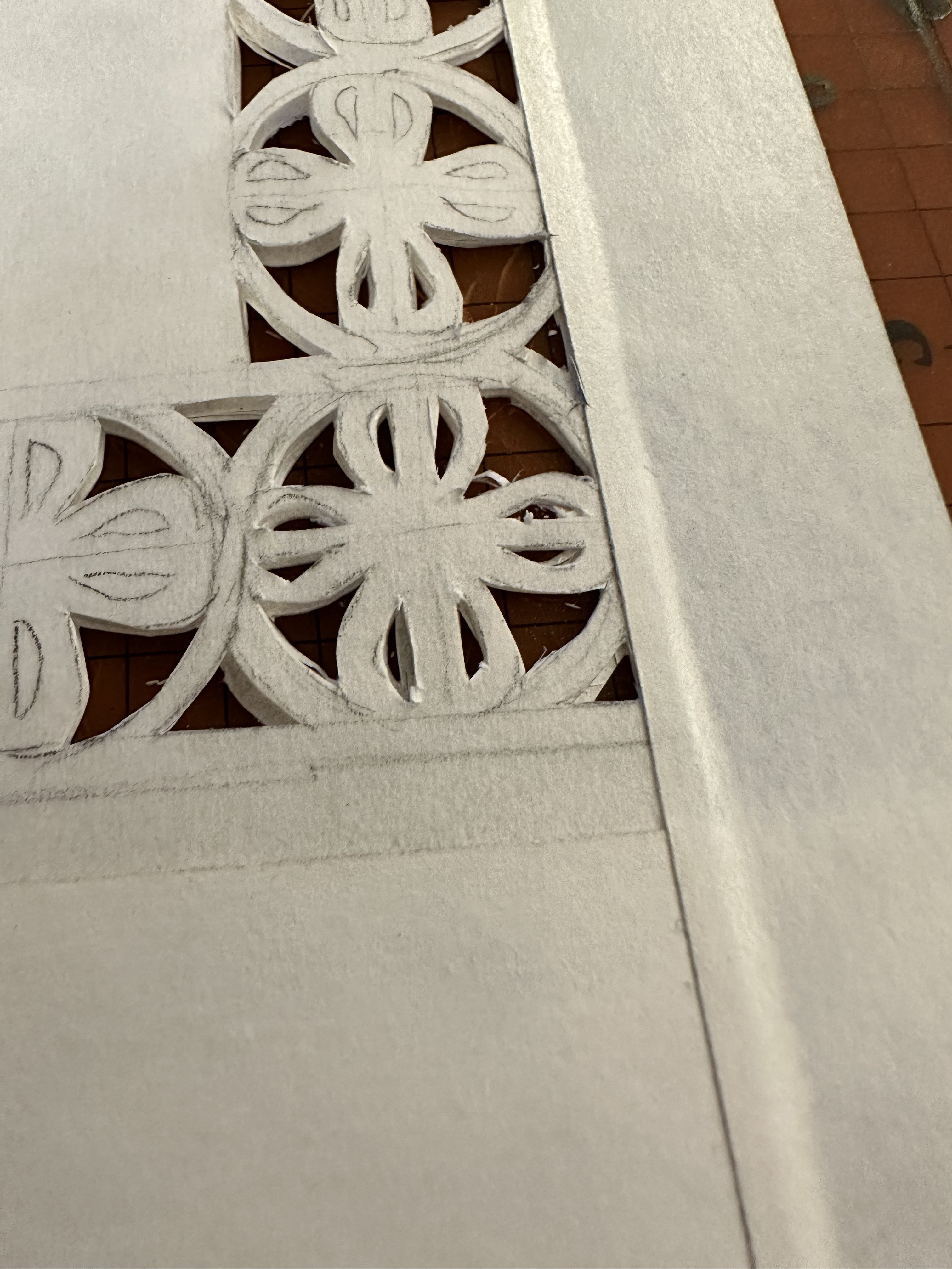
Below is a gallery of the cutting. Even though I used this detail knife from Fiskars, I do have arthritis in both of my hands which means that even on good days, I needed to take breaks. So, I took progress shots of how far I got every twenty minutes or so. I found that by working on the bigger cuts first, it would free me up a bit to do the smaller, more fiddly cuts later. I also found that the larger cuts tended to be more sharply curved than the smaller ones, which meant that I had more broken blade tips with this portion than with the smaller cuts.

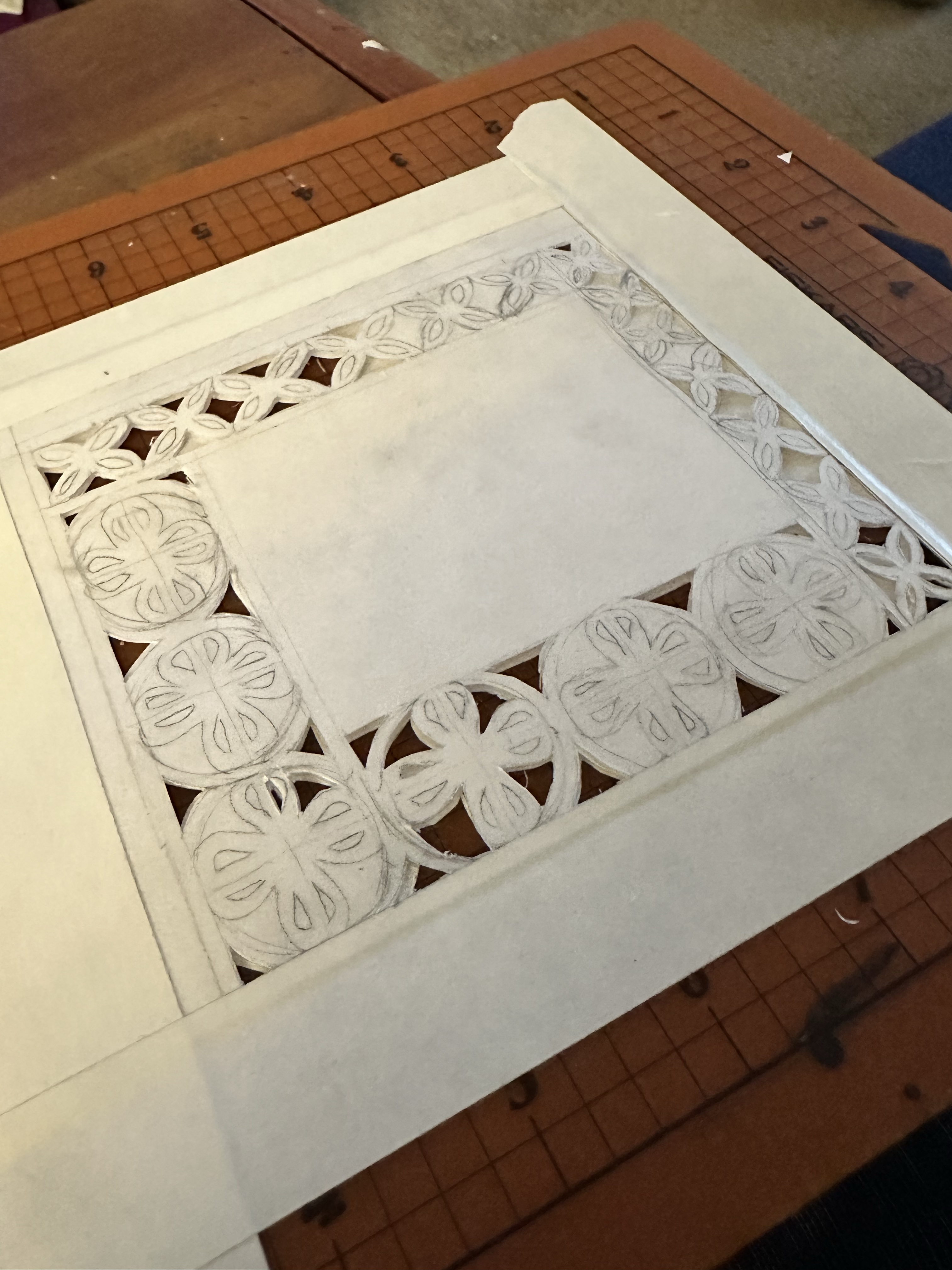

The nice thing about cutting perg is that I could sit on my couch, put something relatively brainless for background noise, and just make artisanal confetti.
In case you’re wondering, yes, I did keep the cutouts. I also kept some of the blades. I joked with my fiancé (also, yes, hi, that’s part of the reason I’ve been quiet because wedding planning has eaten my brain!) that I’d make some reliquaries out of the broken blades and bits of perg, but I couldn’t find a bottle big enough for the broken blades. (though, maybe!) I did, though, stuff most of the confetti in little bottles and sealed them with a cork and some sealing wax. They may go on to be tokens, but the fact that I got through this scroll without too many major incidents is proof of some kind of miracle.
Anyway, once the perg was all cut, I pulled the tape off aaaaand. . . .

Frack.
On the whole, it remained close to what I wanted, except for a place where the bottom sheet shifted, leaving a larger hole than I wanted. Additionally, I knew that the cuts were not as fine-tuned as I wanted, and there would need to be a lot of cleanup. I decided that I would figure out a solution while I worked on the calligraphy and the illumination, as sometimes the flow state I get into when I paint ends up with an ideal solution.
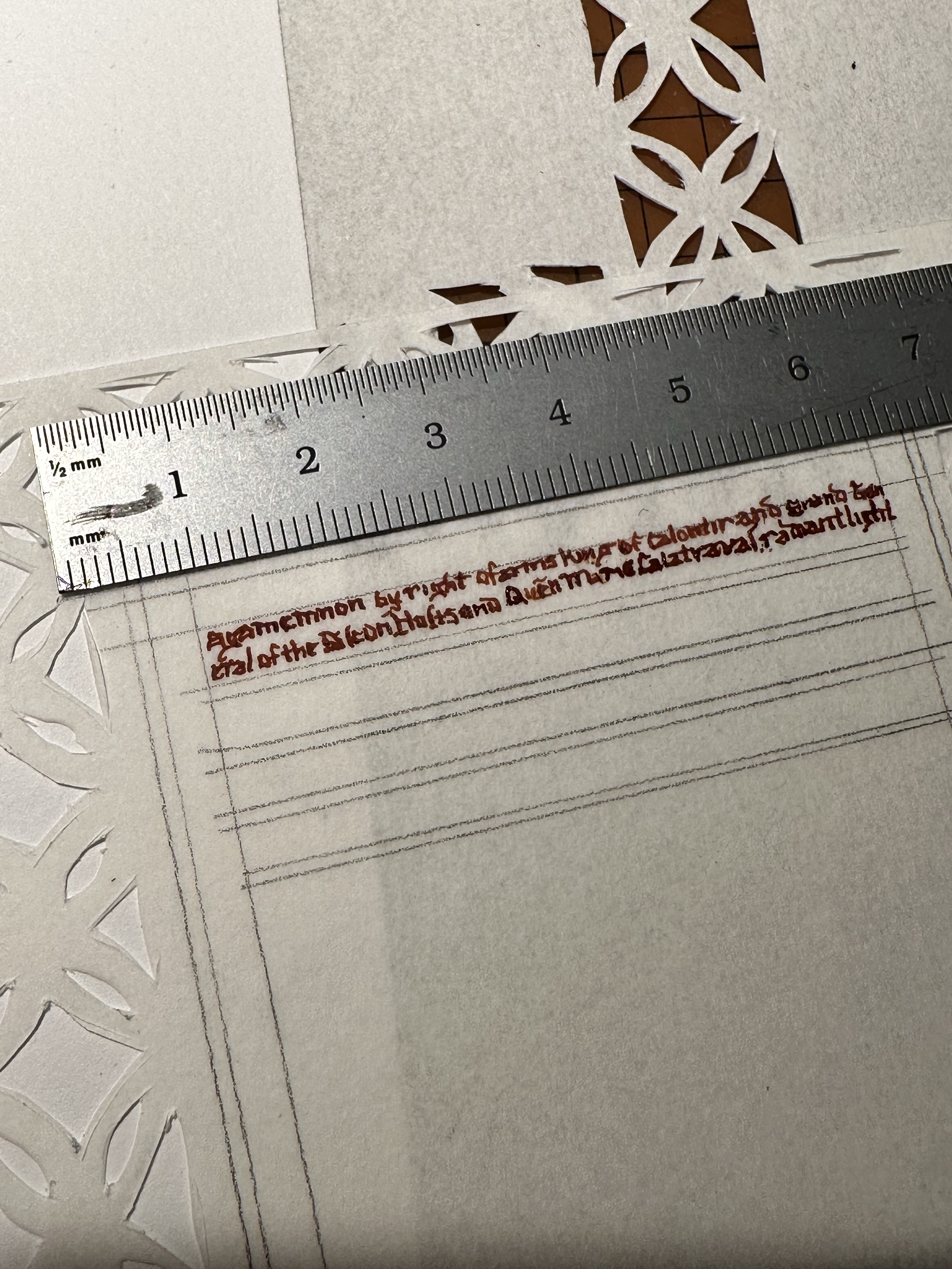
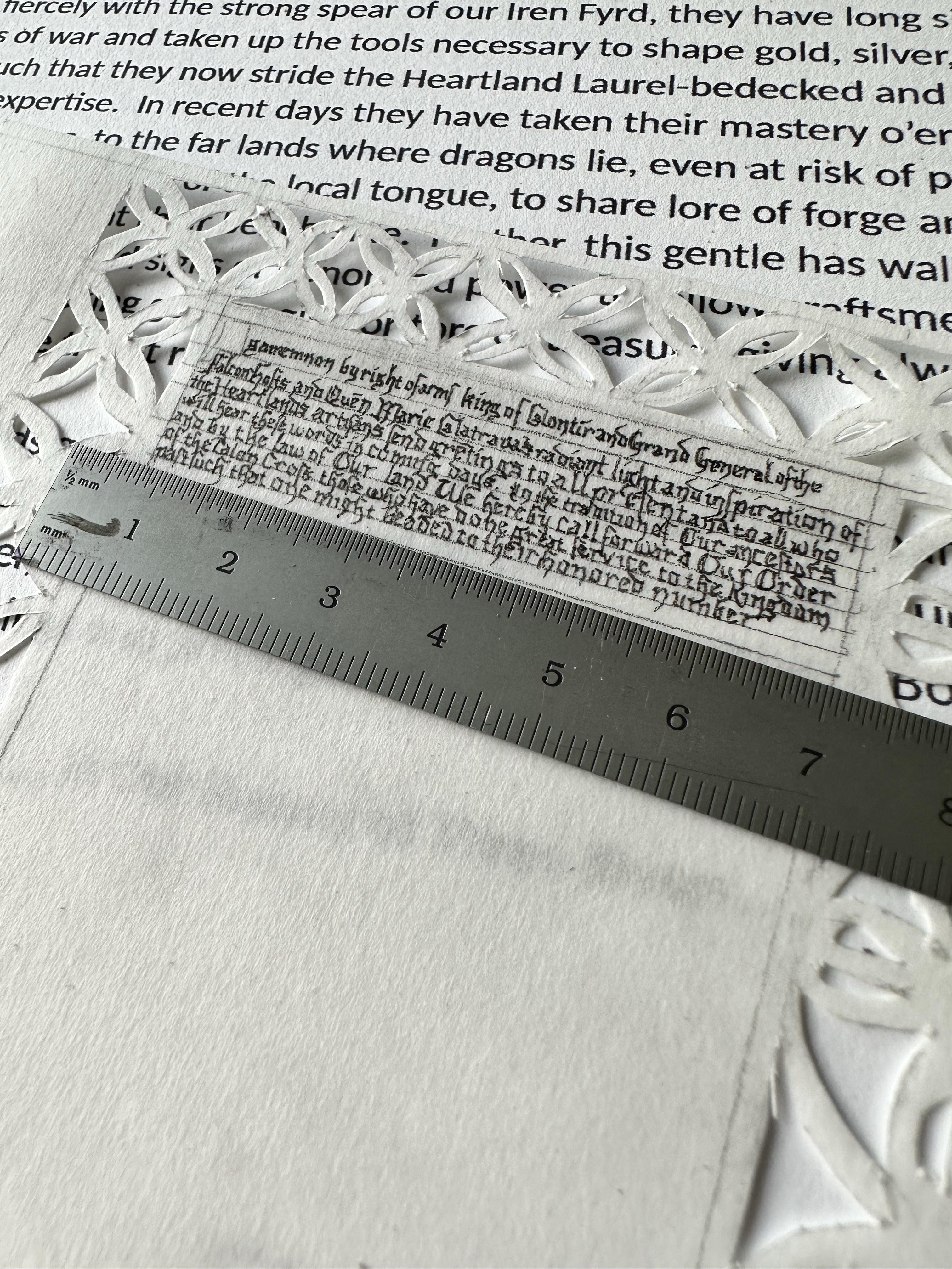
My next step when I do scrolls is generally calligraphy, so I know how the rest of the illumination will work around it (unless it’s a border situation, in which case I block out where the border goes, then do the calligraphy, and spend the rest of my time painting. See also the scroll I did for my friend Gwen). It’s not that I prefer painting, but illumination requires a bit more brainpower for me, especially when I start thinking about how I’m fitting a scroll with 337 words and 1907 characters into a space smaller than an index card. The text, written by my friend Da’ud ibn Ibrahim al-Sisari (called Dawi), was poetic in general scope.
This is where I had to really plan how the text was going to go. The extant also had none of the more plain pages available to look at (which is frustrating as a scribe). I also had to fit text plus room for Their Majesties’ signatures, plus keep the general aesthetics of the time period.
Unfortunately, the best laid plans sometimes don’t end up being the best plans. I had planned to use one of my crow nibs and a commercially-made brown ink that looked close enough to walnut ink.
Yeah, that didn’t work. The crow quill was still too large to do the style of calligraphy I wanted. I was tired, and a little cranky.
Here enters another piece of Art Philosophy from Auncle Konstantia.

Don’t art when you’re tired.
You don’t want to art when you’re tired and cranky because it could lead to mistakes. Those mistakes may not be initially bad, but compounded mistakes are hard to recover from.
Art Philosophy from Auncle Konstantia
So, because I was tired and cranky, I put it away and did something else that night.
The next day, I bought a .005 Micron pen in black from my local art store (as well as a .3 and a .5 in case), and went home and did a couple of things: I carefully scraped the paint from the page using, you guessed it, more X-Acto blades, as well as a sand eraser (I like Tombow’s MONO 512A sand erasers), and decided that was going to be the back of the page that got the paint on it.
One of the things I like about this cleanup process is that it forces me to see a few things: how I got into the mess, and how I get out of the mess, and then avoiding how I make it a bigger mess. If I had to, I could have cut more perg, but I really, ultimately didn’t. By flipping the pages so that the problem was on the back of the page, I could hide it by putting illumination on the front and disguise it that way. I wouldn’t have to burnish the perg to writing on it, either.
Once I had gotten most of the old ink off, I then started doing layouts again on the clean sheet, but this time, tested out my ductus (my standard textura quadrata) on a spare piece of perg to make sure that it was small enough to fit and that the ink would dry fast enough. (I’m a left-handed scribe. I have to make sure.) Once this worked, I got to work doing calligraphy again. I will say that doing calligraphy with a Micron does go by a lot faster. Is it period? No. Did it help me achieve a goal? Yep. Did I write itty-bitty? OH VERY MUCH SO. Was my spacing in line with most texts from the same era? Absolutely not.
In hindsight, I probably could have increased the spacing a little bit more to give a better sense of proportion, but by this point, I just wanted to get the calligraphy done. I also probably could have made slightly larger margins to look more in line with the extant. That said, sometimes, you have to pause and not let perfect be the enemy of the good.
Looking back, I probably could have done multiple pages with the text. I could have put the text on another piece of paper. I also could have done a legal-style document (which is how most of our period exemplars are on). But, I chose this exemplar because it was a challenge, and like Everest and Sir Edmund Hillary, we do the challenges because they are there.
Once the text was complete (there is barely enough room for signatures because so tiny), I took my 20/0 brush and painted in simple ornamented letters using alternating cadmium red and ultramarine blue surrounded by FineTec Olympic Gold watercolour paint.
The next part was painting. I chose a more simple page that didn’t have a lot of gilding on it, as I didn’t have the right gold leaf on hand (I have a fairly pale gold on hand which doesn’t look right for this time period/ocation and I couldn’t get the one I wanted in time within my price point). Again, because this hasn’t been fully digitized, the exemplars were a bit harder, however, given that the exemplar was from 1310, it did mean that I could get an idea of other similar works from the same region and time period for inspiration.

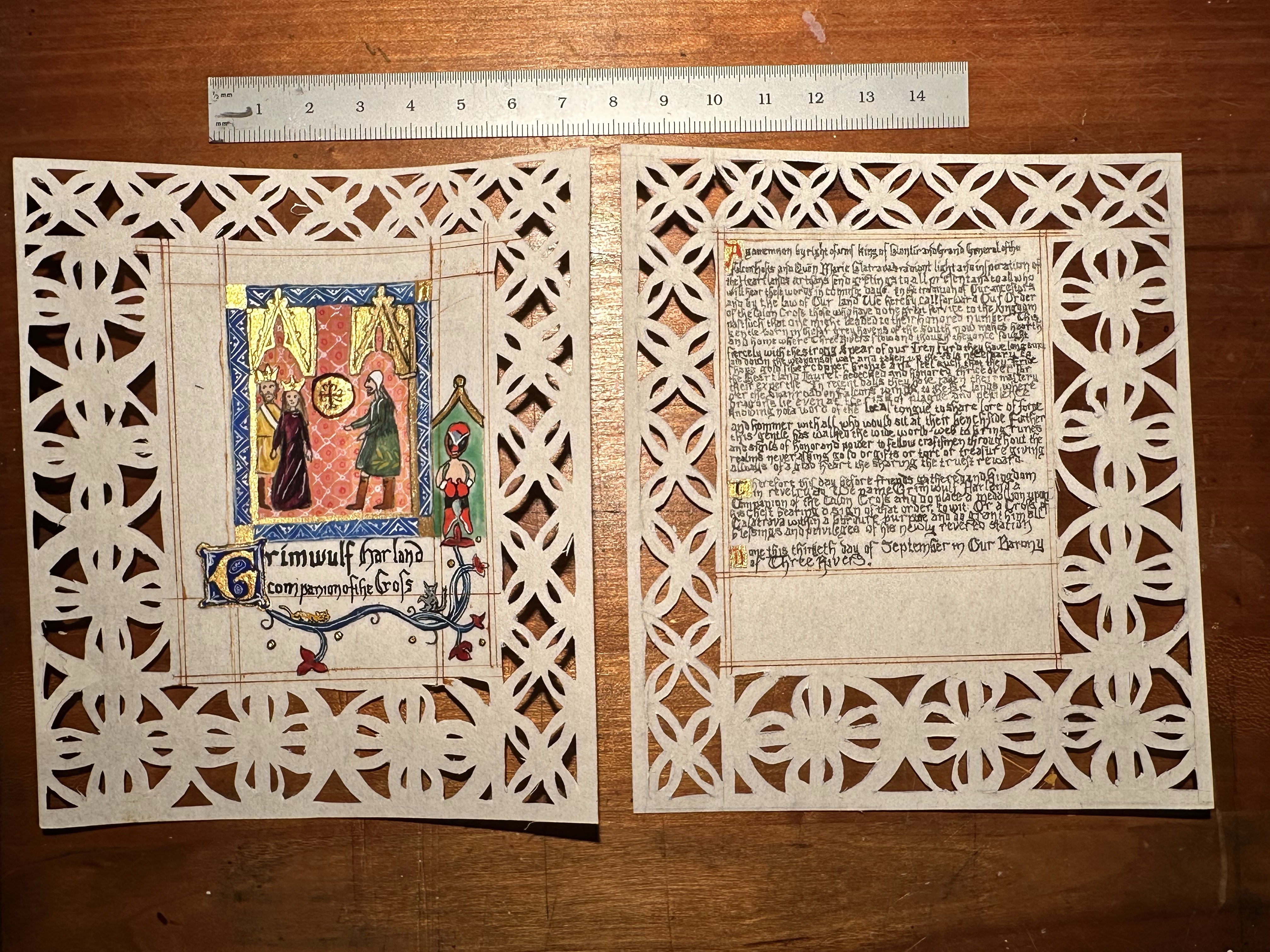
In the illumination, I put three figures: His Majesty, Agamemnon, Her Majesty, Marie, and then Grimwulf. Given the relative size and scale of the extant, it was difficult fitting all three figures in, however, I managed. I also made sure that the illumination also featured the badge of the order.
That said, I love my Easter Eggs. The last time I did an Easter Egg in a scroll, it ended up with the badge of the order in glowing paint. This was no different. Grimwulf is a fan of Homestar Runner, and at one point dressed up as Strong Bad for Halloween. The extant actually contains what is considered to be a donor portrait of Edward de Bar as a knight in armour on another page, so taking that idea, I painted a Strong Bad because I figured it would make Grimwulf happy. I also looked up photos of his cats to play amongst the vines. I also made sure that I had inked guidelines, much like in the extant. (this is where the Crow quill came back into use, and I’m happy with the results)
The paints I used for this project were my handmade paints (and FineTec Olympic Gold). One of the things I wanted to be aware of was how much paint mixing I was actually doing. As I read about scribal techniques in Cennini, and then look at other illuminations, I see how a lot of colours tend to be made by layering paint with small strokes. This particular illumination used a pink, though, that I did have to mix titanium white, cadmium red, and alizarin crimson to mimic a laked madder pigment, which is a possibility for the pink in the extant.
There was one more thing I had to do. I had to cut off the borders, and I had to fix the oopsie where the roundel wasn’t complete. As I learned in the journal article, knife slips were a thing with this, and there are places where the parchment was patched. As pergamenata is a kind of paper, it takes things like glue sticks really well, so I took a glue stick, applied it to the cut portion very carefully, and then stuck a square of perg to the part I had glued. I let the glue dry, and then followed the contours of the original cuts, making room for how the roundel should have looked. (I felt really clever here.)
I did one more run with the X-Acto blade to make sure it my cuts were clean. One of the other things I did was take a bit of red ink and made a red ink splotch on the back of the piece, another more period Easter Egg, found on fol. 30r–v. (no, it’s not real blood, and it’s not really that easily seen from the other side, but it’s my way of putting my stamp on this project.
There were a lot of lessons learned with this project, and I’m already pleased to see that the extant is already inspiring so many people. Canivet is somewhat of a bleeding edge discovery, especially for this early, but I really enjoy how simple cuts of paper and a few bits of paint end up with something that is reminiscent of Gothic arches, rose windows, and the medieval experience.
Grimwulf, my friend, I could not be happier for you to be part of this Order. Welcome to the Order, my brother.


Pingback: Laurel Scroll for Marguerite Honoree d’Cheneau | konstantia kaloethina
Pingback: Two Scrolls for Thomas De Marr’ | konstantia kaloethina