The past few weeks, I’ve been really busy. Besides modern life, I’ve been preparing for an entry into Kingdom Arts and Sciences/A&S Championships. Like Queen’s Prize, it’s a time to share what you’ve been working on, but also to get feedback on your projects. Unlike Queen’s Prize, it is open to all, regardless of the level one has reached (Queen’s Prize is novice-level, meaning that it’s limited entry to people with an AoA arts or science award and lower).
New to Calontir this year was a separate display category. A typical Kingdom A&S or Queen’s Prize has mentoring sessions, used to prepare people into entering the Championship level, and to get tips and ideas for an entry next year. The display category was just that – a display. I was still able to discuss my projects, and what I wanted to do with what I’d done going forward, but it took the pressure off of a typical judging situation. (and given the amount of stuff that I’m also working on in my modern life, I didn’t need the stress of going beyond for a day-long event.) The other thing that the display category accounted for was publicity and visibility, which adds to wordfame.
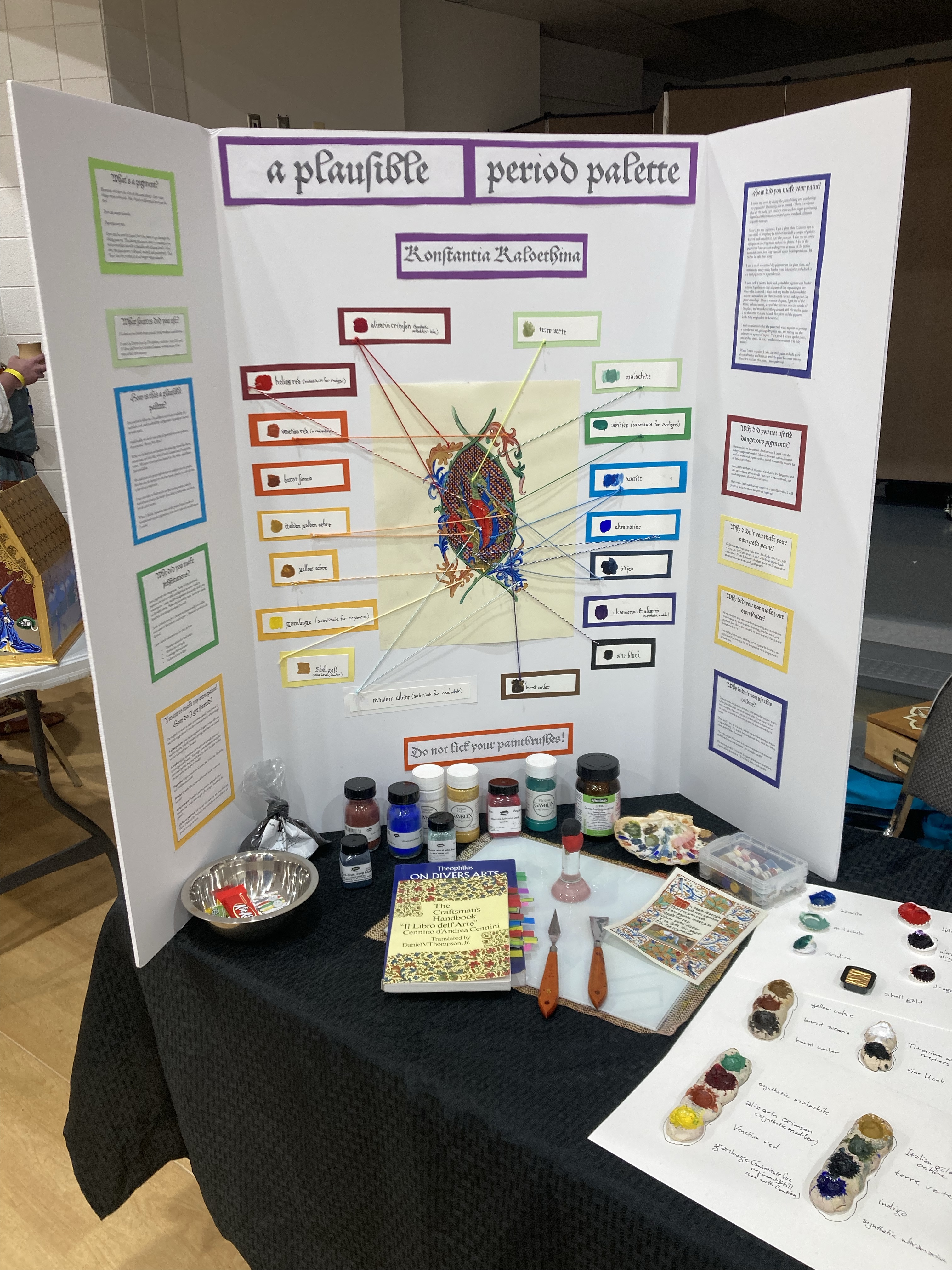
Paintmaking is not my idea of a portable, easily teachable art/science (it’s kind of a both, here). The pigments are powders, some even highly toxic or otherwise hazardous to health, and it takes some specialized equipment that can be fragile. That said, the results really can add a lot of authenticity points to a scroll. I know of people who will teach how at events, but I’m somewhat uncomfortable teaching paintmaking in an environment like an SCA event. That said, I like being able to show my research, and while I plan on teaching how to make paint, it will probably be online for safety concerns. That also said, showing the context of paint on a scroll while showing what the palette looks like really can help those doing scribal, and that’s what I wanted to show.
Anyhow, the main point of my display was to show context – I created a blown-up sample piece from something I had seen in a Getty text (while a French text), and while my two source books were Italian (Cennini) and German (On Divers Arts), I felt that from a Continental art perspective, the palettes would have worked, given the cross-referencing between pigments used in both texts.
One of the things I did with my display, in lieu of documentation, was do a FAQ-style question/answer thing. This allowed people to get an idea of what I was working with, but in the event that I wasn’t there, they could get some questions answered. I’m including them here.
What’s a pigment?
Pigments and dyes do a lot of the same thing – they make things more colourful. But, there’s a difference between the two!
Dyes are water-soluable.
Pigments are not.
Dyes can be used in paints, but they have to go through the laking process. The laking process is done by treating a dye with a mordant (usually a metallic salt of some kind). After this, the precipitate is filtered, washed, and pulverised. This ‘fixes’ the dye, so that it is no longer water-soluble.

How did you make your paint?
I made my paint by doing the period thing and purchasing my pigments! (Seriously, this is period – there is evidence that in the early 13th century some scribes began purchasing ingredients from stationers and some standard colorants began to emerge.)
Once I got my pigments, I got a glass plate (Cennini says to use a slab of porphyry [a kind of marble]), a couple of palette knives, and a muller to start the process. I also put on safety equipment: an N95 mask and nitrile gloves. A lot of the pigments I use are not as dangerous as some of the period ones out there, but they can still cause health problems. I’d rather be safe than sorry.
I put a small amount of dry pigment on the glass plate, and then used a ready-made binder from Schmincke and added in a 1 part pigment to 2 parts binder.
I then took a palette knife and spread the pigment and binder mixture together so that all parts of the pigments got wet. Once this occurred, I then took my muller and moved the mixture around on the plate in small circles, making sure the paint mixed up. Once I was out of space, I got one of the flatter palette knives, scraped the mixture into the middle of the plate, and mixed everything around with the muller again. I do this until it starts to look like paint and the pigment looks fully suspended in the binder.
I test to make sure that the paint will work as paint by getting a paintbrush wet, getting the paint wet, and testing out the mixture on a piece of paper. If it’s good, I scrape up the paint, and add to shells. If not, I mull some more until it is fully mixed.
When I want to paint, I take the dried paint and add a few drops of water, and let it sit until the paint becomes creamy. Once it’s reached this state, I start painting!

I want to make my own paint! How do I get started?
I’m so glad you want to make your own paint! Here’s what I use (with suggestions if you don’t have access to other things).
A glass palette (you can use a piece of glazed white tile or a marble cutting board); consider getting shelf liner or a towel so that it doesn’t move around.
A muller (glass fermentation weights or a sturdy piece of frosted glass will work. You might even be able to find a flat-bottomed goblet, but you will need to frost the glass so that the pigments can disperse evenly)
Pigments (I get mine from Kremer, but Sennelier, Gamblin, and Sinopia also work)
Binder (I really like Schmincke’s ready made Gouache binder)
Palette knives (modern palette knives are perfect and inexpensive – make sure to get a flat scraper to collect the paint!)
Shells or palettes for storage (the palettes are from Mistress Marie (Painted Sky Pottery), but seashells or mussel shells are period storage devices.
Why did you not make your own binder?
It was cheaper and more reliable than making my own binders. I have made my own tempera from egg, distilled water, and pigment, but this is not reusable in the same way that gouache is supposed to be.
I would like to explore making my own gouache binders, but right now, I’m having a lot of fun playing with the pigments themselves.
Why didn’t you make your own gold paint?
Gold is really expensive right now. As of July 11th, 2022, gold is $1,741.00 USD per ounce. I can’t afford making shell gold right now. (When I do have a budget again, yes, I’m going to attempt to make some shell gold paint!)

Why did you not use the dangerous pigments?
Because they’re dangerous. And because I don’t have the safety equipment needed (a hood, eyewash station, hazmat suit) to work with pigments that could, potentially, cause a lot of health problems.
Also, if the authors of the source books say it’s dangerous and that an ordinary artist should take care, it means that I, the modern person, should also take care.
Due to the health and safety concerns, it is unlikely that I will proceed with the more dangerous pigments.
Why did you make substitutions?
Some pigments are dangerous. Some of the medieval pigments are not as stable and lightfast as more modern counterparts. Some medieval pigments chemically don’t play nicely with others. Some are incredibly rare. Some are made from not nice things (mummy brown!).
Some of them were just cheaper and more easily accessible than some of the period counterparts. Some are synthetically derived.
Some noted substitutions for this project:
- Titanium white for lead white
- Viridian for verdigris
- Gamboge for orpiment
- Helios red for realgar

What sources did you use?
I looked at two books from period, using modern translations.
I used On Divers Arts by Theophilus, written c. 1122 CE, and Il Libro dell’Arte by Cennino Cennini, written around the turn of the 15th century.
Why didn’t you use this colour?
Some colours are just rare in texts. The particular purple I made, while plausible, isn’t one that is used a lot. (I can name at least two exemplars that uses purple.) Some colours are just not as accessible, or could be more expensive or time-consuming to make.
That said, I live in Calontir, which means that having a purple is a good thing. I’ve made two purples to date, with one being more period than the other.
The first purple I’ve made is 2 parts manganese (or mineral) violet) and 1 part ultramarine. It’s a bright purple.
The second purple I’ve made is 1 part ultramarine and about 1.5 parts alizarin crimson. It’s a dark, rich, royal purple.

How is this a plausible palette?
Every artist is different. In addition to this, accessibility for materials, cost, and availability of pigments is going to matter to each artist.
Additionally, we don’t have lists of proscribed artist palettes from period. (Sorry, Bob Ross.)
What we do have are techniques for painting items like faces, mountains, and the like, which both Cennini and Theophilus cover. We have to extrapolate based on this what could have been available.
We could also do spectrophotometric analysis on the paints, but this can be destructive to the extant pieces, so a lot of this is based on conjecture.
I was not able to find much on the trading routes, which would have given a bit more of an idea of what was out there for an artist to use.
What I did do, however, was create paints based on listed mineral and organic pigments, done in as safe of a condition as I could.
So, despite everything, I had a great Kingdom Arts and Sciences. I’m hoping to teach some virtual classes on making the paint, and maybe some in-person classes on using it. I’m also hoping to really dig into the documentation aspects (I really had no time to put it together on top of everything else), but that’s a problem for future me, I think.

Pingback: Painting the Heavens: making gouache paint for SCA illumination | konstantia kaloethina
Pingback: Interkingdom Shenani-plans | konstantia kaloethina
I’m obsessed. I love this. Random suggestion, but have you considered using nontoxic historic pigments? There’s a few places on the interwebs that have Lapis Lazuli—not saying that you have to, but it’s already so cool that you already did stuff that looks old fashioned. Btw, the stuff you showed was beautiful.
LikeLike
So, a lot of the other pigments I did use were nontoxic historic pigments. Things like ochres and umbers and siennas are all period pigments and while I wouldn’t eat them, they’re much closer to non-toxic than other pigments out there.
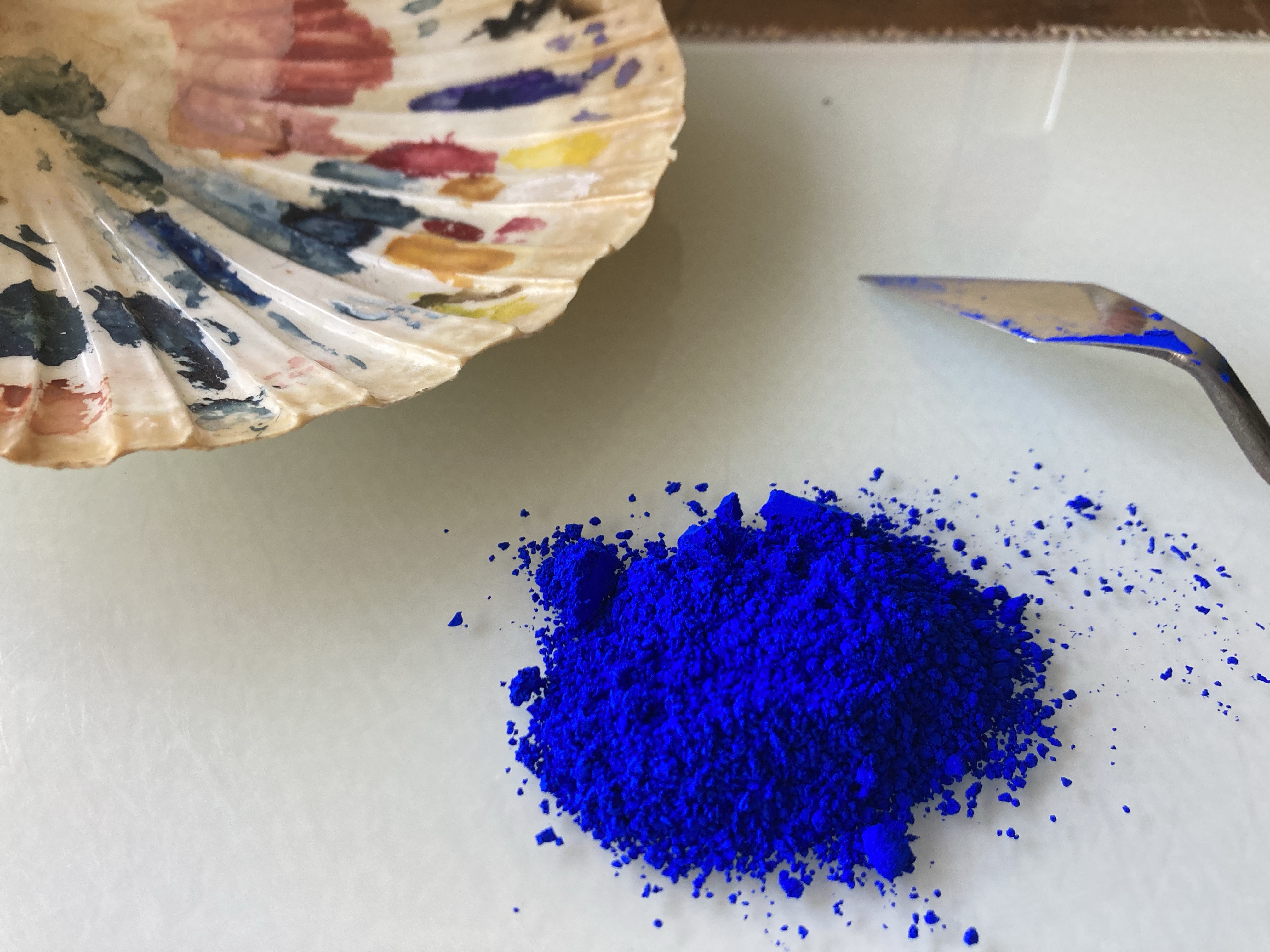
I used synthetic ultramarine (which in period would be made from lapis) because I have a ton of it, and also the prep needed for the real stuff was not really in the time frame I had to do this. (Also, a friend of mine already did a project with making his own paint from lapis and I basically was okay with the concept of purchasing pigments instead.)
That said, the colours that I did use for this were as follows: titanium white (a substitute for lead white), vine black, alizarin crimson (synthetic madder lake), helios red (PR3-Toluidine Red and a safe sub for realgar), Venetian red (a red ochre, generally non-toxic), burnt sienna (another earth pigment and generally non-toxic), Italian golden ochre (sort of non-toxic; Kremer says that this does contain lead, but they didn’t require me to write out a ton of paperwork for it), yellow ochre (more earth pigment, generally considered non-toxic), gamboge (definitely toxic; it’s a purgative, but it was safer than orpiment), terre verte (earth pigment, generally considered non-toxic), malachite (kind of toxic, contains very high levels of copper), viridian (I didn’t want to make my own verdigris), azurite (kind of toxic, contains very high levels of copper), synthetic ultramarine (generally considered non-toxicc), indigo (extremely non-toxic; we use it in jeans and people can drink it in teas), and a combination of ultramarine and alizarin really gave me a pretty dynamite purple which I’ve used in other places.
LikeLiked by 1 person
Ahhh, well, it’s still great.
I understand what you mean. I was obsessed with this lead color but I was terrified of lead and had no safe area to use so I skipped out. Same with ones with heavy mercury. Other colors I’m scared of but I wear gloves with taken like cadmiums and cobalts (not historic).
LikeLike
So, even when I work with non-toxic pigments, I still glove and mask up. It’s a safety concern (I do have a ton of cads that need to be turned into paint, but also, even with copper, it can be completely possible to poison oneself with it.)
But also, if the people (Cennini and Theophilus) say that a pigment is dangerous (people in the Renaissance and the Middle Ages were not stupid), there’s a reason they’re making a note of it. They may not have understood the root causes like we do, but they knew that misusing pigments could cause problems.
It’s also why my workbench is off by itself. At some point, my partner and I have discussed planning for getting actual separate studio space so that I can make as much paint with the less safe pigments without harming me, him, or any potential pets.
LikeLiked by 1 person
So cool. (Yeah, I use gloves and a mask especially with copper pigments—but, I haven’t actually made those yet, I just bought some.) The fine granules scare me the most, because I don’t know if they’re going to seep in. Same with the nickel ones.
Do you have a YouTube channel where you share your process?
LikeLike
So, my experience with azurite at the very least is that it takes forever to get to a workable consistency. If you’ve got a particularly grainy kind, it’s like mulling over sandpaper. It’s not fun, and I don’t much care for it (but the colour, I suppose, is worth it).
I do have a Youtube channel, but I’m terrible about posting there, and it’s not organized at all. (I did post some on paintmaking, though, when I made some very modern gouache with Pearl-Ex powders for funzies: https://youtu.be/PgroDqeFGRU)
LikeLiked by 1 person
I’ve never had the opportunity to mull that. It sounds scary.
Do you have other places where you post your art?
LikeLike
Mostly here, but also FB (which I have locked down), but I do have a few pieces up in my kingdom wiki page (which is currently down thanks to some PHP errors). I’m in the process of transferring the photos I do have here, though, but that’s taking more time than I would like.
LikeLiked by 1 person
Ahhh. Well, I followed you anyway, I’m fascinated and intrigued and can’t wait to see more. 👁👁
LikeLike
Do check out the Scroll Gallery – there’s still some pieces up there. The last scroll I did used almost all handmade paint with the exception of the gold paint, which was much kinder to my budget. It can be seen here: https://kaloethina.com/2022/09/04/interkingdom-shenani-plans/
LikeLiked by 1 person
Thank you.
LikeLike
Pingback: Egyptian Rainbows | konstantia kaloethina